 Back
BackStatistics Final Exam Review – Step-by-Step Guidance
Study Guide - Smart Notes
 Tailored notes based on your materials, expanded with key definitions, examples, and context.
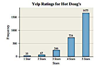
Q12. Yelp Ratings for Hot Doug’s Restaurant
Background
Topic: Frequency Distributions and Data Visualization
This question tests your ability to interpret bar graphs, calculate frequencies and percentages, and describe the shape of a distribution.
Key Terms and Formulas:
Frequency: The number of times a particular rating was given.
Percentage:
Distribution Shape: Describes how data is spread (left-skewed, right-skewed, symmetric).
Step-by-Step Guidance
Identify the frequency for each star rating from the graph: 1 Star (35), 2 Stars (67), 3 Stars (246), 4 Stars (724), 5 Stars (1675).
To find the most popular rating, look for the highest frequency among the star ratings.
To determine the total number of ratings, add up the frequencies for all star categories.
To find how many more 5 Star ratings there are than 4 Star ratings, subtract the frequency of 4 Stars from 5 Stars.
To calculate the percentage of 5 Star ratings, use the formula:
To describe the shape of the distribution, observe the pattern of frequencies across the star ratings and consider whether the data is skewed or symmetric.
Try solving on your own before revealing the answer!
Final Answers:
a) The most popular rating is 5 Stars.
b) The total number of ratings is 2747.
c) There are 951 more 5 Star ratings than 4 Star ratings.
d) The percentage of 5 Star ratings is approximately 61%.
e) The distribution is right-skewed (most ratings are high).
Each answer is based on interpreting the frequencies and applying the relevant formulas.
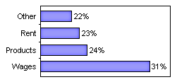
Q13. Improving a Misleading Bar Graph
Background
Topic: Data Visualization and Graphical Integrity
This question tests your understanding of how to properly represent data in bar graphs and avoid misleading visualizations.
Key Terms:
Proportional Representation: Bars should accurately reflect the values they represent.
Graphical Integrity: Ensuring that visual elements do not exaggerate or minimize differences in data.
Step-by-Step Guidance
Examine the lengths of the bars and compare them to the percentages shown.
Consider whether the visual difference between bars matches the numerical difference in percentages.
Think about how to adjust the graph so that the bar lengths are proportional to the actual percentages.
Review the answer choices and identify which one best addresses the issue of proportionality.
Try solving on your own before revealing the answer!
Final Answer:
The correct answer is: c) The lengths of the bars should be proportional to the percentages.
This ensures the graph accurately represents the data and avoids misleading viewers.
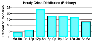
Q15. Misleading Crime Distribution Graph
Background
Topic: Data Visualization and Interpretation
This question tests your ability to critically evaluate graphs and identify misleading representations.
Key Terms:
Percent of Robberies: The proportion of robberies occurring in each time interval.
Graphical Misrepresentation: When a graph exaggerates or distorts the data.
Step-by-Step Guidance
Examine the y-axis and the intervals on the x-axis to see how the data is distributed.
Consider whether the intervals are equal and if the graph accurately reflects the claim made in the article.
Think about how the graph could mislead viewers regarding the worst hours for robberies.
Identify any issues with the scale, grouping, or visual emphasis that could distort interpretation.
Try solving on your own before revealing the answer!
Final Answer:
The graph is misleading because the intervals are not equal and the visual emphasis exaggerates the afternoon hours. The claim is not fully supported by the data.
Always check interval sizes and visual scaling when interpreting graphs.
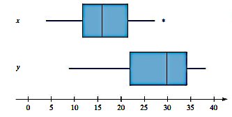
Q23. Boxplot Comparison of Variables x and y
Background
Topic: Boxplots and Data Dispersion
This question tests your ability to interpret boxplots, compare medians, quartiles, dispersion, and identify outliers.
Key Terms and Formulas:
Median: The middle value of the data set.
Quartiles: (first quartile), (third quartile).
Dispersion: Spread of the data, often measured by range or interquartile range.
Outlier: A value that lies outside the typical range, often marked with a symbol (e.g., asterisk).
Shape: Describes the distribution (skewed left, skewed right, symmetric, uniform).
Step-by-Step Guidance
To find the median of y, locate the center line in the y boxplot and estimate its value.
To find the third quartile of x, locate the right edge of the x box and estimate its value.
Compare the lengths of the boxes and whiskers for x and y to determine which variable has more dispersion.
Look for any symbols (e.g., asterisk) outside the whiskers of x to identify outliers and estimate their values.
Observe the symmetry and placement of the median in y to describe its shape.
Try solving on your own before revealing the answer!
Final Answers:
a) The median of y is approximately 27.
b) The third quartile of x is approximately 25.
c) Variable y has more dispersion.
d) Variable x has an outlier at approximately 35.
e) Variable y is right-skewed.
Boxplots are useful for comparing medians, quartiles, and identifying outliers visually.
Q35. Properties of the Normal Density Curve
Background
Topic: Normal Distribution
This question tests your understanding of the characteristics of the normal density curve, which is fundamental in statistics for modeling continuous data.
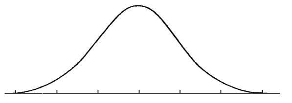
Key Terms:
Normal Density Curve: A symmetric, bell-shaped curve representing the distribution of a continuous variable.
Mean (): The center of the distribution.
Standard Deviation (): Measures the spread of the distribution.
Step-by-Step Guidance
The curve is symmetric about the mean ().
The total area under the curve is 1.
The curve approaches, but never touches, the horizontal axis.
The mean, median, and mode are all equal and located at the center.
Most data falls within 1, 2, and 3 standard deviations from the mean (Empirical Rule).
Try solving on your own before revealing the answer!
Final Answer:
The normal density curve is symmetric, bell-shaped, and centered at the mean.
The total area under the curve is 1, and most values fall within a few standard deviations of the mean.
These properties are essential for understanding probability and inferential statistics.
