 Back
BackStatistics Midterm Study Guidance: Regression, Data Visualization, Probability, and More
Study Guide - Smart Notes
 Tailored notes based on your materials, expanded with key definitions, examples, and context.
Q1. Multiple Regression with Dummy Variables: Employee Salary Analysis
Background
Topic: Multiple Linear Regression with Dummy Variables
This question tests your understanding of how to build and interpret a multiple regression equation using both a quantitative variable (years of experience) and a categorical variable (gender, coded as a dummy variable).
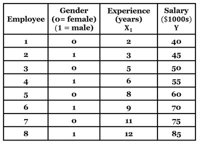
Key Terms and Formulas
Multiple Regression Equation:
Dummy Variable: A variable coded as 0 or 1 to represent categories (here, gender: 0 = female, 1 = male)
Response Variable: The variable being predicted (Salary, )
Predictor Variables: Experience (), Gender ()
Step-by-Step Guidance
Write the general form of the multiple regression equation using the variables provided: .
Identify the values for a female employee with 10 years of experience: , (since female = 0).
Identify the values for a male employee with 10 years of experience: , (since male = 1).
Substitute the values into the regression equation for each scenario, but do not compute the final salary yet.
To determine if gender has a significant effect, examine the coefficient for the gender variable () and consider its size and statistical significance (if provided).
Try solving on your own before revealing the answer!
Q2. Census in Data Collection
Background
Topic: Types of Data Collection Methods
This question tests your understanding of what a census is in statistics and how it differs from other sampling methods.
Key Terms
Census: Collecting data from every individual in the population.
Sample: Collecting data from a subset of the population.
Step-by-Step Guidance
Review the definition of a census and compare it to the definitions of sampling methods.
Identify which option describes collecting data from the entire population.
Try solving on your own before revealing the answer!
Q3. Sampling Technique and Bias: Campus Dining Survey
Background
Topic: Sampling Methods and Bias
This question tests your ability to identify sampling techniques and recognize potential sources of bias in survey data collection.
Key Terms
Convenience Sampling: Selecting individuals who are easiest to reach.
Selection Bias: When the sample is not representative of the population.
Step-by-Step Guidance
Consider where and how the students are being selected (outside the cafeteria at lunchtime).
Determine which sampling method this describes (random, stratified, cluster, or convenience).
Think about whether this method could introduce bias and what kind.
Try solving on your own before revealing the answer!
Q4. Visualizing Annual Rainfall Data
Background
Topic: Choosing Appropriate Graphs for Quantitative Data
This question tests your ability to select the most suitable graph for visualizing time series data (annual rainfall over 100 years).
Key Terms
Line Graph: Best for showing trends over time for quantitative data.
Bar Graph, Pie Chart, Scatterplot: Used for other types of data or relationships.
Step-by-Step Guidance
Identify the type of data (quantitative, measured over time).
Recall which graph type is best for visualizing trends in time series data.
Try solving on your own before revealing the answer!
Q5. Constructing a Frequency Distribution and Assessing Normality
Background
Topic: Frequency Distributions and Data Normality
This question asks you to organize data into a frequency distribution and consider whether the distribution appears normal.
Key Terms and Steps
Frequency Distribution: Table showing how data are distributed across intervals (classes).
Normal Distribution: Symmetrical, bell-shaped distribution.
Class Width: The difference between the lower limits of consecutive classes.
Step-by-Step Guidance
Start with the lowest value (45 kg) and create intervals of width 10 kg (e.g., 45–54, 55–64, etc.).
Count how many data points fall into each interval and fill out the frequency distribution.
Consider the shape of the distribution (is it symmetric, skewed, or unclear without a histogram?).
Try solving on your own before revealing the answer!
Q6. Interpreting Histograms: Delivery Times
Background
Topic: Histograms and Distribution Shapes
This question tests your ability to match a frequency distribution to its histogram and describe the distribution's shape (normal, uniform, skewed left, skewed right).
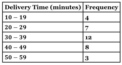
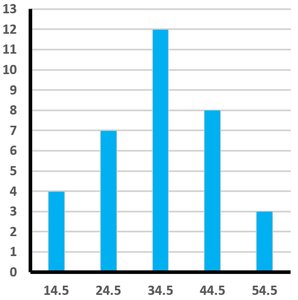
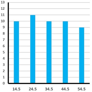
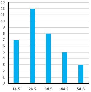
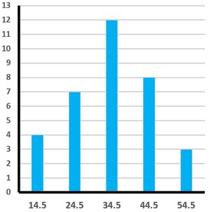
Key Terms
Normal Distribution: Symmetrical, bell-shaped.
Uniform Distribution: All bars are about the same height.
Skewed Right: Tail on the right side is longer.
Skewed Left: Tail on the left side is longer.
Step-by-Step Guidance
Compare the frequencies in the table to the heights of the bars in each histogram.
Identify which histogram matches the frequency distribution provided.
Describe the shape of the distribution based on the histogram you selected.
Try solving on your own before revealing the answer!
Q18. Interpreting Percentiles from an Ogive
Background
Topic: Percentiles and Ogives
This question asks you to interpret an ogive (cumulative frequency graph) to determine the score corresponding to a given percentile and to explain what that percentile means in context.
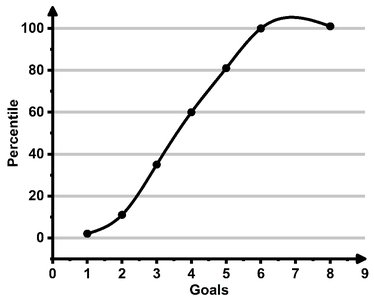
Key Terms
Percentile: The value below which a given percentage of observations fall.
Ogive: A graph that shows cumulative frequencies or percentiles.
Step-by-Step Guidance
Locate the percentile of interest on the y-axis of the ogive (e.g., 60th percentile).
Draw a horizontal line from the percentile to the curve, then drop a vertical line to the x-axis to find the corresponding score (number of goals).
Interpret what it means for a team to be at or below this percentile in terms of goals scored.
Try solving on your own before revealing the answer!
Q20. Interpreting Boxplots: Water Usage Fees
Background
Topic: Boxplots (Box-and-Whisker Plots) and Comparing Distributions
This question tests your ability to interpret boxplots to compare medians and variability across groups (here, neighborhoods).
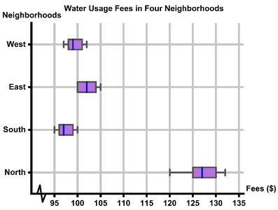
Key Terms
Median: The line inside the box, representing the middle value.
Interquartile Range (IQR): The width of the box, showing the spread of the middle 50% of data.
Step-by-Step Guidance
Identify the median for each neighborhood by looking at the line inside each box.
Compare the medians to determine which neighborhood has the highest typical water usage fee.
Consider the spread and position of the boxes to support your conclusion.
Try solving on your own before revealing the answer!
