 Back
BackStatistics Study Guide: Visual Data Representations and Analysis
Study Guide - Smart Notes
 Tailored notes based on your materials, expanded with key definitions, examples, and context.
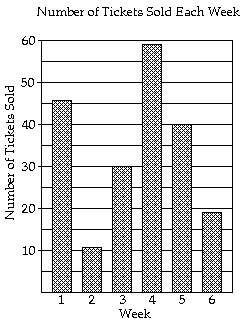
Q13. During which week was the fewest number of tickets sold?
Background
Topic: Data Visualization (Bar Graphs)
This question tests your ability to interpret bar graphs and identify minimum values from visual data.
Key Terms:
Bar Graph: A chart that represents categorical data with rectangular bars.
Frequency: The number of times an event occurs (here, tickets sold per week).
Step-by-Step Guidance
Examine the heights of the bars for each week on the graph. The height represents the number of tickets sold.
Compare the heights of all bars to determine which is the shortest.
Identify the week corresponding to the shortest bar. This week had the fewest tickets sold.
Try solving on your own before revealing the answer!
Final Answer: Week 2
Week 2 has the shortest bar, indicating the fewest tickets sold.
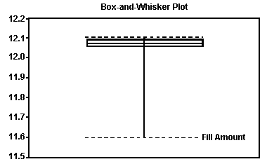
Q36. Based on the boxplot for the amount of soda poured by a filling machine, what shape do you believe the data to have?
Background
Topic: Boxplots and Distribution Shape
This question tests your ability to interpret boxplots and infer the shape of a data distribution (e.g., symmetric, skewed).
Key Terms:
Boxplot: A graphical summary of data showing the median, quartiles, and extremes.
Skewness: A measure of asymmetry in a distribution.
Step-by-Step Guidance
Observe the position of the median (line inside the box) relative to the quartiles and whiskers.
If the median is closer to the lower quartile and the upper whisker is longer, the data is skewed right. If the median is closer to the upper quartile and the lower whisker is longer, the data is skewed left.
If the box and whiskers are roughly symmetric, the data is approximately symmetric.
Try solving on your own before revealing the answer!
Final Answer: Skewed to the left
The median is closer to the upper quartile, and the lower whisker is longer, indicating left skewness.
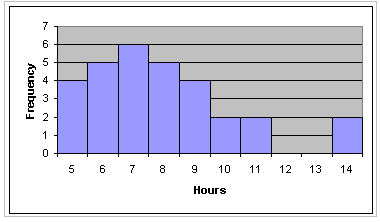
Q16. Construct a frequency histogram for the data: Internet hours for 30 students.
Background
Topic: Frequency Histograms
This question tests your ability to organize quantitative data into a frequency histogram, which visually shows how often each value or range of values occurs.
Key Terms:
Histogram: A bar graph representing the frequency of data within specified intervals (bins).
Frequency: The count of data points within each interval.
Step-by-Step Guidance
Group the data into intervals (e.g., 5–6, 7–8, etc.).
Count how many data points fall into each interval.
Draw bars for each interval, with heights corresponding to the frequency.
Try solving on your own before revealing the answer!
Final Answer: Histogram as shown
The histogram visually displays the frequency of hours spent online by students.
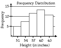
Q18. Construct a frequency distribution and a relative frequency distribution for the height data.
Background
Topic: Frequency and Relative Frequency Distributions
This question tests your ability to organize data into frequency and relative frequency tables, and to interpret these distributions visually.
Key Terms:
Frequency Distribution: Table showing how many times each value or interval occurs.
Relative Frequency: The proportion of the total represented by each frequency.
Step-by-Step Guidance
List the height intervals and their corresponding frequencies.
Calculate the relative frequency for each interval:
Draw bar graphs for both frequency and relative frequency distributions.
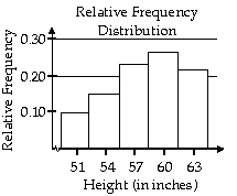
Try solving on your own before revealing the answer!
Final Answer: Frequency and relative frequency distributions as shown
The graphs display the distribution of heights and their relative frequencies.
Q20. Construct a dot plot for the radar speed data.
Background
Topic: Dot Plots
This question tests your ability to represent quantitative data using a dot plot, which shows each individual data point.
Key Terms:
Dot Plot: A simple plot where each data point is represented by a dot above its value on a number line.
Step-by-Step Guidance
Draw a number line covering the range of radar speeds.
Place a dot above each value for every occurrence in the data set.
Observe the distribution and any patterns in the data.
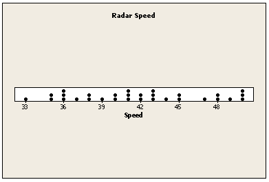
Try solving on your own before revealing the answer!
Final Answer: Dot plot as shown
The dot plot visually represents the distribution of radar speeds.
