 Back
BackStatistics Test 1 Study Guide – Step-by-Step Guidance
Study Guide - Smart Notes
 Tailored notes based on your materials, expanded with key definitions, examples, and context.
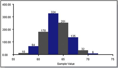
Q12. Is the distribution below bell-shaped? Explain your answer.
Background
Topic: Shape of Distributions
This question is testing your ability to recognize and describe the shape of a frequency distribution, specifically whether it is bell-shaped (normal distribution).
Key Terms:
Bell-shaped distribution: Also known as a normal distribution, it is symmetric about the center and has most values clustered around the mean, with frequencies tapering off toward the extremes.
Symmetry: A distribution is symmetric if the left and right sides are mirror images.
Frequency: The number of times a value or range of values occurs.
Step-by-Step Guidance
Observe the histogram and note the general shape of the bars. Look for symmetry around a central value.
Check if the frequencies increase to a peak in the middle and then decrease symmetrically on both sides.
Identify if the distribution has a single peak (unimodal) and if the tails on both ends are roughly equal.
Consider whether the distribution is skewed or if it maintains a balanced, bell-shaped appearance.
Try solving on your own before revealing the answer!
Final Answer:
Yes, the distribution is bell-shaped. It is symmetric, with frequencies rising to a peak in the center and tapering off toward both ends, which is characteristic of a normal distribution.
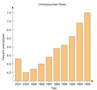
Q13. What is wrong with this graph?
Background
Topic: Graphical Representation of Data
This question is testing your ability to critically evaluate graphs for errors or misleading features in the presentation of data.
Key Terms:
Axis orientation: The order and direction of values on the axes should be logical and consistent.
Non-zero axis: The vertical axis should typically start at zero to avoid exaggerating differences.
Chronological order: Years should be presented in order from earliest to latest (or vice versa), not reversed.
Step-by-Step Guidance
Examine the horizontal axis (years) and check if the order is chronological or reversed.
Look at the vertical axis and see if it starts at zero or a higher value, which can distort the visual impression of changes.
Consider how these features might mislead viewers about trends or differences in the data.
Think about how you would correct these issues to make the graph more accurate and clear.
Try solving on your own before revealing the answer!
Final Answer:
The graph has a non-zero axis and the years are presented in reverse order, which can mislead viewers about the trend in unemployment rates. The axis should start at zero and the years should be in chronological order.
