Back
BackStep-by-Step Guidance for College Statistics Exam Questions
Study Guide - Smart Notes
 Tailored notes based on your materials, expanded with key definitions, examples, and context.
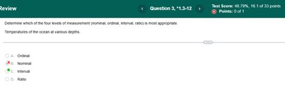
Q1. Determine which of the four levels of measurement (nominal, ordinal, interval, ratio) is most appropriate: Temperatures of the ocean at various depths.
Background
Topic: Levels of Measurement
This question tests your understanding of the four levels of measurement in statistics and your ability to classify a variable (temperature) correctly.
Key Terms and Concepts:
Nominal: Categories with no order (e.g., colors, names).
Ordinal: Categories with a meaningful order, but differences are not meaningful (e.g., rankings).
Interval: Ordered, meaningful differences, but no true zero (e.g., temperature in Celsius or Fahrenheit).
Ratio: Ordered, meaningful differences, and a true zero (e.g., height, weight, age).
Step-by-Step Guidance
Consider what type of variable temperature is. Is there a true zero point (absolute absence of temperature)?
Ask yourself if you can meaningfully compare differences between values (e.g., is the difference between 10°C and 20°C the same as between 20°C and 30°C?).
Think about whether ratios make sense (e.g., is 20°C twice as hot as 10°C?).
Recall that interval data has meaningful differences but no true zero, while ratio data has both meaningful differences and a true zero.
Try solving on your own before revealing the answer!
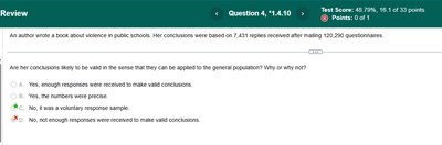
Q2. An author wrote a book about science in public schools. Her conclusions were based on 7,431 replies received after mailing 120,000 questionnaires. Are her conclusions likely to be valid in the sense that they can be applied to the general population? Why or why not?
Background
Topic: Sampling Methods and Validity
This question tests your understanding of sampling methods, specifically voluntary response samples, and how they affect the validity of statistical conclusions.
Key Terms and Concepts:
Voluntary Response Sample: A sample where participants choose to respond, often leading to bias.
Generalizability: Whether results from a sample can be applied to the broader population.
Step-by-Step Guidance
Consider how the sample was collected. Did everyone have an equal chance to respond, or did only certain people choose to reply?
Think about what kind of bias might be present in voluntary response samples.
Ask yourself if the sample is likely to represent the views of the entire population or just those who felt strongly enough to respond.
Try solving on your own before revealing the answer!
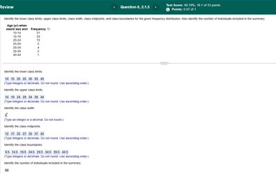
Q3. Identify the lower class limits, upper class limits, class width, class midpoints, and class boundaries for the given frequency distribution. Also identify the number of individuals included in the summary.
Background
Topic: Frequency Distributions and Histograms
This question tests your ability to interpret and analyze frequency distributions, including identifying class limits, widths, midpoints, and boundaries.
Key Terms and Formulas:
Lower Class Limit: The smallest value that can belong to a class.
Upper Class Limit: The largest value that can belong to a class.
Class Width:
Class Midpoint:
Class Boundaries: Values that separate classes without gaps.
Step-by-Step Guidance
List the lower and upper class limits for each class interval.
Calculate the class width using the formula above.
Find the midpoint for each class interval.
Determine the class boundaries by averaging the upper limit of one class and the lower limit of the next.
Add up the frequencies to find the total number of individuals.
Try solving on your own before revealing the answer!
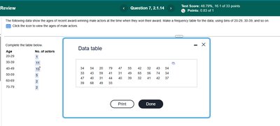
Q4. The following data show the ages of recent award-winning male actors at the time when they won their award. Make a frequency table for five class widths, using class limits of 20-29, 30-39, and so on.
Background
Topic: Frequency Tables and Data Grouping
This question tests your ability to organize raw data into a frequency table using specified class intervals.
Key Terms and Concepts:
Frequency Table: A table that shows how many data values fall into each class interval.
Class Interval: The range of values for each group (e.g., 20-29, 30-39, etc.).
Step-by-Step Guidance
List the class intervals as specified (e.g., 20-29, 30-39, etc.).
Go through the data and count how many values fall into each class interval.
Record the frequencies in the table next to each class interval.
Try solving on your own before revealing the answer!
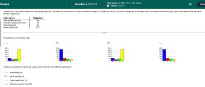
Q5. A study was conducted to determine time people get to class. The data below lists 600 randomly selected students. Construct a Pareto chart that best corresponds to the given data. If someone wanted the bar to go up, what seems to be the most efficient approach?
Background
Topic: Pareto Charts and Data Visualization
This question tests your ability to interpret categorical frequency data and select the correct Pareto chart, as well as analyze how to increase a specific category's frequency.
Key Terms and Concepts:
Pareto Chart: A bar graph where categories are ordered by frequency from highest to lowest.
Frequency: The number of occurrences in each category.
Step-by-Step Guidance
Order the categories by frequency from highest to lowest.
Match the data to the correct Pareto chart by comparing the order and height of the bars.
Consider which category you want to increase and what action would most efficiently raise its frequency.
Try solving on your own before revealing the answer!