 Back
BackSummarising Data: Tabular & Graphical Methods
Study Guide - Smart Notes
 Tailored notes based on your materials, expanded with key definitions, examples, and context.
Summarising Data: Tabular & Graphical Methods
2.1 Summarising Data for a Categorical Variable
Categorical variables represent data sorted into distinct groups or categories. Summarising such data involves counting the number of observations in each category and representing these counts in tables or graphs.
2.1.1 Frequency Distribution
Frequency distribution is a table that displays the number of observations (frequency) in each category.
Each category is mutually exclusive and collectively exhaustive.
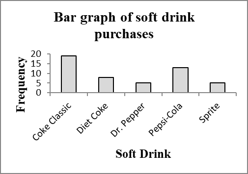
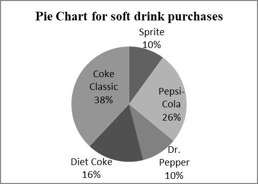
Example: The table below shows the frequency distribution of soft drink purchases from a sample of 50.
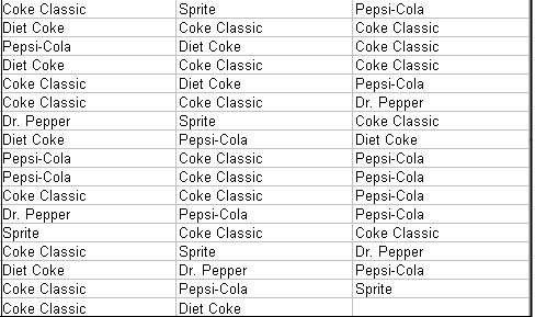
Soft Drink | Frequency |
|---|---|
Coke Classic | 19 |
Diet Coke | 8 |
Dr. Pepper | 5 |
Pepsi-Cola | 13 |
Sprite | 5 |
Total | 50 |
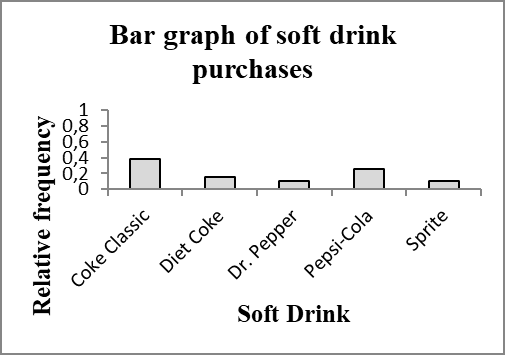
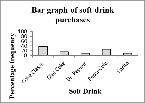
2.1.2 Relative Frequency and Percent Frequency Distributions
Relative frequency is the proportion of observations in each category:
Percent frequency is the relative frequency multiplied by 100.
The sum of relative frequencies is always 1; the sum of percent frequencies is always 100.
Example: Relative and percent frequencies for soft drink purchases:
Soft Drink | Frequency | Relative Frequency | Percent Frequency |
|---|---|---|---|
Coke Classic | 19 | 0.38 | 38 |
Diet Coke | 8 | 0.16 | 16 |
Dr. Pepper | 5 | 0.10 | 10 |
Pepsi-Cola | 13 | 0.26 | 26 |
Sprite | 5 | 0.10 | 10 |
Total | 50 | 1.00 | 100 |
2.1.3 Bar Charts and Pie Charts
Bar charts visually display the frequency, relative frequency, or percent frequency for each category. Bars are separated to emphasize non-overlapping categories.
Pie charts show the proportion of each category as a sector of a circle, with the angle proportional to the relative frequency.
Axes and titles must be clearly labeled.
2.2 Summarising Data for a Quantitative Variable
Quantitative variables are numerical and can be summarized using frequency distributions, histograms, and other graphical methods. Special care is needed in defining class intervals for grouping data.
2.2.1 Frequency, Relative Frequency, and Percentage Frequency Distributions
For quantitative data, classes (intervals) must be defined to group data values.
Sturges' Rule helps estimate the number of classes: or
Class width is calculated as:
Class limits define the boundaries of each interval. Right-inclusive intervals include the upper limit.
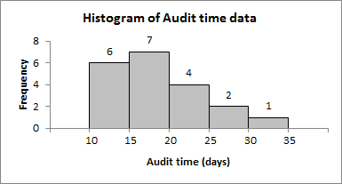
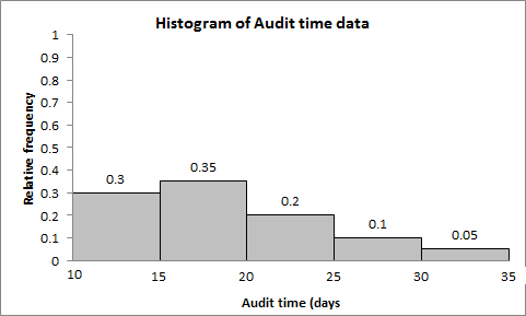
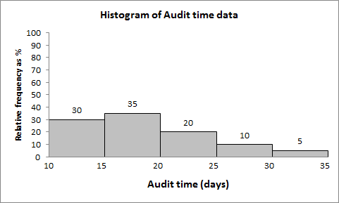
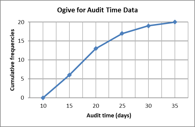
Example: Audit times (in days) for 20 clients, grouped into 5 classes of width 5.
Audit Time (days) | Frequency | Relative Frequency | Percentage Frequency |
|---|---|---|---|
(10-15] | 6 | 0.30 | 30 |
(15-20] | 7 | 0.35 | 35 |
(20-25] | 4 | 0.20 | 20 |
(25-30] | 2 | 0.10 | 10 |
(30-35] | 1 | 0.05 | 5 |
Total | 20 | 1.00 | 100 |
2.2.2 Histogram
Histogram is a graphical representation of the frequency distribution for quantitative data. Bars are adjacent, reflecting continuous intervals.
The x-axis shows the variable (e.g., audit time), and the y-axis shows frequency, relative frequency, or percent frequency.
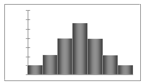
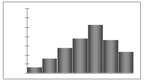
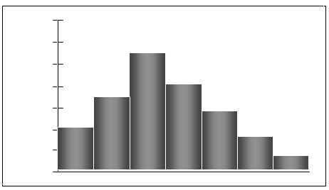
Describing the Shape of a Distribution
Histograms reveal the shape of the data distribution:
Symmetric: Both sides are mirror images.
Skewed left (negatively skewed): Tail extends to the left.
Skewed right (positively skewed): Tail extends to the right.
2.2.3 Cumulative Frequency Distributions
Cumulative frequency for a class is the number of data points with values less than or equal to the upper class limit.
Cumulative relative frequency and cumulative percent frequency are the cumulative versions of the above.
These distributions help answer questions about proportions or counts above or below certain thresholds.
Ogive: A graph of cumulative frequency versus upper class limit.
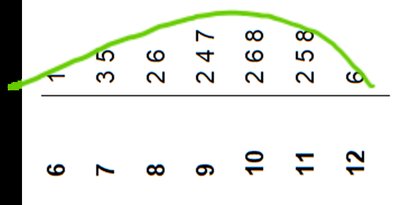
2.2.4 Stem-and-Leaf Display
A stem-and-leaf display shows both the rank order and shape of a data set, preserving the original data values.
The stem is the leading digit(s), and the leaf is the last digit.
It is useful for small to moderate-sized data sets.
Rotating the display can help visualize the distribution's shape.
2.3 Summarising Data for Two Variables
When analyzing the relationship between two variables, tabular and graphical methods such as cross-tabulation and scatter diagrams are used.
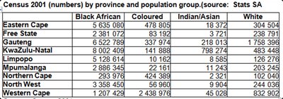
2.3.1 Cross-Tabulation
Cross-tabulation (contingency table) summarizes data for two variables, showing the frequency of observations for each combination of categories.
It is used for both categorical and quantitative variables (after grouping quantitative variables).
Example: Census data by province and population group.
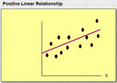
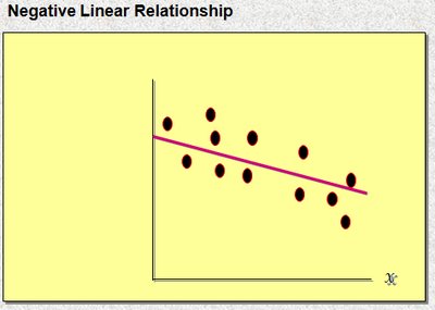
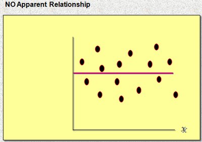
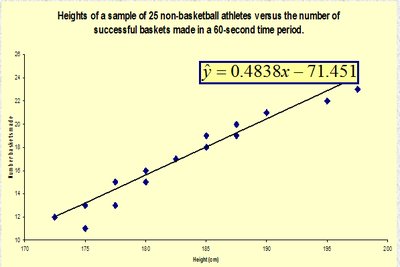
2.3.2 The Scatter Diagram and Trend Line
A scatter diagram plots pairs of values for two quantitative variables, revealing the type and strength of their relationship.
The trend line (regression line) approximates the linear relationship between the variables.
Relationships can be positive, negative, or have no apparent association.
Additional info: These methods form the foundation for exploratory data analysis and are essential for understanding the structure and relationships within data before applying more advanced statistical techniques.
