 Back
BackSummarizing Quantitative Data: Numbers and Graphs
Study Guide - Smart Notes
 Tailored notes based on your materials, expanded with key definitions, examples, and context.
Summarizing Quantitative Data Using Numbers and Graphs
Displays for Quantitative Data
Quantitative data can be visually summarized using several types of graphs, which help reveal patterns, trends, and distributions within the data set.
Dotplot: Each data point is represented as a dot along a number line, providing a simple visualization of the distribution.
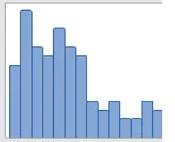
Histogram: Data is grouped into intervals (bins), and the frequency of data within each bin is shown as a bar. Histograms are useful for identifying the shape of the distribution, such as symmetry or skewness.
Example: A histogram of home prices or test scores can show whether most values cluster around a central value or if there are outliers.
Summarizing a Data Set With Numbers
Numerical summaries provide concise information about the center, spread, and shape of a data set.
Mean: The arithmetic average of all values. It is sensitive to outliers and skewed data.
Median: The middle value when data is ordered from smallest to largest. It is a resistant measure of center, unaffected by extreme values.
Mode: The value that appears most frequently in the data set.
Example: For the data set 4, 5, 6, ..., 63, the median is the 14th value when ordered.
Upside and downside to the median:
The median is resistant to outliers but only uses one or two values in its calculation.
The Quartiles and Five-Number Summary
Quartiles divide the data into four equal parts, and the five-number summary provides a quick overview of the distribution.
Quartiles: Q1 (first quartile), Q2 (median), Q3 (third quartile).
Five-number summary: Minimum, Q1, Median, Q3, Maximum.
Range: Difference between maximum and minimum values.
Interquartile Range (IQR):
Uses: The five-number summary helps identify the center, spread, skewness, and potential outliers in the data.
Boxplots and Outliers
Boxplots visually display the five-number summary and highlight outliers using the 1.5 IQR rule.
Basic boxplot: Shows the median, quartiles, and extremes.
Modified boxplot: Marks outliers as individual points.
1.5 IQR Rule for Outliers: Values more than 1.5 times the IQR above Q3 or below Q1 are considered outliers.
Calculating the Center: Mean vs. Median
The mean and median are both measures of center, but their suitability depends on the data's distribution.
Mean:
Median: The middle value in ordered data.
The mean is the "balance point" of the data and is pulled in the direction of skewness.
The mean is non-resistant and sensitive to outliers; the median is resistant.
Choose the mean for symmetric data and the median for skewed or outlier-prone data.
Measures of Spread: Standard Deviation and IQR
Spread describes how much the data values vary.
Standard Deviation: Measures the average distance of data points from the mean. Different formulas are used for samples and populations.
Interquartile Range (IQR): Measures the spread of the middle 50% of the data.
Use mean and standard deviation for symmetric data; use median and IQR for skewed data or data with outliers.
The Empirical Rule
The Empirical Rule describes the spread of data in a normal distribution:
About 68% of data falls within one standard deviation of the mean.
About 95% falls within two standard deviations.
About 99.7% falls within three standard deviations.
Formula:
contains 68% contains 95% contains 99.7%$
Additional info: The histogram image provided visually demonstrates how the mean and median can differ in a skewed distribution, with the mean being pulled toward the tail.
