Back
BackUnit 1 Review: Foundational Statistics Concepts and Data Interpretation
Study Guide - Smart Notes
 Tailored notes based on your materials, expanded with key definitions, examples, and context.
Q15. Express each of the following numbers in the three forms of fraction, decimal, and percentage.
Background
Topic: Number Representation in Statistics
This question tests your ability to convert between fractions, decimals, and percentages, which is a foundational skill in statistics for interpreting and presenting data.
Key Terms and Formulas
Fraction: A way to represent a part of a whole, written as .
Decimal: A number expressed in base 10, often used for precision.
Percentage: A number or ratio expressed as a fraction of 100, denoted with the % symbol.
Conversions:
Fraction to Decimal: Divide the numerator by the denominator.
Decimal to Percentage: Multiply the decimal by 100 and add the % symbol.
Percentage to Decimal: Divide by 100.
Decimal to Fraction: Write the decimal as a fraction and simplify if possible.
Step-by-Step Guidance
For each value, identify its current form (fraction, decimal, or percentage).
Convert the value to the other two forms using the conversion rules above.
For example, to convert to a decimal, divide 3 by 5. To convert that decimal to a percentage, multiply by 100.
For a decimal like 0.8, write it as a fraction (e.g., , then simplify), and as a percentage (0.8 × 100 = 80%).
For a percentage like 150%, divide by 100 to get the decimal (1.5), and write as a fraction (e.g., ).
Try solving on your own before revealing the answer!
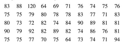
Q19. Listed below are the lengths (in minutes) of selected animated children’s movies. Construct a stem plot. Does the stem plot show the distribution of the data? If so, how?
Background
Topic: Data Visualization – Stem-and-Leaf Plots
This question is about constructing a stem-and-leaf plot, which is a way to display quantitative data to observe its distribution, shape, and spread.
Key Terms and Formulas
Stem-and-Leaf Plot: A graphical method that splits each data value into a "stem" (all but the last digit) and a "leaf" (the last digit).
Distribution: The way in which data values are spread or clustered.
Step-by-Step Guidance
List all the movie lengths in order from smallest to largest.
Determine the stems (e.g., for 83, the stem is 8 and the leaf is 3).
Write each value in the plot, grouping leaves with the same stem together.
Once the plot is constructed, observe the shape (e.g., symmetric, skewed, clusters, gaps, outliers).
Try solving on your own before revealing the answer!
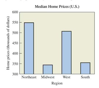
Q20. The figure below shows the median home prices in regions of the United States. In what way might this graph be subject to misinterpretation? How could such misinterpretation be avoided?
Background
Topic: Data Interpretation and Graphical Misrepresentation
This question tests your ability to critically evaluate graphs for potential sources of misinterpretation, such as misleading scales or visual exaggeration.
Key Terms and Concepts
Median: The middle value in a data set when ordered from least to greatest.
Bar Graph: A chart that uses bars to represent quantities.
Misinterpretation: Drawing incorrect conclusions due to misleading visual elements (e.g., non-zero baselines, inconsistent scales).
Step-by-Step Guidance
Examine the vertical axis: Does it start at zero or a higher value? How might this affect perception?
Compare the heights of the bars: Are differences visually exaggerated or minimized?
Consider how the graph could be improved to avoid misinterpretation (e.g., using a zero baseline, clear labeling).
Try solving on your own before revealing the answer!
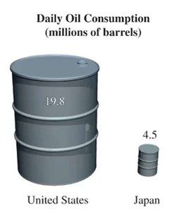
Q21. The figure below depicts the amounts of daily oil consumption (in millions of barrels) in the United States and Japan for a recent year. Does the illustration accurately depict the data? Why or why not?
Background
Topic: Data Visualization – Pictographs and Proportionality
This question asks you to evaluate whether a pictorial representation (pictograph) accurately reflects the underlying data, focusing on proportionality and visual accuracy.
Key Terms and Concepts
Pictograph: A graph that uses images or symbols to represent data quantities.
Proportionality: The visual representation should match the numerical ratio of the data.
Area vs. Height: If images are scaled by area (not just height), differences can be exaggerated.
Step-by-Step Guidance
Compare the actual data values: U.S. (19.8 million barrels), Japan (4.5 million barrels).
Examine how the sizes of the barrels are represented: Are they scaled by height, area, or volume?
Consider whether the visual difference matches the numerical ratio (should be about 4.4 times larger).
Think about how pictorial representations can mislead if not scaled properly.
Try solving on your own before revealing the answer!