 Back
BackUnit 1 Review: Understanding Misleading Graphics in Statistics
Study Guide - Smart Notes
 Tailored notes based on your materials, expanded with key definitions, examples, and context.
Q1. What is misleading about the following graphics?
Background
Topic: Misleading Graphs and Data Visualization
This question tests your ability to critically evaluate graphical representations of data and identify ways in which graphs can be misleading or misrepresent the underlying data. This is an important skill in statistics, as visualizations can sometimes exaggerate or distort the truth.
Key Terms and Concepts:
Misleading Graph: A graph that distorts the data, either intentionally or unintentionally, leading to incorrect interpretations.
Area vs. Height: When using images or shapes to represent quantities, it is important to ensure that the visual representation matches the actual data change (e.g., doubling area vs. doubling height).
Scale Manipulation: Changing the scale of axes or using non-zero baselines can exaggerate or minimize apparent differences.
Step-by-Step Guidance
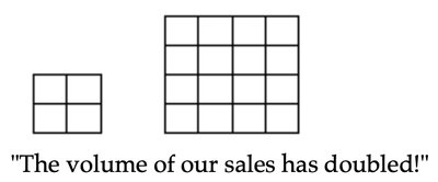
Examine the first graphic (the two squares with the caption "The volume of our sales has doubled!"). Count the number of small squares in each figure to see if the visual increase matches the claim.
Consider whether the increase in area (number of squares) is proportional to the claim of "doubling." Think about how area grows compared to linear dimensions.
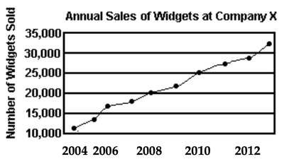
For the second graphic (the line graph), look at the vertical axis (Number of Widgets Sold) and the horizontal axis (Year). Check if the scale starts at zero and if the intervals are consistent.
Ask yourself: Does the way the graph is drawn exaggerate or minimize the changes in sales over time? Are there any visual tricks (like compressed axes or non-zero baselines) that could mislead the viewer?
Try analyzing these graphics on your own before revealing the answer!
Final Answer:
For the first graphic, the area of the larger square is actually four times the area of the smaller one, not double. This exaggerates the increase in sales. For the second graphic, if the vertical axis does not start at zero or the scale is manipulated, it can make the increase in sales look more dramatic than it really is. Always check the axes and the way quantities are represented visually!
