 Back
BackUnit 1 Study Guide: Sampling Designs and Describing Data in Elementary Statistics
Study Guide - Smart Notes
 Tailored notes based on your materials, expanded with key definitions, examples, and context.
Statistics Basics
Descriptive Statistics vs. Inferential Statistics
Statistics is the science of collecting, organizing, analyzing, and interpreting data. It is divided into two main branches: descriptive statistics and inferential statistics. Descriptive statistics summarize and organize data from a population or sample, while inferential statistics use sample data to make generalizations or predictions about a population.
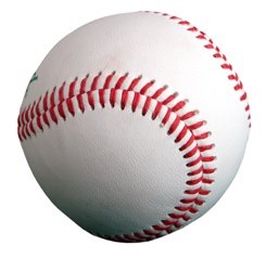
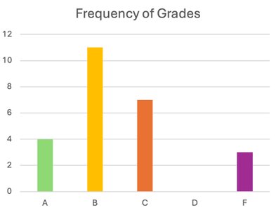
Descriptive Statistics: Methods for organizing and summarizing information. Examples include the number of home runs in a season, average salary, or frequency of grades.
Inferential Statistics: Methods for drawing and measuring the reliability of conclusions about a population based on information obtained from a sample. For example, testing if the thickness of baseball laces affects home runs using a sample of games.
Key Measures in Descriptive Statistics:
Frequency: The number of times a particular value occurs.
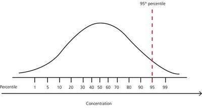
Position: Location compared to others (e.g., percentile).
Central Tendency: Mean, median, mode, and trimmed mean.
Variation: Range, interquartile range, variance, standard deviation.
Variables and Data Types
Qualitative vs. Quantitative Data
A variable is a characteristic that varies from one person or thing to another. Data can be classified as qualitative or quantitative:
Qualitative (Categorical) Data: Non-numerical, sorts into categories (e.g., hair color, model of car).
Quantitative Data: Numerical, can be discrete or continuous.
Discrete: Possible values can be listed, usually counts (e.g., number of siblings).
Continuous: Possible values form an interval (e.g., foot length, weight).
Organizing Qualitative Data
Frequency and Relative Frequency Tables
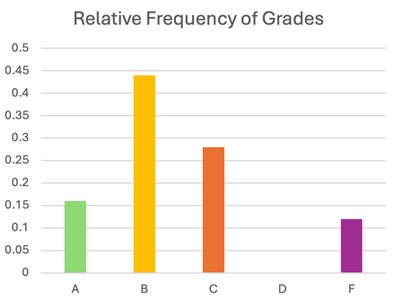
Qualitative data can be organized using frequency tables, bar charts, and pie charts. Frequency is the count of occurrences, while relative frequency is the proportion of occurrences relative to the total.
Bar Charts: Visual representation of frequencies for categories.
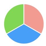
Pie Charts: Show proportions of categories as slices of a circle.
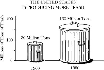
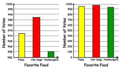
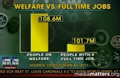
Misleading Graphs
Graphs can be misleading due to truncated axes or improper scaling. Always check the axes and scaling to ensure accurate interpretation.
Truncated Graphs: Chopped off bottom of the axis, exaggerating differences.
Improper Scaling: Visual exaggeration of differences by manipulating scale.
Organizing Quantitative Data
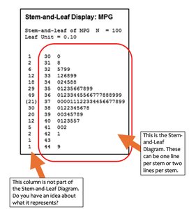
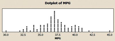
Stem-and-Leaf Diagrams and Dot Plots
Quantitative data can be organized using stem-and-leaf diagrams and dot plots, which help visualize the distribution and identify measures of central tendency.
Stem-and-Leaf Diagram: Splits data into stems (leading digits) and leaves (trailing digits).
Dot Plot: Dots represent individual data points along a number line.
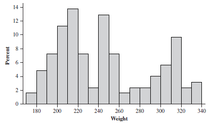
Histograms
Histograms are used for quantitative data, grouping values into bins or classes. Guidelines for creating histograms:
Number of classes should be between 5 and 15.
Each observation must belong to one class.
Classes should have equal width when feasible.
Distribution Shapes
Common Distribution Shapes
Data distributions can take several shapes:
Uniform: All values have similar frequency.
Symmetric: Mirror image frequencies on both sides.
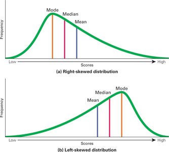
Positively Skewed (Right): Long tail to the right; mean is right of median.
Negatively Skewed (Left): Long tail to the left; mean is left of median.
Unimodal, Bimodal, Multimodal: One, two, or multiple peaks.

Sampling Designs
Simple Random Sampling
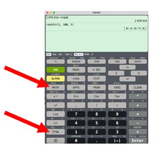
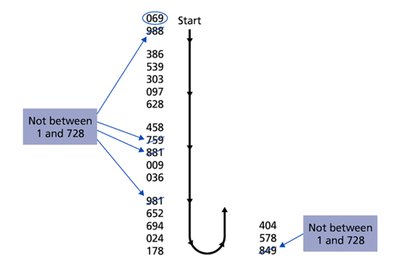
Simple random sampling ensures each possible sample of a given size is equally likely to be chosen. Random number generators and tables are commonly used tools.
Random Number Generator: Technology or tables to select random samples.
Sampling Bias: Avoid samples that are not representative of the population.
Other Sampling Methods
Stratified Sampling: Divide population into groups (strata) and sample from each.
Cluster Sampling: Divide population into clusters and randomly select clusters.
Systematic Sampling: Select every k-th member from a list after a random start.
Measures of Center and Variation
Measures of Central Tendency
Measures of central tendency describe the center of a data set:
Sample Mean (\bar{x}):
Population Mean (\mu):
Median: Middle value when data is ordered.
Mode: Most frequent value.
Measures of Spread
Measures of spread describe variability in the data:
Range: Difference between maximum and minimum values.
Interquartile Range (IQR): Difference between the first and third quartiles.
Variance: Average squared deviation from the mean.
Standard Deviation: Square root of variance.
Sample Variance:
Sample Standard Deviation:
Population Variance:
Population Standard Deviation:
Empirical Rule (Normal Distribution)
For normally distributed data:
~68% of data within 1 standard deviation of the mean
~95% within 2 standard deviations
~99.7% within 3 standard deviations
Box Plots and Five-Number Summary
Box Plots
Box plots visually display the five-number summary: minimum, Q1, median, Q3, and maximum. The interquartile range (IQR) is used to identify outliers.
Outliers: Values outside 1.5*IQR from the box.
Extreme Outliers: Values outside 3*IQR from the box.
Trimmed Mean
A trimmed mean is calculated by removing a certain percentage of the smallest and largest values before computing the mean. This is useful when outliers are present.
Summary Table: Types of Data and Graphs
Type of Data | Graphical Representation |
|---|---|
Qualitative (Categorical) | Bar Chart, Pie Chart |
Quantitative (Discrete) | Stem-and-Leaf, Dot Plot, Histogram |
Quantitative (Continuous) | Histogram, Box Plot |
Assignments and Practice
Complete MyLab HW #1 and #2.
Practice drawing bar charts, pie charts, histograms, stem-and-leaf diagrams, and dot plots.
Review common distribution shapes and examples for each.
Understand sampling methods and their impact on bias and variability.
Calculate measures of center and spread by hand and using technology.
