Skip to main content
Statistics
My Course
Learn
Exam Prep
AI Tutor
Study Guides
Textbook Solutions
Flashcards
Explore
Try the app
My Course
Learn
Exam Prep
AI Tutor
Study Guides
Textbook Solutions
Flashcards
Explore
Try the app
Back
Boxplots-Excel quiz
You can tap to flip the card.
What is the first step in creating a box plot in Excel?
You can tap to flip the card.
👆
What is the first step in creating a box plot in Excel?
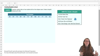
The first step is to select the data you want to display in the box plot.
Track progress
Control buttons has been changed to "navigation" mode.
1/15
Related flashcards
Related practice
Recommended videos
Boxplots-Excel definitions
Boxplots-Excel
15 Terms
3. Describing Data Numerically
4 topics
11 problems
Chapter
David-Paige
03:30
Boxplots-Excel Example 1
414
views
14
rank
05:14
Boxplots-Excel
563
views
10
rank
Terms in this set (15)
Hide definitions
What is the first step in creating a box plot in Excel?
The first step is to select the data you want to display in the box plot.
Which tab do you click after selecting your data to insert a box plot in Excel?
You click the 'Insert' tab in the top ribbon after selecting your data.
Where can you find the box and whisker plot option in Excel's chart section?
You find it under the statistical chart options, which may be labeled 'Statistical' or shown as a blue histogram icon.
What should you do if the default chart title is not descriptive?
You should click on the chart title, delete the generic text, and replace it with a more descriptive title that matches your data.
Why might you want to change the color of your box plot in Excel?
Changing the color can improve contrast, making features like the median line easier to see.
How can you add data labels to your box plot in Excel?
Go to 'Add Chart Element,' select 'Data Labels,' and choose where you want the labels to appear on the plot.
What does the median line in a box plot represent?
The median line shows the middle value of your data set, dividing it into two equal halves.
Why might you want to remove the x-axis from your box plot?
If the x-axis does not provide useful information, removing it can make the plot cleaner and easier to read.
How do you adjust the y-axis bounds in Excel to better fit your data?
Select the y-axis, go to 'More Axis Options,' and change the minimum and maximum bounds to better match your data range.
What is the purpose of adjusting the y-axis scale in a box plot?
Adjusting the y-axis scale prevents the plot from being squished or stretched, making it easier to interpret.
What key measures does a box plot visually represent?
A box plot shows the median, quartiles, and potential outliers, highlighting central tendency and variability.
How can you make sure your box plot is easy to interpret?
Customize titles, colors, axis scales, and add data labels to enhance readability and clarity.
What does the 'X' symbol in an Excel box plot typically indicate?
The 'X' symbol marks the mean value of the data set.
Why is it important to match the chart title to your data table?
Matching the chart title to your data table helps viewers quickly understand what the plot represents.
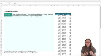
What type of data is best visualized using a box plot in Excel?
Box plots are best for visualizing the distribution of continuous data sets.
 BackBack
 03:30
03:30