 Back
BackDisplaying and Describing Categorical Data: Contingency Tables, Conditional Distributions, and Graphical Summaries
Study Guide - Smart Notes
 Tailored notes based on your materials, expanded with key definitions, examples, and context.
Displaying and Describing Categorical Data
Contingency Tables and the Titanic Data
Contingency tables are a fundamental tool in statistics for summarizing the relationship between two categorical variables. They allow us to examine how individuals are distributed across combinations of categories, and are especially useful for exploring associations and dependencies between variables.
Contingency Table: A matrix that displays the frequency distribution of variables. Each cell shows the count for a specific combination of categories.
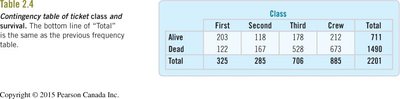
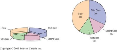
Example: The Titanic dataset is a classic example, where the two variables are Class (First, Second, Third, Crew) and Survival Status (Alive, Dead).
Table: Contingency Table of Ticket Class and Survival
Class | First | Second | Third | Crew | Total |
|---|---|---|---|---|---|
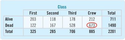
Alive | 203 | 118 | 178 | 212 | 711 |
Dead | 122 | 167 | 528 | 673 | 1490 |
Total | 325 | 285 | 706 | 885 | 2201 |
Marginal and Joint Distributions
Marginal distributions are the totals for each category of a single variable, ignoring the other variable. Joint distributions show the proportion or percentage for each cell relative to the overall total.
Marginal Distribution: The distribution of either variable alone, found in the margins (totals) of the table.
Joint Distribution: The proportion of the total for each cell (e.g., the percentage of all passengers who were First Class and survived).
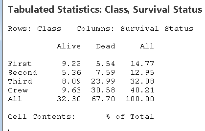
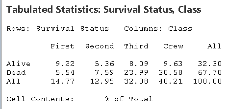
Table: Joint Distribution (% of Total)
Class | First | Second | Third | Crew | All |
|---|---|---|---|---|---|
Alive | 9.22 | 5.36 | 8.09 | 9.63 | 32.30 |
Dead | 5.54 | 7.59 | 23.99 | 30.58 | 67.70 |
All | 14.77 | 12.95 | 32.08 | 40.21 | 100.00 |
Conditional Distributions
Conditional distributions show the distribution of one variable for individuals who satisfy a condition on another variable. For example, the distribution of class among survivors, or the survival rate within each class.
Row Percentages: Show the distribution of class among those who survived or perished.
Column Percentages: Show the survival rate within each class.
Table: Class Conditional on Survival Status (Row Percentages)
Class | First | Second | Third | Crew | Total |
|---|---|---|---|---|---|
Alive | 28.6% | 16.6% | 25.0% | 29.8% | 100% |
Dead | 8.2% | 11.2% | 35.4% | 45.2% | 100% |
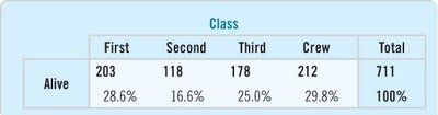
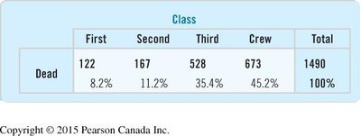
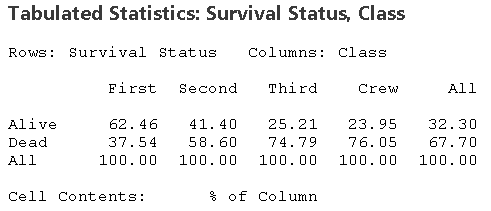
Table: Survival Status Conditional on Class (Column Percentages)
Class | First | Second | Third | Crew | All |
|---|---|---|---|---|---|
Alive | 62.46% | 41.40% | 25.21% | 23.95% | 32.30% |
Dead | 37.54% | 58.60% | 74.79% | 76.05% | 67.70% |
All | 100.00% | 100.00% | 100.00% | 100.00% | 100.00% |
Graphical Summaries: Pitfalls and Best Practices
Visual displays are essential for understanding categorical data, but they must be constructed carefully to avoid misleading impressions.
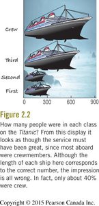
Area Principle: The area occupied by a part of a graph should correspond to the magnitude of the value it represents. Violating this principle can distort perception.
Example: The Titanic ship graphic visually exaggerates the number of crew members by using area (ship size) rather than length or height proportional to counts.
Pie charts and bar charts are common for displaying categorical data. Pie charts show parts of a whole, while bar charts are better for comparing counts or percentages across categories.
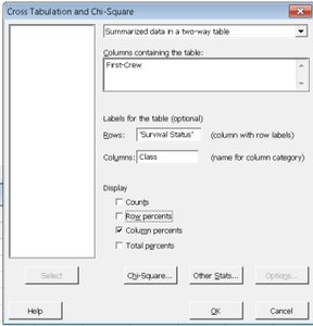
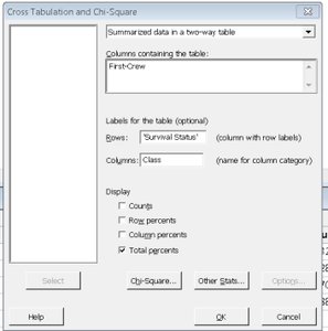
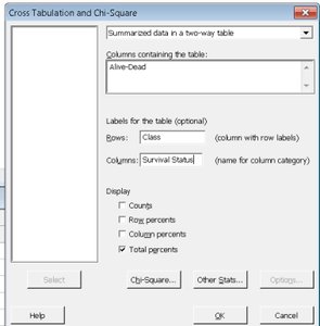
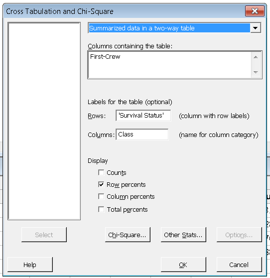
Statistical Software: Cross Tabulation and Chi-Square
Statistical software such as Minitab can be used to generate contingency tables, calculate row and column percentages, and perform chi-square tests for association between categorical variables.
Cross Tabulation Dialogs: Allow users to specify which variables are rows and columns, and to select display options such as counts, row percents, column percents, or total percents.
Summary Table: Types of Percentages in Contingency Tables
Type | Interpretation | When to Use |
|---|---|---|
Row Percentages | Distribution of categories within each row (e.g., class among survivors) | Comparing composition within a group |
Column Percentages | Distribution of categories within each column (e.g., survival rate within each class) | Comparing outcomes across groups |
Total Percentages | Each cell as a percentage of the grand total | Assessing overall proportions |
Key Points and Best Practices
Always check the area principle when constructing visual displays.
Use bar charts for comparing counts or percentages; use pie charts for showing parts of a whole.
Contingency tables are essential for exploring relationships between two categorical variables.
Conditional distributions (row or column percentages) reveal associations and dependencies.
Statistical software can automate calculations and provide options for different types of percentages.
