 Back
BackStatistics Practice Exam Guidance – Visuals, Probability, and Data Analysis
Study Guide - Smart Notes
 Tailored notes based on your materials, expanded with key definitions, examples, and context.
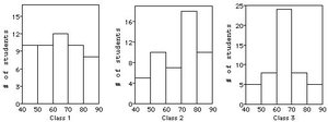
Q4. Which class had the smallest IQR?
Background
Topic: Comparing Distributions Using Histograms
This question tests your ability to interpret histograms and compare the spread of data (specifically the interquartile range, or IQR) across different groups.
Key Terms:
Interquartile Range (IQR): The difference between the third quartile (Q3) and the first quartile (Q1). It measures the spread of the middle 50% of the data.
Symmetry: A symmetric distribution often has a smaller IQR if the data is concentrated around the center.
Histogram: A graphical representation of the distribution of numerical data.
Step-by-Step Guidance
Examine each histogram and identify the shape of the distribution for each class. Look for symmetry and concentration of data.
Recall that a symmetric and unimodal distribution typically has a smaller IQR, as most data points are clustered around the center.
Compare the spread of the data in each histogram. Which class has most students concentrated in the middle bins?
Consider how the IQR relates to the spread: a smaller IQR means less variability in the middle 50% of scores.
Try solving on your own before revealing the answer!
Final Answer: Class 3, because the shape is symmetric and unimodal, with data concentrated around the center.
Class 3's histogram shows most students scoring in the middle range, indicating a smaller IQR compared to the other classes.
Q18. Several scatterplots are given with calculated correlations. Which is which?
Background
Topic: Understanding Correlation and Scatterplots
This question tests your ability to match scatterplot patterns to their corresponding correlation coefficients.
Key Terms:
Correlation Coefficient (r): Measures the strength and direction of a linear relationship between two variables. Values range from -1 (perfect negative) to +1 (perfect positive).
Scatterplot: A graph that shows the relationship between two variables.
Linear vs. Nonlinear: Linear relationships have straight-line patterns; nonlinear relationships may curve or scatter.
Step-by-Step Guidance
Review each scatterplot and identify whether the pattern is linear, nonlinear, or random.
Recall that a strong positive linear relationship will have a correlation close to +1, while a strong negative linear relationship will have a correlation close to -1.
Random scatter (no clear pattern) will have a correlation near 0.
Nonlinear patterns (such as parabolic curves) also tend to have correlations near 0, even if the relationship is strong but not linear.
Try solving on your own before revealing the answer!
Final Answer: 1a, 2c, 3d, 4b
1) Strong positive linear (0.989), 2) Weak positive (0.071), 3) Strong negative linear (-0.74), 4) Parabolic (0.005).
Q19. If the height was recorded in inches, what would be the correlation?
Background
Topic: Correlation and Change of Units
This question tests your understanding of how changing units affects the correlation coefficient between two variables.
Key Terms and Formulas:
Correlation Coefficient (r): Measures the strength and direction of a linear relationship between two variables.
Change of Units: Changing units (e.g., cm to inches) does not affect the correlation coefficient.
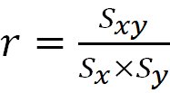
Formula:
Step-by-Step Guidance
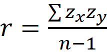
Recall that the correlation coefficient is unitless and unaffected by linear transformations (such as converting cm to inches).
Calculate the mean and standard deviation for each variable if needed, but note that the correlation will remain the same.
Use the formula for correlation to confirm this property.
Try solving on your own before revealing the answer!
Final Answer: 0.982
Changing the units of height does not affect the correlation coefficient.
Q24. Which vineyard produces the most expensive wine?
Background
Topic: Comparing Distributions Using Boxplots
This question tests your ability to interpret boxplots and identify which group has the highest values.
Key Terms:
Boxplot: A graphical summary of data showing the median, quartiles, and extremes.
Maximum Value: The highest value in the data set, often indicated by the upper whisker or a dot for an outlier.
IQR: The width of the box represents the interquartile range.
Step-by-Step Guidance
Examine the boxplots and identify the maximum value for each vineyard.
Compare the upper whiskers and any outliers to determine which vineyard has the highest case price.
Recall that the highest value is not necessarily the median or the IQR, but the maximum data point.
Try solving on your own before revealing the answer!
Final Answer: Vineyard B, because it has the highest case price at about $150.
The maximum value in Vineyard B's boxplot is higher than the others.
Q31. Which of the labeled points below would you propose to be the most influential?
Background
Topic: Outliers, Influential Points, and Leverage in Regression
This question tests your understanding of how certain data points can influence the regression line.
Key Terms:
Outlier: A point with a large residual, extreme in Y.
Leverage: Points extreme in X, far from the rest of the data.
Influential Point: A point that significantly changes the regression line if removed.
Step-by-Step Guidance
Identify which points are far from the main cluster of data, either in X or Y.
Recall that influential points are those that would change the regression line if removed.
Consider both leverage and outlier status when deciding which point is most influential.
Try solving on your own before revealing the answer!
Final Answer: Point B
Point B is extreme in both X and Y, making it highly influential.
