

Ch. 2 - Descriptive Statistics
Larson - Elementary Statistics: Picturing the World 8th Edition
Larson8th EditionElementary Statistics: Picturing the WorldISBN: 9780137493470Not the one you use?Change textbook
Chapter 2, Problem 2.1.24c

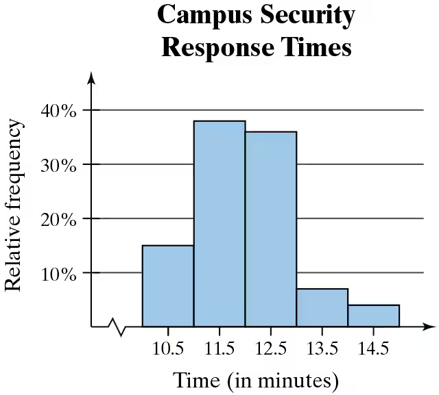
Use the relative frequency histogram to describe any patterns with the data.
<IMAGE>

Verified step by step guidance
1
Observe the relative frequency histogram provided. The x-axis represents the response times in minutes, while the y-axis represents the relative frequency as a percentage.
Identify the range of response times. The histogram shows data grouped into intervals: 10.5-11.5, 11.5-12.5, 12.5-13.5, and 13.5-14.5 minutes.
Note the height of the bars, which indicates the relative frequency for each interval. The tallest bars correspond to the intervals 11.5-12.5 minutes, showing the highest relative frequency (approximately 40%).
Describe the pattern: The data suggests that most campus security response times fall within the 11.5-12.5 minute range, with fewer responses occurring in the intervals 10.5-11.5 and 13.5-14.5 minutes.
Conclude that the distribution of response times is unimodal and slightly skewed to the right, as the frequency decreases for higher intervals beyond 12.5 minutes.

Verified video answer for a similar problem:

This video solution was recommended by our tutors as helpful for the problem above.
Video duration:
1m
Was this helpful?

Key Concepts

Here are the essential concepts you must grasp in order to answer the question correctly.

Relative Frequency

Relative frequency is the ratio of the frequency of a particular category to the total number of observations. It is expressed as a percentage and helps in understanding the proportion of data points that fall within specific intervals. In the context of the histogram, it indicates how often response times occur relative to the total response times recorded.
Recommended video:
Guided course
06:38
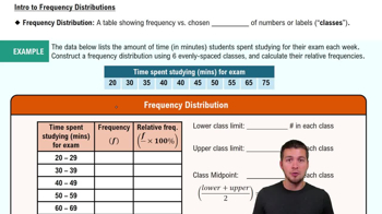
Intro to Frequency Distributions

Histogram

A histogram is a graphical representation of the distribution of numerical data, where the data is divided into intervals (bins) and the frequency of data points within each interval is represented by the height of bars. In this case, the histogram displays campus security response times, allowing for visual analysis of patterns such as central tendency and variability in response times.
Recommended video:
Guided course
05:54
Intro to Histograms

Patterns in Data

Identifying patterns in data involves analyzing the distribution and trends within the dataset. In the histogram, patterns may include peaks (modes), gaps, or trends that indicate how response times are clustered. For instance, a higher relative frequency in certain time intervals suggests that those response times are more common, which can inform operational decisions for campus security.
Recommended video:
Guided course
04:39
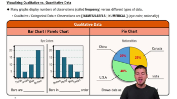
Visualizing Qualitative vs. Quantitative Data
Related Practice
Textbook Question

Graphical Analysis In Exercises 21–24, you are asked to compare three data sets.


(c) Estimate the sample standard deviations. Then determine how close each of your estimates is by finding the sample standard deviations.


i.

ii.

iii.

92
views
Textbook Question

Use the ogive to approximate the

the number of black bears that weigh between 158.5 pounds and 244.5 pounds.

189
views
Textbook Question

Graphical Analysis In Exercises 21–24, you are asked to compare three data sets.


(c) Estimate the sample standard deviations. Then determine how close each of your estimates is by finding the sample standard deviations.


i.

ii.

iii.

93
views
Textbook Question

What Would You Do? The admissions department for a college is asked to recommend the minimum SAT scores that the college will accept for full-time students. The SAT scores of 50 applicants are listed. 1170 1000 910 870 1070 1290 920 1470 1080 1180 770 900 1120 1070 1370 1160 970 930 1240 1270 1250 1330 1010 1010 1410 1130 1210 1240 960 820 650 1010 1190 1500 1400 1270 1310 1050 950 1150 1450 1290 1310 1100 1330 1410 840 1040 1090 1080

If you want to accept the top 88% of the applicants, what should the minimum score be? Explain.

118
views
Textbook Question

Use the data set and the indicated number of classes to construct


(c) a frequency polygon,

Pulse Rates

Number of classes: 6 Data set: Pulse rates of all students in a class 68 105 95 80 90 100 75 70 84 98 102 70 65 88 90 75 78 94 110 120 95 80 76 108

71
views
Textbook Question

Extending Concepts


Trimmed Mean To find the 10% trimmed mean of a data set, order the data, delete the lowest 10% of the entries and the highest 10% of the entries, and find the mean of the remaining entries.


c. What is the benefit of using a trimmed mean versus using a mean found using all data entries? Explain your reasoning.

95
views