- Download the worksheet to save time writing
- Start solving the practice problems
- If you're stuck, watch the video solutions
- See your summary to get more insights

The following data set represents measurements of two related variables in an experiment.
Construct a scatterplot.
The table below shows the resting heart rates (in beats per minute) of nine individuals measured in the morning and again in the evening. Construct a scatterplot. Based on the graph, does there appear to be a relationship between heart rates measured in the morning and those recorded in the evening?
Listed below are the ages (in years) of Olympic marathon winners at the time of their victories. Use these ages to construct a frequency distribution. Use a class width of 5 years and begin with a lower-class limit of 20 years. Do the ages appear to have a normal distribution? Give reason.
Data Set (Ages of Olympic Marathon Winners):
A meteorology team recorded the wind speeds (in km/h) of storms over a period of time. The frequency distribution of wind speeds is given below.
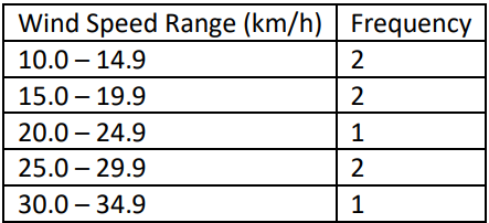
Using the frequency distribution above, find:
(i) The class limits of the first class
(ii) The class boundaries of the first class
(iii) The class midpoint of the first class
A fitness center records the number of minutes spent on treadmills by different members in a month. The data are:
, , , , , , , , , , , , , , , , , , , , , , , , , , , , , .
Based on a relative frequency distribution with classes, what is the relative frequency for the class interval ?
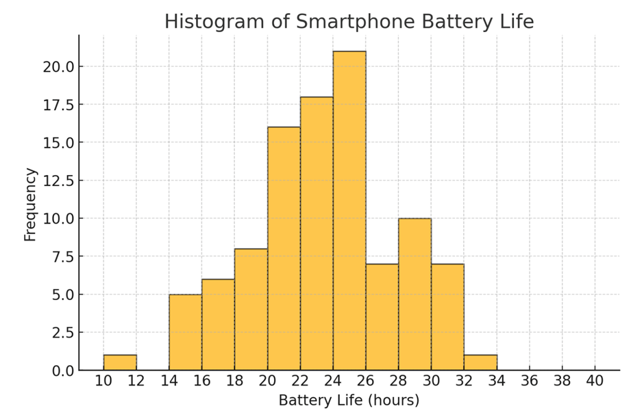
Use the following histogram generated by statistical software, which represents the battery life (in hours) of a sample of smartphones. (The values on the horizontal scale are rounded.)
Provide the estimated class width, along with the lower- and upper-class limits of the fourth bar from the left in the histogram.
In a health study, the resting pulse rates (beats per minute) of a group of adult males were recorded. The recorded pulse rates are given below:
62, 70, 72, 80, 74, 66, 78, 84, 88, 92, 70, 78, 66, 72, 80
(a) Construct a dot plot for the given data.
(b) Is there a pulse rate that appears to be an outlier? What is the outlier’s value?
The following data shows the number of hours spent studying per week by a sample of students:
Draw a box and whisker plot that represents the data set.
In , the five best-selling tablet producers by units sold were:
Brand : million
Brand : million
Brand : million
Brand : million
Brand : million
Display this information in a Pareto chart and describe any patterns you notice.
How are the bars arranged in a Pareto chart?
Given the frequencies of 10, 20, and 30 for three categories, what is the total number of responses?