

Ch. 2 - Descriptive Statistics
Larson - Elementary Statistics: Picturing the World 8th Edition
Larson8th EditionElementary Statistics: Picturing the WorldISBN: 9780137493470Not the one you use?Change textbook
Chapter 2, Problem 2.1.19d

Use the frequency histogram
d. describe any patterns with the data..
Histogram displaying employee salaries in thousands of dollars, showing frequency distribution across various salary ranges.

Verified step by step guidance
1
Step 1: Observe the histogram and identify the salary ranges on the x-axis (34.5-44.5, 44.5-54.5, etc.) and the frequency of employees in each range on the y-axis.
Step 2: Note the shape of the histogram. It appears to be unimodal and slightly skewed to the right, with the highest frequency occurring in the 54.5-64.5 salary range.
Step 3: Describe the central tendency. The majority of employees earn salaries in the middle ranges (54.5-64.5 and 64.5-74.5), indicating that these are the most common salary brackets.
Step 4: Identify any outliers or less frequent salary ranges. Salaries in the 34.5-44.5 and 94.5+ ranges have significantly lower frequencies, suggesting fewer employees earn salaries in these brackets.
Step 5: Summarize the pattern. The data shows a concentration of employee salaries in the middle ranges, with fewer employees earning very low or very high salaries, which is typical of a distribution with a central peak.

Verified video answer for a similar problem:

This video solution was recommended by our tutors as helpful for the problem above.
Video duration:
2m
Was this helpful?

Key Concepts

Here are the essential concepts you must grasp in order to answer the question correctly.

Frequency Histogram

A frequency histogram is a graphical representation of the distribution of numerical data. It displays the frequency of data points within specified ranges (bins) on the x-axis, while the y-axis shows the number of occurrences. This visualization helps identify patterns, such as the shape of the distribution, central tendencies, and variability in the data.
Recommended video:
Guided course
05:54
Intro to Histograms

Patterns in Data

Identifying patterns in data involves analyzing the histogram to observe trends, clusters, or anomalies. For instance, one might look for peaks indicating common salary ranges, gaps suggesting less frequent salaries, or the overall shape of the distribution (normal, skewed, etc.). Recognizing these patterns is crucial for making informed decisions based on the data.
Recommended video:
Guided course
04:39
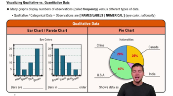
Visualizing Qualitative vs. Quantitative Data

Salary Distribution

Salary distribution refers to how employee salaries are spread across different ranges. In the context of the histogram, it shows how many employees fall into various salary brackets, which can reveal insights about income inequality, average salaries, and the overall economic health of the organization. Understanding this distribution is essential for effective workforce planning and compensation strategies.
Recommended video:
Guided course
06:38
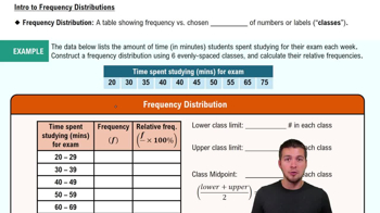
Intro to Frequency Distributions
Related Practice
Textbook Question

Extending Concepts


Golf The distances (in yards) for nine holes of a golf course are listed.

336 393 408 522 147 504 177 375 360


d. Use your results from part (c) to explain how to quickly find the mean and the median of the original data set when the distances are converted to inches.

95
views
Textbook Question

Song Lengths Side-by-side box-and-whisker plots can be used to compare two or more different data sets. Each box-and-whisker plot is drawn on the same number line to compare the data sets more easily. The lengths (in seconds) of songs played at two different concerts are shown.

d. Can you determine which concert lasted longer? Explain.

121
views
Textbook Question

Pearson’s Index of Skewness The English statistician Karl Pearson (1857–1936) introduced a formula for the skewness of a distribution.

P = 3 (x̄ - median) / s

Most distributions have an index of skewness between -3 and 3. When P > 0, the data are skewed right. When P < 0, the data are skewed left. When P = 0, the data are symmetric. Calculate the coefficient of skewness for each distribution. Describe the shape of each.


e. x̄ = 155, s = 20.0, median = 175

315
views
Textbook Question

Pearson’s Index of Skewness The English statistician Karl Pearson (1857–1936) introduced a formula for the skewness of a distribution.

P = 3 (x̄ - median) / s

Most distributions have an index of skewness between -3 and 3. When P > 0, the data are skewed right. When P < 0, the data are skewed left. When P = 0, the data are symmetric. Calculate the coefficient of skewness for each distribution. Describe the shape of each.


c. x̄ = 9.2, s = 1.8, median = 9.2

528
views
Textbook Question

Use the frequency histogram

describe any patterns with the data..

186
views