

Ch. 2 - Exploring Data with Tables and Graphs
Triola - Elementary Statistics 14th Edition
Triola14th EditionElementary StatisticsISBN: 9780137366446Not the one you use?Change textbook
Chapter 2, Problem 2.2.17

In Exercises 9–18, construct the histograms and answer the given questions.


Analysis of Last Digits Use the frequency distribution from Exercise 21 in Section 2-1 to construct a histogram. What can be concluded from the distribution of the digits? Specifically, do the heights appear to be reported or actually measured?

Verified step by step guidance
1
Obtain the frequency distribution from Exercise 21 in Section 2-1. This table should list the last digits (e.g., 0 through 9) and their corresponding frequencies. Ensure you have this data ready for analysis.
Set up the axes for the histogram: The x-axis will represent the last digits (0 through 9), and the y-axis will represent the frequencies. Label both axes appropriately.
For each last digit, draw a bar whose height corresponds to its frequency. Ensure the bars are of equal width and are adjacent to each other without gaps, as this is a key feature of histograms.
Analyze the shape of the histogram. Look for patterns such as uniformity (all bars roughly the same height), peaks, or irregularities. This will help determine whether the data appears to be naturally measured or artificially reported.
Interpret the results: If the histogram shows a uniform distribution, it suggests the digits are likely measured. If certain digits (e.g., 0 or 5) appear more frequently, it may indicate that the heights were rounded or reported rather than precisely measured.

Verified video answer for a similar problem:

This video solution was recommended by our tutors as helpful for the problem above.
Video duration:
2m
Was this helpful?

Key Concepts

Here are the essential concepts you must grasp in order to answer the question correctly.

Histogram

A histogram is a graphical representation of the distribution of numerical data, where the data is divided into intervals (bins) and the frequency of data points within each interval is represented by the height of bars. This visual tool helps in understanding the shape, spread, and central tendency of the data, making it easier to identify patterns or anomalies.
Recommended video:
Guided course
05:54
Intro to Histograms

Frequency Distribution

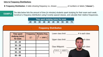
A frequency distribution is a summary of how often each value occurs in a dataset. It organizes data into categories or intervals, allowing for a clear view of the data's distribution. This foundational concept is crucial for constructing histograms, as it provides the necessary counts for each bin that will be represented graphically.
Recommended video:
Guided course
06:38
Intro to Frequency Distributions

Reported vs. Measured Data

Reported data refers to values that are recorded or stated, often influenced by subjective factors or rounding, while measured data is obtained through direct observation or experimentation, reflecting actual values. Understanding the distinction between these types of data is essential for interpreting the histogram accurately, as it can affect the conclusions drawn about the distribution's reliability and validity.
Recommended video:
Guided course
04:39
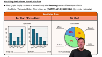
Visualizing Qualitative vs. Quantitative Data
Related Practice
Textbook Question

In Exercises 17–20, identify how the graph is deceptive.


Cost of Giving Birth According to the Agency for Healthcare Research and Quality Healthcare Cost and Utilization Project, the typical cost of a C-section baby delivery is \$4500, and the typical cost of a vaginal delivery is \$2600. See the following illustration.


128
views
Textbook Question

In Exercises 9 and 10, construct the time-series graph.


Home Runs Listed below are the numbers of home runs in Major League Baseball for each year beginning with 1993 (listed in order by row). Is there a trend?

117
views
Textbook Question

In Exercises 5–8, answer the questions by referring to the following Minitab-generated histogram, which depicts the weights (grams) of all quarters listed in Data Set 40 “Coin Weights” in Appendix B. (Grams are actually units of mass and the values shown on the horizontal scale are rounded.)


Sample Size What is the approximate number of quarters depicted in the three bars farthest to the left?

165
views
Textbook Question

Boston Commute Time The accompanying table summarizes daily commute times in Boston. How many commute times are included in the summary? Is it possible to identify the exact values of all of the original data amounts?

191
views
Textbook Question

In Exercises 15 and 16, construct the frequency polygons.


Chicago Commute Times Use the frequency distribution from Exercise 13 in Section 2-1 to construct a frequency polygon. Does the graph suggest that the distribution is skewed? If so, how?


111
views
Textbook Question

Use Table 2-11 to find the critical values of r. Based on a comparison of the linear correlation coefficient r and the critical values, what do you conclude about a linear correlation?

Using the data from Exercise 6 “Airport Data Speeds,” the linear correlation coefficient is r = 0.866

255
views