
Textbook Question
Interpreting Normal Quantile Plots Which of the following normal quantile plots appear to represent data from a population having a normal distribution? Explain.
204
views


 Verified step by step guidance
 06:29
06:29
 07:10
07:10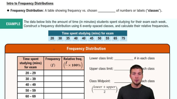 06:38
06:38Interpreting Normal Quantile Plots Which of the following normal quantile plots appear to represent data from a population having a normal distribution? Explain.
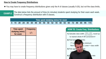
Tornado Alley Refer to the accompanying frequency distribution that summarizes the number of tornadoes in Oklahoma in each year for the past several years. What is the class width? Is it possible to identify the original data values?
In Exercises 1–5, use the data listed in the margin, which are magnitudes (Richter scale) and depths (km) of earthquakes from Data Set 24 “Earthquakes” in Appendix B
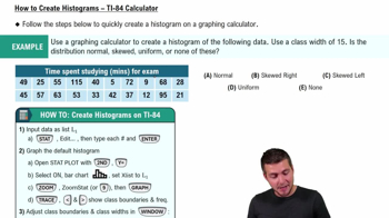
Histogram Construct the histogram corresponding to the frequency distribution from Exercise 1. For the values on the horizontal axis, use the class midpoint values. Which of the following comes closest to describing the distribution: uniform, normal, skewed left, skewed right?
Estimating r For each of the following, estimate the value of the linear correlation coefficient r for the given paired data obtained from 50 randomly selected adults.
d. The 50 adults all drove cars from Jacksonville, Florida, to Richmond, Virginia. Their average (mean) speeds are recorded along with the times it took to complete that trip.
Histogram of Interarrival Times Construct the histogram that corresponds to the frequency distribution from Exercise 1. Use class midpoint values for the horizontal scale. Does the histogram suggest that the data are from a population having a normal distribution? Why or why not?
Tornado Alley Construct the relative frequency distribution corresponding to the frequency distribution in Exercise 1