Visualizing Qualitative vs. Quantitative Data
- Download the worksheet to save time writing
- Start solving the practice problems
- If you're stuck, watch the video solutions
- See your summary to get more insights

Visualizing Qualitative vs. Quantitative Data
4 problems
Problem 1Multiple Choice
The table below provides data on fuel efficiency (in miles per gallon) for different car models over time. A mathematical model is used to describe the trend in fuel efficiency.
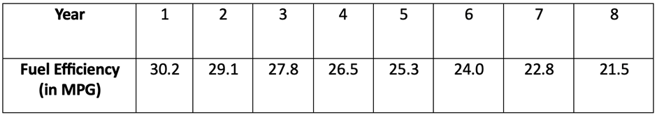
Assume that the model will be used only for the scope of the given data, and consider only linear, quadratic, logarithmic, exponential, and power models. Construct a scatterplot and identify the best-fitting model.
Problem 4Multiple Choice
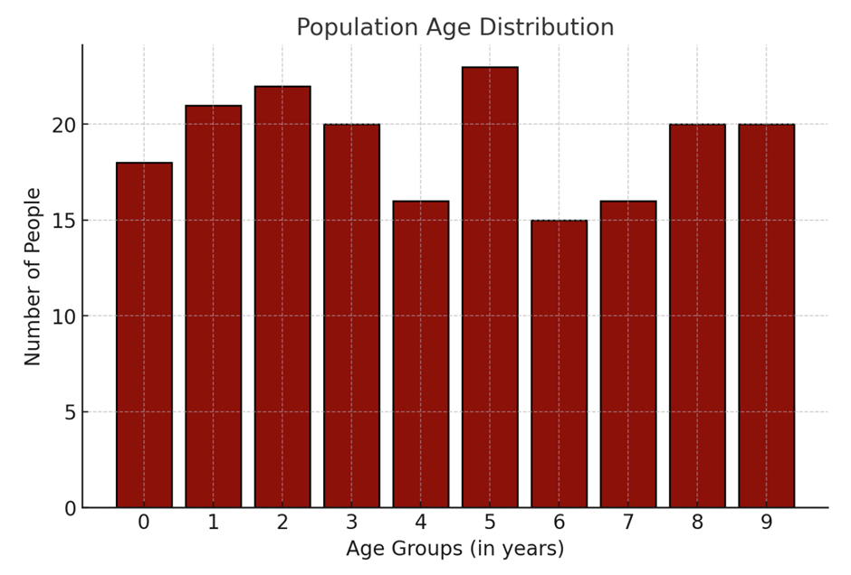
Below is a histogram representing the distribution of ages in a certain population. Each bar represents the number of individuals within a specific age group.
Does the display depict a normal distribution? Why or why not? What should be the expected shape of the histogram for a typical normal distribution?