2. Describing Data with Tables and Graphs / Visualizing Qualitative vs. Quantitative Data / Problem 4
Problem 4
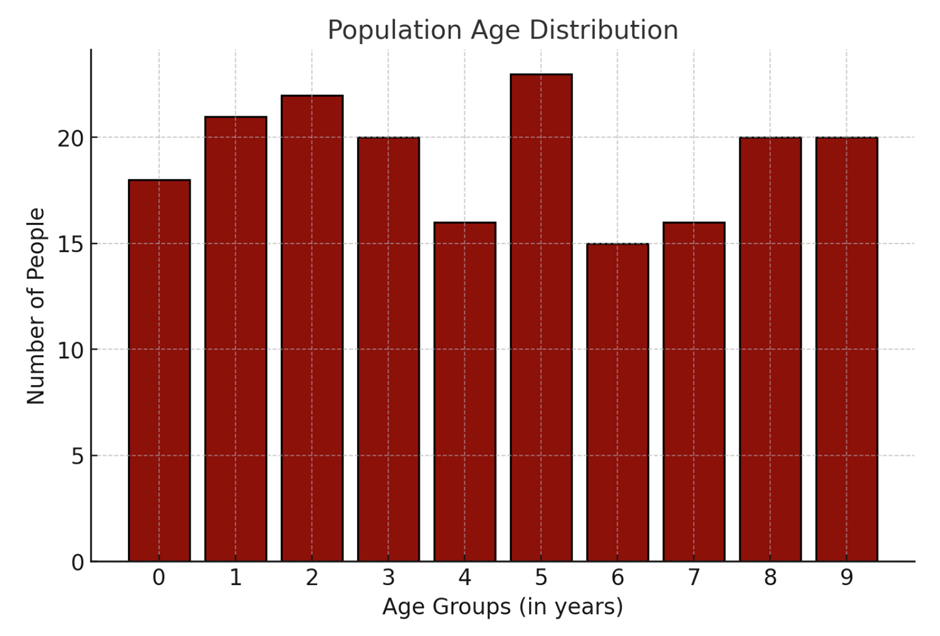
Below is a histogram representing the distribution of ages in a certain population. Each bar represents the number of individuals within a specific age group. Does the display depict a normal distribution? Why or why not? What should be the expected shape of the histogram for a typical normal distribution?