2. Describing Data with Tables and Graphs / Visualizing Qualitative vs. Quantitative Data / Problem 1
Problem 1
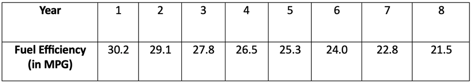
The table below provides data on fuel efficiency (in miles per gallon) for different car models over time. A mathematical model is used to describe the trend in fuel efficiency. Assume that the model will be used only for the scope of the given data, and consider only linear, quadratic, logarithmic, exponential, and power models. Construct a scatterplot and identify the best-fitting model.