Ch. 2 - Exploring Data with Tables and Graphs
Triola - Elementary Statistics 14th Edition
Triola14th EditionElementary StatisticsISBN: 9780137366446Not the one you use?Change textbook
Chapter 2, Problem 2.CQQ.6

Computers As a quality control manager at Texas Instruments, you find that defective calculators have various causes, including worn machinery, human error, bad supplies, and packaging mistreatment. Which of the following graphs would be best for describing the causes of defects: histogram; scatterplot; Pareto chart; dotplot; pie chart?

Verified step by step guidance
1
Understand the purpose of the graph: The goal is to describe the causes of defects and their relative frequencies or importance. This requires a graph that can effectively display categorical data and highlight the most significant causes.
Review the options: A histogram is used for continuous numerical data, a scatterplot shows relationships between two numerical variables, a dotplot is for small datasets, and a pie chart shows proportions. A Pareto chart, however, is specifically designed to display categorical data in descending order of frequency or importance.
Recall the Pareto principle: The Pareto chart is based on the 80/20 rule, which states that a small number of causes often account for the majority of problems. This makes it ideal for identifying the most significant causes of defects.
Explain the structure of a Pareto chart: It combines a bar graph (to show the frequency of each cause) and a line graph (to show the cumulative percentage). The bars are arranged in descending order of frequency, making it easy to identify the most critical causes.
Conclude that the Pareto chart is the best choice: Since the problem involves identifying and describing the causes of defects, the Pareto chart is the most effective tool for this purpose. It allows the quality control manager to prioritize efforts on the most significant causes.

Verified video answer for a similar problem:

This video solution was recommended by our tutors as helpful for the problem above.
Video duration:
3m
Was this helpful?

Key Concepts

Here are the essential concepts you must grasp in order to answer the question correctly.

Pareto Chart

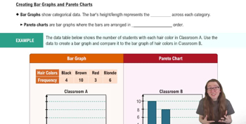
A Pareto chart is a type of bar graph that represents the frequency or impact of problems in descending order. It is based on the Pareto principle, which states that roughly 80% of effects come from 20% of causes. This chart is particularly useful in quality control to identify the most significant factors contributing to defects, allowing managers to prioritize their efforts effectively.
Recommended video:
04:52
Creating Bar Graphs and Pareto Charts

Histogram

A histogram is a graphical representation of the distribution of numerical data, showing the frequency of data points within specified ranges (bins). While useful for understanding the distribution of a single variable, it is less effective for categorizing and comparing multiple causes of defects, making it less suitable for this context.
Recommended video:
Guided course
05:54
Intro to Histograms

Pie Chart

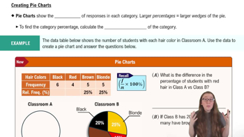
A pie chart is a circular statistical graphic divided into slices to illustrate numerical proportions. Each slice represents a category's contribution to the whole. While it can show the relative sizes of different causes of defects, it may not effectively convey the priority or impact of each cause, especially when there are many categories.
Recommended video:
06:10
Creating Pie Charts
Related Practice
Textbook Question

Normal Distribution If the following data are randomly selected, which are expected to have a normal distribution?


a. Weights of Reese’s Peanut Butter Cups

151
views
Textbook Question

Seatbelts The Beams Seatbelts company manufactures—well, you know. When a sample of seatbelts is tested for breaking point (measured in kilograms), the sample data are explored. Identify the important characteristic of data that is missing from this list: center, distribution, outliers, changing characteristics over time.

105
views
Textbook Question

Normal Distribution If the following data are randomly selected, which are expected to have a normal distribution?


d. Exact volumes of Coke in 12 oz cans

122
views
Textbook Question

In Exercises 1–5, use the data listed in the margin, which are magnitudes (Richter scale) and depths (km) of earthquakes from Data Set 24 “Earthquakes” in Appendix B

[Image]

Data Type


b. For the listed earthquake depths, are the data categorical or quantitative?

246
views
Textbook Question

Tornado Alley A stemplot of the same data summarized in Exercise 1 is created, and one of the rows of that stemplot is 3 | 000144669. Identify the values represented by that row of the stemplot.

96
views
Textbook Question

In Exercises 1–5, use the data listed in the margin, which are magnitudes (Richter scale) and depths (km) of earthquakes from Data Set 24 “Earthquakes” in Appendix B

[Image]

Data Type


d. Given that the listed earthquake depths are part of a larger collection of depths, do the data constitute a sample or a population?

172
views