
Ch. 3 - Describing, Exploring, and Comparing Data
Triola - Elementary Statistics 14th Edition
Triola14th EditionElementary StatisticsISBN: 9780137366446Not the one you use?Change textbook
Chapter 3, Problem 3.3.33

Boxplots from Large Data Sets in Appendix B. In Exercises 33–36, use the given data sets in Appendix B. Use the boxplots to compare the two data sets.


Pulse Rates Use the same scale to construct boxplots for the pulse rates of males and females from Data Set 1 “Body Data” in Appendix B.

Verified step by step guidance
1
Step 1: Organize the data for pulse rates of males and females from Data Set 1 'Body Data' in Appendix B. Separate the data into two groups: one for males and one for females.
Step 2: Calculate the five-number summary for each group (males and females). The five-number summary includes the minimum, first quartile (Q1), median, third quartile (Q3), and maximum values.
Step 3: Use the five-number summary to determine the range of each boxplot. The box represents the interquartile range (IQR), which is the difference between Q3 and Q1. The whiskers extend to the smallest and largest data points within 1.5 * IQR from the quartiles.
Step 4: Plot the boxplots for both males and females on the same scale. Ensure the horizontal axis represents pulse rates and the vertical axis differentiates between the two groups (males and females).
Step 5: Compare the boxplots by analyzing their medians, IQRs, and the presence of any outliers. Discuss differences in central tendency, variability, and any notable patterns between the two groups.

Verified video answer for a similar problem:

This video solution was recommended by our tutors as helpful for the problem above.
Video duration:
5m
Was this helpful?

Key Concepts

Here are the essential concepts you must grasp in order to answer the question correctly.

Boxplots

Boxplots, or box-and-whisker plots, are graphical representations that summarize a data set's distribution through its quartiles. They display the median, upper and lower quartiles, and potential outliers, providing a visual comparison of different data sets. Boxplots are particularly useful for identifying the spread and skewness of data, making them ideal for comparing groups, such as pulse rates of males and females.

Quartiles

Quartiles are values that divide a data set into four equal parts, each containing 25% of the data. The first quartile (Q1) marks the 25th percentile, the second quartile (Q2) is the median or 50th percentile, and the third quartile (Q3) is the 75th percentile. Understanding quartiles is essential for interpreting boxplots, as they help to identify the central tendency and variability of the data.
Recommended video:
Guided course
04:51
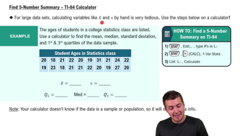
Find 5-Number Summary - TI-84 Calculator

Comparative Analysis

Comparative analysis involves evaluating two or more data sets to identify differences and similarities in their characteristics. In the context of boxplots, this means examining the central tendency, spread, and potential outliers of pulse rates for males and females. This analysis helps in drawing conclusions about the data sets, such as whether one group tends to have higher or lower pulse rates than the other.
Recommended video:
Guided course
04:48
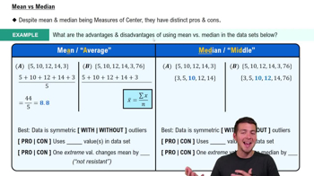
Comparing Mean vs. Median
Related Practice
Textbook Question

Critical Thinking. For Exercises 5–20, watch out for these little buggers. Each of these exercises involves some feature that is somewhat tricky. Find the (a) mean, (b) median, (c) mode, (d) midrange, and then answer the given question.


Geography Majors The data listed below are estimated incomes (dollars) of students who graduated from the University of North Carolina (UNC) after majoring in geography. The data are based on graduates in the year 1984. The income of basketball superstar Michael Jordan (a 1984 UNC graduate and geography major) is included. Does his income have much of an effect on the measures of center? Based on these data, would the college have been justified by saying that the mean income of a graduate in their geography program is greater than \$250,000?


17,466 18,085 17,875 19,339 19,682 19,610 18,259 16,354 2,200,000

232
views
Textbook Question

Percentiles. In Exercises 17–20, use the following radiation levels (in W/kg) for 50 different cell phones. Find the percentile corresponding to the given radiation level.


1.47 W/kg

144
views
Textbook Question

What’s Wrong? Education Week magazine published a list consisting of the mean teacher salary in each of the 50 states for a recent year. If we add the 50 means and then divide by 50, we get \$56,479. Is the value of \$56,479 the mean teacher salary for the population of all teachers in the 50 United States? Why or why not?

132
views
Textbook Question

Percentiles. In Exercises 17–20, use the following radiation levels (in W/kg) for 50 different cell phones. Find the percentile corresponding to the given radiation level.


0.48 W/kg

222
views
Textbook Question

Identifying Significant Values with the Range Rule of Thumb. In Exercises 33–36, use the range rule of thumb to identify the limits separating values that are significantly low or significantly high.


Foot Lengths Based on Data Set 9 “Foot and Height” in Appendix B, adult males have foot lengths with a mean of 27.32 cm and a standard deviation of 1.29 cm. Is the adult male foot length of 30 cm significantly low, significantly high, or neither? Explain.

Textbook Question

Resistant Measures Listed below are 10 wait times (minutes) for “Rock ‘n’ Roller Coaster” at 10 AM (from Data Set 33 “Disney World Wait Times”). The data are listed in order from lowest to highest. Find the mean and median of these ten values. Then find the mean and median after excluding the value of 180, which appears to be an outlier. Compare the two sets of results. How much was the mean affected by the inclusion of the outlier? How much is the median affected by the inclusion of the outlier?


15 20 25 30 30 35 45 50 50 180 

170
views