Ch. 1 - Introduction to Statistics
Larson - Elementary Statistics: Picturing the World 8th Edition
Larson8th EditionElementary Statistics: Picturing the WorldISBN: 9780137493470Not the one you use?Change textbook
Chapter 1, Problem 1.2.24

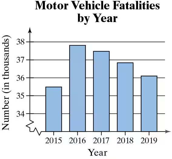
Determine the level of measurement of the data listed on the horizontal and vertical axes in the figure.
Bar graph showing motor vehicle fatalities from 2015 to 2019, with years on the x-axis and fatalities in thousands on the y-axis.

Verified step by step guidance
1
Step 1: Understand the concept of levels of measurement. There are four levels of measurement in statistics: nominal, ordinal, interval, and ratio. Each level determines the type of data and the mathematical operations that can be performed.
Step 2: Analyze the horizontal axis (Year). The years (2015, 2016, 2017, 2018, 2019) represent a sequential order but do not have a true zero point or equal intervals between values. This makes the data on the horizontal axis an interval level of measurement.
Step 3: Analyze the vertical axis (Number of fatalities in thousands). The numbers represent a quantitative measure with a true zero point (zero fatalities is meaningful) and equal intervals between values. This makes the data on the vertical axis a ratio level of measurement.
Step 4: Confirm the interpretation of the graph. The horizontal axis (Year) is interval data because it represents time, which is sequential but lacks a true zero. The vertical axis (Number of fatalities) is ratio data because it is a countable quantity with a meaningful zero and equal intervals.
Step 5: Summarize the findings. The horizontal axis (Year) is measured at the interval level, and the vertical axis (Number of fatalities) is measured at the ratio level.

Verified video answer for a similar problem:

This video solution was recommended by our tutors as helpful for the problem above.
Video duration:
6m
Was this helpful?

Key Concepts

Here are the essential concepts you must grasp in order to answer the question correctly.

Levels of Measurement

Levels of measurement refer to the different ways data can be categorized and quantified. The four primary levels are nominal, ordinal, interval, and ratio. Each level has specific characteristics that determine how data can be analyzed and interpreted. Understanding these levels is crucial for selecting appropriate statistical methods and accurately interpreting results.
Recommended video:
Guided course
10:28
Difference in Proportions: Hypothesis Tests Example 1

Bar Graphs

Bar graphs are visual representations of categorical data, where each category is represented by a bar whose length corresponds to the value it represents. In this case, the horizontal axis represents years, while the vertical axis shows the number of fatalities in thousands. Bar graphs are useful for comparing quantities across different categories and can help identify trends over time.
Recommended video:
04:52
Creating Bar Graphs and Pareto Charts

Descriptive Statistics

Descriptive statistics summarize and describe the main features of a dataset. This includes measures such as mean, median, mode, and range, which provide insights into the central tendency and variability of the data. In the context of the bar graph, descriptive statistics can help analyze trends in motor vehicle fatalities over the years, allowing for a clearer understanding of the data presented.
Recommended video:
Guided course
05:53
Parameters vs. Statistics