
Ch. 2 - Exploring Data with Tables and Graphs
Triola - Elementary Statistics 14th Edition
Triola14th EditionElementary StatisticsISBN: 9780137366446Not the one you use?Change textbook
Chapter 2, Problem 2.3.22

V and Digital Ads Listed below are amounts (billions of dollars) spent on TV and digital advertising. The amounts are listed in order by year ending with the year 2022. The last few years are projected amounts (based on data from Magna Global). Construct a graph that reveals the story that the data are trying to tell. What story does the graph depict?
TV Ads:
Data table showing annual spending in billions on TV advertising from 2010 to 2022, with projected amounts for recent years.
[Image]

Verified step by step guidance
1
Step 1: Organize the data into two separate series: one for TV advertising and one for digital advertising. Ensure the years are aligned with the corresponding values for each type of advertising.
Step 2: Choose an appropriate graph type to visualize the data. A line graph is ideal for showing trends over time, as it allows for easy comparison between the two series.
Step 3: Plot the years on the x-axis and the advertising amounts (in billions of dollars) on the y-axis. Use one line for TV advertising and another line for digital advertising, ensuring they are clearly labeled.
Step 4: Add a legend to the graph to distinguish between TV and digital advertising. Include axis labels and a title that reflects the purpose of the graph, such as 'Trends in TV and Digital Advertising Spending Over Time'.
Step 5: Analyze the graph to interpret the story it tells. Look for patterns, such as whether spending on TV advertising is increasing, decreasing, or stabilizing, and compare it to the trend in digital advertising spending. Highlight any significant changes or projections for future years.

Verified video answer for a similar problem:

This video solution was recommended by our tutors as helpful for the problem above.
Video duration:
3m
Was this helpful?

Key Concepts

Here are the essential concepts you must grasp in order to answer the question correctly.

Data Visualization

Data visualization is the graphical representation of information and data. By using visual elements like charts, graphs, and maps, it helps to communicate complex data clearly and efficiently. In the context of the question, constructing a graph from the advertising spending data allows for an easier interpretation of trends and comparisons over time.
Recommended video:
Guided course
04:39
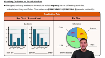
Visualizing Qualitative vs. Quantitative Data

Trend Analysis

Trend analysis involves examining data over a period to identify patterns or trends. In this case, analyzing the spending on TV and digital advertising from 2010 to 2022 can reveal whether advertising budgets are increasing or decreasing, and how the shift between TV and digital platforms is evolving. This understanding is crucial for making informed marketing decisions.
Recommended video:
04:13
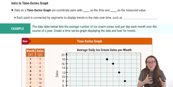
Creating Time-Series Graphs

Projected Data

Projected data refers to estimates of future values based on historical data trends. In the provided data, the amounts for the last few years are projections, which are important for forecasting future advertising spending. Understanding how projections are made and their implications can help in assessing the potential growth or decline in advertising investments.
Recommended video:
Guided course
04:39
Visualizing Qualitative vs. Quantitative Data
Related Practice
Textbook Question

In Exercises 13 and 14, construct the pie chart.


Box Office Boffo Use the data from Exercise 11 “Box Office Boffo.”

"Recent annual gross revenue (millions of dollars) for the leading movie studios are as follows: 20th Century Fox (1082), Buena Vista (3092), Paramount (757), Sony/Columbia (1304), Universal (1772), Warner Brothers (1941)."

162
views
Textbook Question

Exercises 29–34 involve large sets of data, so technology should be used. Complete lists of the data are not listed in Appendix B, but they can be downloaded from the website TriolaStats.com. Use the indicated data and construct the frequency distribution.


Earthquake Depths Use the depths (km) of the 600 earthquakes included in Data Set 24 “Earthquakes.” Use a class width of 10.0 km and begin with a lower class limit of 0.0 km. Does the frequency distribution appear to be a normal distribution?

116
views
Textbook Question

In Exercises 5–8, identify the class width, class midpoints, and class boundaries for the given frequency distribution. Also identify the number of individuals included in the summary. The frequency distributions are based on real data from Appendix B.

7.

449
views
Textbook Question

Ethics There are data showing that smoking is detrimental to good health. Given that people could be helped and lives could be saved by reducing smoking, is it ethical to graph the data in a way that is misleading by exaggerating the health risks of smoking?

124
views
Textbook Question

Cell Phone Radiation If we collect a sample of cell phone radiation amounts much larger than the sample included with Exercise 3, and if our sample includes a single outlier, how will that outlier appear in a histogram?

152
views
Textbook Question

In Exercises 13–16, write a statement that interprets the P-value and includes a conclusion about linear correlation.


Using the data from Exercise 6 “Airport Data Speeds,” the P-value is 0.003.

167
views