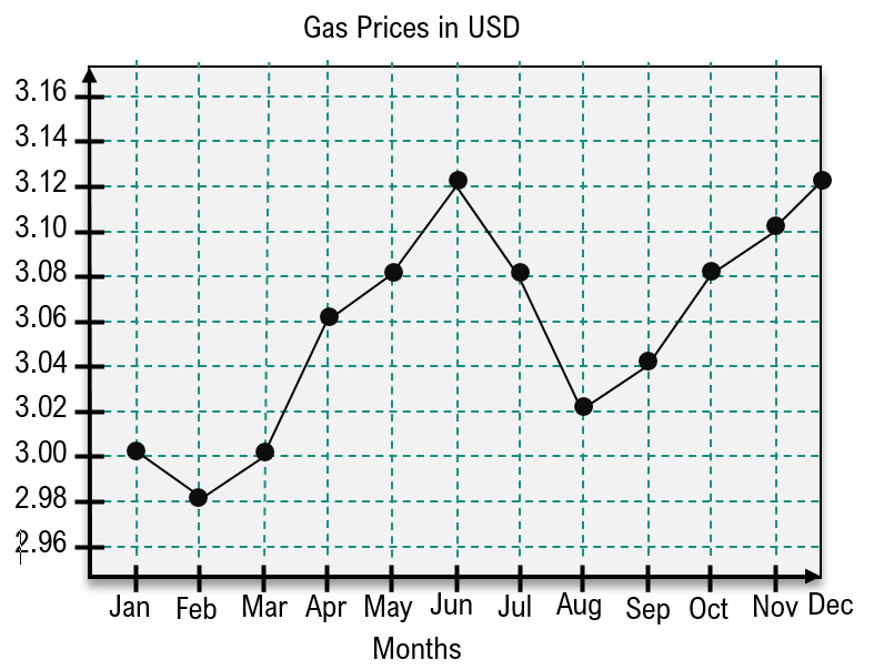
In this course, we have explored various ways to analyze data, focusing on frequencies across categories and classes. However, when it comes to understanding how data changes over time, time series graphs become an essential tool. These graphs effectively illustrate how a variable's value evolves, allowing us to visualize trends over specific time intervals.
A time series graph consists of coordinate pairs, where the x-axis represents time and the y-axis indicates the measured value at that time. To create a time series graph, one must plot points based on these coordinates. For instance, if we are analyzing average daily ice cream sales over a year, the x-axis would be labeled with months, while the y-axis would reflect the sales figures.
To plot a point, you move along the x-axis to the corresponding month and then vertically to the sales figure. For example, if the average daily sales in month one are three, you would plot the point (1, 3). Continuing this process for each month allows you to visualize the data accurately. Once all points are plotted, connecting them with line segments helps to clearly identify trends, such as periods of increase or decrease in sales.
In our ice cream sales example, we observe that sales increased from month two to month seven, indicating a positive trend. Conversely, there were decreases from month one to month two and from month seven to month twelve. Analyzing these trends is crucial for understanding the overall performance of the dataset over time.
By mastering the creation and analysis of time series graphs, you will be well-equipped to identify significant patterns in data, enhancing your ability to make informed decisions based on temporal changes.


