- Download the worksheet to save time writing
- Start solving the practice problems
- If you're stuck, watch the video solutions
- See your summary to get more insights

Refer to the dataset "Employee Salary Analysis" given below. The dataset includes employee gender, years of experience, and annual salary. For gender, let 0 represent female and 1 represent male.
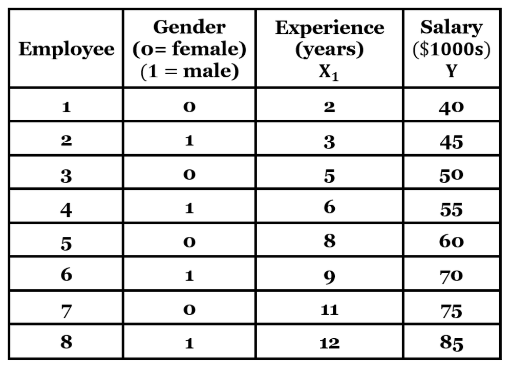
i. Using salary as the response variable, determine the multiple regression equation using variable experience and the dummy variable for gender.
Then, use the equation to predict the salary for an employee with the characteristics given below:
Female employee with 10 years of experience
Male employee with 10 years of experience
ii. Does gender appear to have a significant effect on salary?
Which of the following best describes a census in the context of data collection?
To gather opinions on campus dining, a student stands outside the cafeteria at lunchtime and interviews students who are leaving. What sampling technique is used, and what are the potential sources of bias?
After recording the annual average rainfall (in millimeters) for the past 100 years, we need to determine the most appropriate type of graph to visualize these data. Which of the following graph should be used?
The data set below represents the weights (kg) of high school seniors before graduation. Begin with a lower-class limit of 45 kg and use a class width of 10 kg to construct a frequency distribution. Can we conclude that the distribution appears to be normal?
Weights (kg):
The following frequency distribution represents the delivery times (in minutes) for packages shipped from a logistics center.
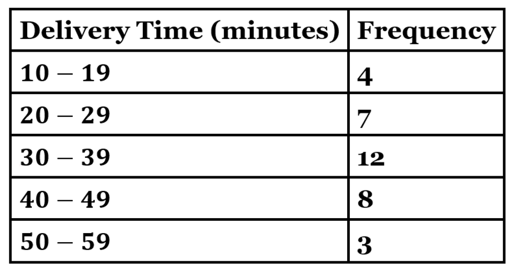
Construct the histogram corresponding to this frequency distribution. Which of these best describes the distribution: uniform, normal, skewed left, or skewed right?
You have data on the number of employees in different departments: {HR: 12, IT: 20, Sales: 8}. How would you synthesize this information into a bar graph?
If two pie charts show different percentages for the same category, what can be inferred?
If a frequency polygon has class midpoints labeled as 20, 40, 60, and 80, what does a point at x=60 and y=20 represent?
Given the dataset [1, 2, 2, 4, 4, 4, 5], how many dots will be stacked above the number 4 in the dot plot?
What is the first step in constructing a stemplot from a dataset?
Why do we connect plotted points with segments in a time series graph?
The following are the resting heart rates (in ) of adult males:
, , , , , , , ,
Find the mean. Does the result seem reasonable?
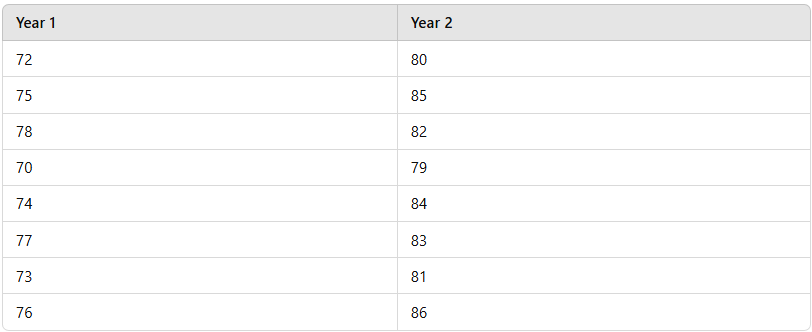
Use the following recorded weights (in kg) of a group of individuals measured in two different years. Find the mean and median for each set of data, then compare the two sets of results. How have the weights changed over time?
Use the data below to calculate the mean, median, and mode of daily screen time. Then, determine whether each measure appropriately represents the central tendency of the data. If any measure is not applicable or does not accurately reflect the data's center, explain why.
Daily screen time (in hours) recorded for a sample of high school students:
, , , , , , , , , , , , ,
The number of hours five employees worked in a week is as follows: , , , , . What is the sample standard deviation of the hours worked? Use the formula .
In a study of laptop prices, the mean price is with a standard deviation of . The prices follow a bell-shaped distribution. Is a laptop priced at unusual? Explain your reasoning.
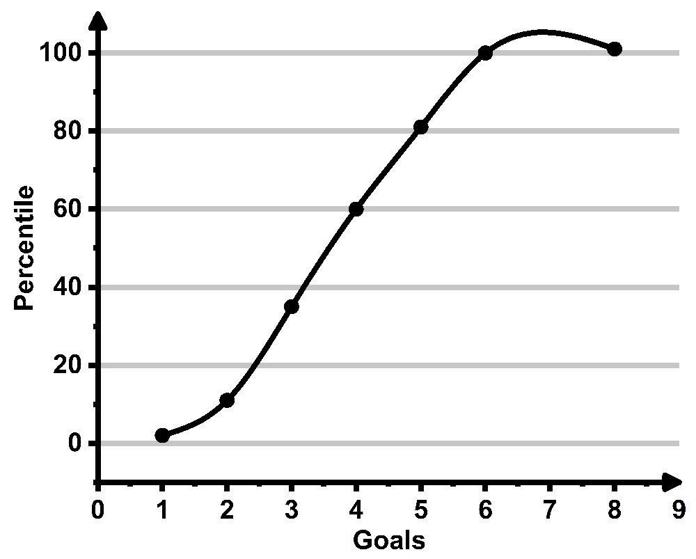
The goals scored by the winning teams in a football tournament final are represented in the ogive below. What score represents the th percentile? What interpretation could be drawn from this?
Using the given data sets, construct a boxplot for both groups and compare the two data sets. The table below presents resting heart rates (in beats per minute) for athletes and non-athletes.
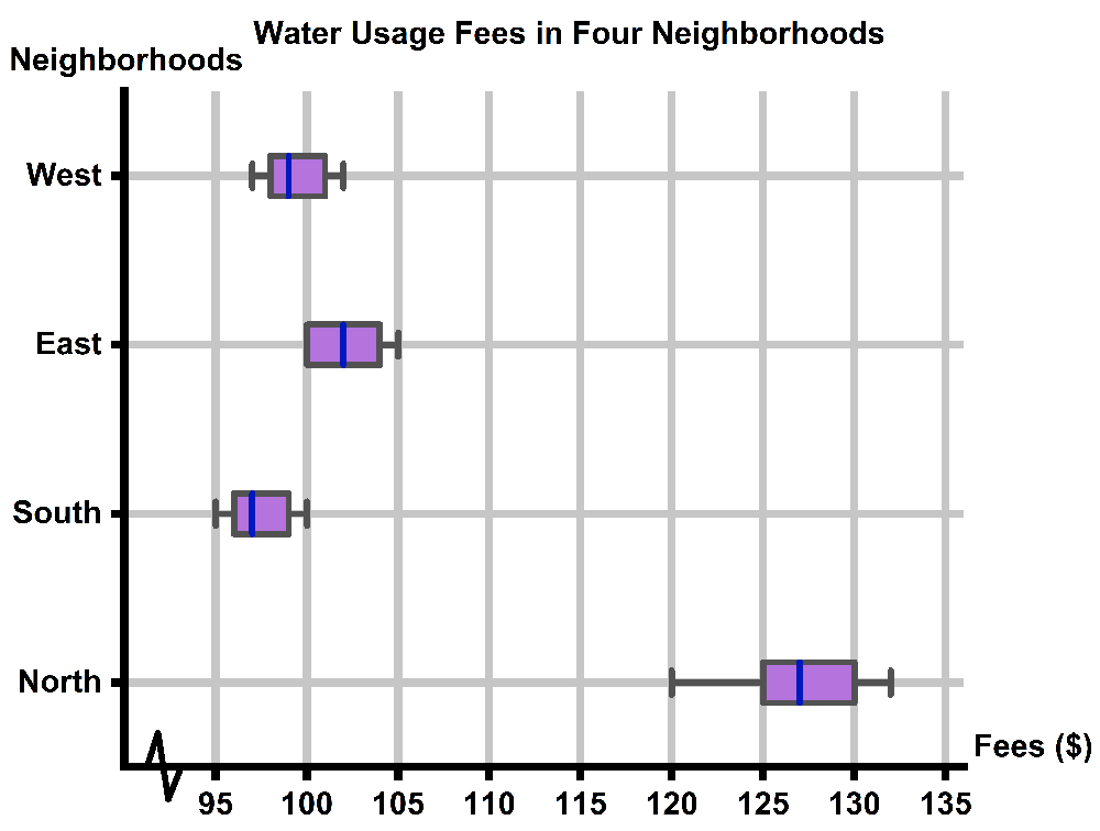
A city council is analyzing water usage fees in four different neighborhoods: North, South, East, and West. Residents of the North neighborhood have complained that their monthly water bills are higher than those in other areas. You collect a random sample of monthly water bills from each neighborhood, ensuring that all homes are of similar size and usage. Does it seem like North has higher bills? Use the box and whisker plot diagram below.