

Ch. 2 - Descriptive Statistics
Larson - Elementary Statistics: Picturing the World 8th Edition
Larson8th EditionElementary Statistics: Picturing the WorldISBN: 9780137493470Not the one you use?Change textbook
Chapter 2, Problem 2.1.37

Constructing a Frequency Distribution and a Relative Frequency Histogram In Exercises 37–40, construct a frequency distribution and a relative frequency histogram for the data set using five classes. Which class has the greatest relative frequency and which has the least relative frequency?
Taste Test
Data set: Ratings from 1 (lowest) to 10 (highest) provided by 36 people after taste-testing a new flavor of protein bar 2 6 9 2 9 9 6 10 5 8 7 6 5 10 1 4 9 3 4 5 3 6 5 2 4 9 2 9 3 3 6 5 1 9 4 2

Verified step by step guidance
1
Step 1: Determine the range of the data by subtracting the smallest value (1) from the largest value (10). This will help in determining the class width.
Step 2: Calculate the class width by dividing the range by the number of classes (5). Round up to the nearest whole number if necessary to ensure all data points are included.
Step 3: Define the class intervals. Start with the smallest value in the data set as the lower limit of the first class, and add the class width to determine the upper limit of each class. Repeat this process to create five non-overlapping classes.
Step 4: Construct the frequency distribution by counting how many data points fall into each class interval. Record these frequencies in a table.
Step 5: Calculate the relative frequency for each class by dividing the frequency of each class by the total number of data points (36). Then, use the relative frequencies to construct a relative frequency histogram, ensuring the x-axis represents the class intervals and the y-axis represents the relative frequencies.

Verified video answer for a similar problem:

This video solution was recommended by our tutors as helpful for the problem above.
Video duration:
4m
Was this helpful?

Key Concepts

Here are the essential concepts you must grasp in order to answer the question correctly.

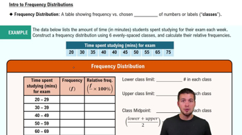
Frequency Distribution

A frequency distribution is a summary of how often each value occurs in a dataset. It organizes data into classes or intervals, showing the number of observations (frequency) that fall within each class. This helps in understanding the distribution of data points and identifying patterns or trends within the dataset.
Recommended video:
Guided course
06:38
Intro to Frequency Distributions

Relative Frequency

Relative frequency is the ratio of the frequency of a particular class to the total number of observations in the dataset. It provides a way to express how common or rare a class is relative to the entire dataset, often represented as a percentage. This concept is crucial for comparing classes and understanding their significance in the context of the whole data set.
Recommended video:
Guided course
06:38
Intro to Frequency Distributions

Histogram

A histogram is a graphical representation of the frequency distribution of a dataset. It consists of bars that represent the frequency of data points within specified intervals (classes). The height of each bar indicates the frequency, allowing for a visual comparison of the distribution and helping to identify which classes have the greatest and least relative frequencies.
Recommended video:
Guided course
05:54
Intro to Histograms
Related Practice
Textbook Question

Comparing z-Scores from Different Data Sets The table shows population statistics for the ages of Best Actor and Best Supporting Actor winners at the Academy Awards from 1929 to 2020. The distributions of the ages are approximately bell-shaped. In Exercises 51–54, compare the z-scores for the actors.


Best Actor 1970: John Wayne, Age: 62

Best Supporting Actor 1970: Gig Young, Age: 56

107
views
Textbook Question

What is the difference between class limits and class boundaries?

1016
views
Textbook Question

Graphing Data Sets In Exercises 17–32, organize the data using the indicated type of graph. Describe any patterns.


Nursing Use a stem-and-leaf plot to display the data, which represent the number of hours 24 nurses work per week. 

40 40 35 48 38 40 36 50 32 36 40 35

30 24 40 36 40 36 40 39 33 40 32 38

151
views
Textbook Question

Finding z-Scores The distribution of the ages of the winners of the Tour de France from 1903 to 2020 is approximately bell-shaped. The mean age is 27.9 years, with a standard deviation of 3.4 years. In Exercises 43–48, use the corresponding z-score to determine whether the age is unusual. Explain your reasoning. (Source: Le Tour de France)

100
views
Textbook Question

Building Basic Skills and Vocabulary


Given a data set, how do you know whether to calculate σ or s?

216
views
Textbook Question

Building Basic Skills and Vocabulary


Explain how to find the range of a data set. What is an advantage of using the range as a measure of variation? What is a disadvantage?

123
views