

Ch. 2 - Descriptive Statistics
Larson - Elementary Statistics: Picturing the World 8th Edition
Larson8th EditionElementary Statistics: Picturing the WorldISBN: 9780137493470Not the one you use?Change textbook
Chapter 2, Problem 2.2.18

Graphing Data Sets In Exercises 17–32, organize the data using the indicated type of graph. Describe any patterns.


Nursing Use a stem-and-leaf plot to display the data, which represent the number of hours 24 nurses work per week. 
40 40 35 48 38 40 36 50 32 36 40 35
30 24 40 36 40 36 40 39 33 40 32 38

Verified step by step guidance
1
Step 1: Understand the problem. The task is to create a stem-and-leaf plot for the given data set, which represents the number of hours 24 nurses work per week. A stem-and-leaf plot organizes data by separating each value into a 'stem' (all but the last digit) and a 'leaf' (the last digit).
Step 2: Organize the data in ascending order. Arrange the data set in increasing order to make it easier to construct the stem-and-leaf plot. The ordered data set is: 24, 30, 32, 32, 33, 35, 35, 36, 36, 36, 36, 38, 38, 39, 40, 40, 40, 40, 40, 40, 40, 40, 48, 50.
Step 3: Identify the stems and leaves. The 'stem' will be the tens digit of each number, and the 'leaf' will be the ones digit. For example, for the number 24, the stem is 2, and the leaf is 4. For the number 36, the stem is 3, and the leaf is 6.
Step 4: Construct the stem-and-leaf plot. Create a vertical list of stems (2, 3, 4, 5) and write the corresponding leaves next to each stem. For example, under the stem '3', write the leaves 0, 2, 2, 3, 5, 5, 6, 6, 6, 6, 8, 8, 9. Repeat this process for all stems.
Step 5: Analyze the plot for patterns. Look for clusters, gaps, or any other patterns in the data. For example, you might notice that the majority of the data is concentrated around the stem '4', indicating that most nurses work around 40 hours per week.

Verified video answer for a similar problem:

This video solution was recommended by our tutors as helpful for the problem above.
Video duration:
2m
Was this helpful?

Key Concepts

Here are the essential concepts you must grasp in order to answer the question correctly.

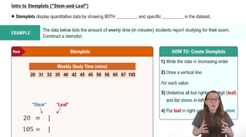
Stem-and-Leaf Plot

A stem-and-leaf plot is a method of displaying quantitative data in a graphical format, similar to a histogram, that helps to visualize the distribution of the data. Each number is split into a 'stem' (the leading digit or digits) and a 'leaf' (the trailing digit). This format retains the original data values while allowing for easy identification of patterns, such as clusters or gaps in the data.
Recommended video:
06:23
Creating Stemplots

Data Organization

Data organization refers to the systematic arrangement of data to facilitate analysis and interpretation. In the context of graphing, it involves categorizing and structuring data points in a way that highlights trends and relationships. Effective organization is crucial for accurately representing the data and drawing meaningful conclusions from visualizations.
Recommended video:
Guided course
04:39
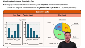
Visualizing Qualitative vs. Quantitative Data

Identifying Patterns

Identifying patterns in data involves analyzing the visual representation to discern trends, clusters, or anomalies. Patterns can indicate relationships between variables or highlight significant observations, such as common values or ranges. Recognizing these patterns is essential for making informed decisions based on the data and for communicating findings effectively.
Recommended video:
Guided course
05:54
Intro to Histograms
Related Practice
Textbook Question

Comparing z-Scores from Different Data Sets The table shows population statistics for the ages of Best Actor and Best Supporting Actor winners at the Academy Awards from 1929 to 2020. The distributions of the ages are approximately bell-shaped. In Exercises 51–54, compare the z-scores for the actors.


Best Actor 1970: John Wayne, Age: 62

Best Supporting Actor 1970: Gig Young, Age: 56

107
views
Textbook Question

In Exercises 13 and 14, find the range, mean, variance, and standard deviation of the population data set.


Drunk Driving The number of alcohol-impaired crash fatalities (in thousands) per year from 2010 through 2019 (Source: National Highway Traffic Safety Administration)

10.1 9.9 10.3 10.1 9.9 10.3 11.0 10.9 10.7 10.1

119
views
Textbook Question

What is the difference between class limits and class boundaries?

1016
views
Textbook Question

Constructing a Frequency Distribution and a Relative Frequency Histogram In Exercises 37–40, construct a frequency distribution and a relative frequency histogram for the data set using five classes. Which class has the greatest relative frequency and which has the least relative frequency?

Taste Test

Data set: Ratings from 1 (lowest) to 10 (highest) provided by 36 people after taste-testing a new flavor of protein bar 2 6 9 2 9 9 6 10 5 8 7 6 5 10 1 4 9 3 4 5 3 6 5 2 4 9 2 9 3 3 6 5 1 9 4 2

260
views
Textbook Question

Finding z-Scores The distribution of the ages of the winners of the Tour de France from 1903 to 2020 is approximately bell-shaped. The mean age is 27.9 years, with a standard deviation of 3.4 years. In Exercises 43–48, use the corresponding z-score to determine whether the age is unusual. Explain your reasoning. (Source: Le Tour de France)

100
views
Textbook Question

Building Basic Skills and Vocabulary


Given a data set, how do you know whether to calculate σ or s?

216
views