
Ch. 2 - Descriptive Statistics
Larson - Elementary Statistics: Picturing the World 8th Edition
Larson8th EditionElementary Statistics: Picturing the WorldISBN: 9780137493470Not the one you use?Change textbook
Chapter 2, Problem 2.2.12

Graphical Analysis In Exercises 9–12, use the stem-and-leaf plot or dot plot to list the actual data entries. What is the maximum data entry? What is the minimum data entry?


<IMAGE>

Verified step by step guidance
1
Observe the dot plot provided. Each dot represents a data entry, and the horizontal axis shows the values of the data. Count the number of dots above each value to determine the frequency of that value.
List all the data entries by recording the value for each dot. For example, if there are three dots above 215, include 215 three times in the data list.
Identify the maximum data entry by finding the largest value on the horizontal axis that has at least one dot above it.
Identify the minimum data entry by finding the smallest value on the horizontal axis that has at least one dot above it.
Summarize the findings by listing the complete data set, the maximum data entry, and the minimum data entry.

Verified video answer for a similar problem:

This video solution was recommended by our tutors as helpful for the problem above.
Video duration:
1m
Was this helpful?

Key Concepts

Here are the essential concepts you must grasp in order to answer the question correctly.

Stem-and-Leaf Plot

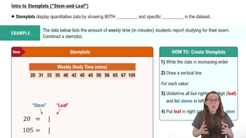
A stem-and-leaf plot is a method of displaying quantitative data in a graphical format, similar to a histogram. Each data point is split into a 'stem' (the leading digit or digits) and a 'leaf' (the trailing digit). This allows for easy visualization of the distribution of the data while retaining the original values, making it useful for identifying the shape of the data set.
Recommended video:
06:23
Creating Stemplots

Dot Plot

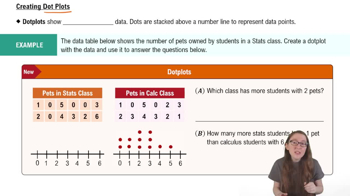
A dot plot is a simple graphical display that uses dots to represent individual data points along a number line. Each dot corresponds to a single observation, making it easy to see the frequency of values and identify clusters or gaps in the data. Dot plots are particularly useful for small data sets and provide a clear visual representation of the distribution.
Recommended video:
04:01
Creating Dotplots

Maximum and Minimum Data Entries

The maximum and minimum data entries refer to the highest and lowest values in a data set, respectively. Identifying these values is crucial for understanding the range of the data, which can provide insights into its spread and variability. In graphical representations like dot plots, the maximum is found at the rightmost point, while the minimum is at the leftmost point.
Recommended video:
Guided course
04:39
Visualizing Qualitative vs. Quantitative Data
Related Practice
Textbook Question

Graphing Data Sets In Exercises 17–32, organize the data using the indicated type of graph. Describe any patterns.


Smartphone Sales The five best-selling smartphone manufacturers of 2020 were Apple (206.1 million units), Huawei (189.0 million units), Samsung (266.7 million units), vivo (111.7 million units), and Xiaomi (147.8 million units). Use a Pareto chart to display the data. (Source: International Data Corporation)

145
views
Textbook Question

Graphing Data Sets In Exercises 17–32, organize the data using the indicated type of graph. Describe any patterns.


Highest-Paid Athletes Use a stem-and-leaf plot that has two rows for each stem to display the data, which represent the incomes (in millions) of the top 30 highest-paid athletes. (Source: Forbes Media LLC)

39 42 41 45 48 48 106 45 88 54 61 37 62 74 40

47 56 57 105 96 37 48 41 64 52 47 45 59 49 104

118
views
Textbook Question

Estimating the Sample Mean and Standard Deviation for Grouped Data In Exercises 41–44, make a frequency distribution for the data. Then use the table to estimate the sample mean and the sample standard deviation of the data set.

Weekly Study Hours The distribution of the number of hours that a random sample of college students study per week is shown in the pie chart. Use 32 as the midpoint for “30+ hours.”

107
views
Textbook Question

Graphical Analysis In Exercises 21–24, you are asked to compare three data sets.


(c) Estimate the sample standard deviations. Then determine how close each of your estimates is by finding the sample standard deviations.


i. ii. iii.

69
views
Textbook Question

Salary Offers You are applying for jobs at two companies. Company C offers starting salaries with μ = \$59,000 and σ = \$1500. Company D offers starting salaries with μ = \$59,000 and σ = \$1000. From which company are you more likely to get an offer of \$62,000 or more? Explain your reasoning.

124
views
Textbook Question

Constructing Data Sets In Exercises 25–28, construct a data set that has the given statistics.


n = 6

x̄ = 7

s ≈ 2

74
views