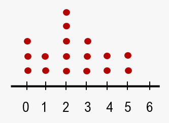
Dot plots are effective tools for visualizing quantitative or numerical data, allowing for quick identification of trends while also displaying specific values within a dataset. To create a dot plot, one begins with a number line, where each data point is represented by a dot positioned above its corresponding value. If multiple data points share the same value, the dots are stacked vertically. This method provides a clear and concise representation of the data.
For instance, if the dataset includes values such as 1, 0, 5, and others, the process involves locating each value on the number line, placing a dot above it, and crossing it off to avoid duplication. When encountering repeated values, additional dots are simply stacked above the existing ones. This visual representation makes it easy to analyze the data and answer specific questions regarding the dataset.
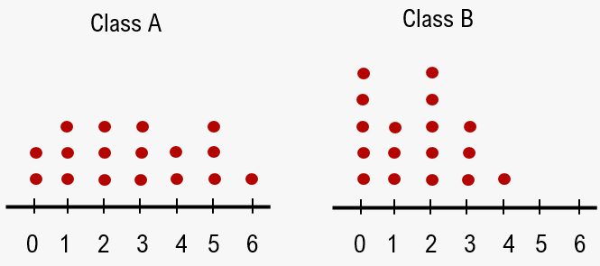
For example, if tasked with determining which class has more students with two pets, one would compare the number of dots above the value of two in each class's dot plot. If the statistics show two dots for the stats class and three for the calculus class, it is evident that calculus has more students with two pets.
Similarly, to find out how many more students in the stats class have one pet compared to calculus students with six pets, one would look for the number of dots above one in the stats plot and above six in the calculus plot. If there is one dot above one in stats and none above six in calculus, the conclusion would be that there is one more student in stats with one pet than there are calculus students with six pets.
Overall, dot plots serve as a straightforward method for organizing and interpreting numerical data, making them a valuable resource for statistical analysis.