Ch. 2 - Exploring Data with Tables and Graphs
Triola - Elementary Statistics 14th Edition
Triola14th EditionElementary StatisticsISBN: 9780137366446Not the one you use?Change textbook
Chapter 2, Problem 2.2.12

In Exercises 9–18, construct the histograms and answer the given questions.


Tornadoes Use the frequency distribution from Exercise 16 in Section 2-1 to construct a histogram. Does the histogram appear to be skewed? If so, identify the type of skewness.

Verified step by step guidance
1
Obtain the frequency distribution from Exercise 16 in Section 2-1. This table should include the class intervals (or bins) and their corresponding frequencies. Ensure you have this data ready to construct the histogram.
Label the x-axis of the histogram with the class intervals (bins) and the y-axis with the frequencies. The x-axis represents the range of tornado occurrences, while the y-axis represents how often they occur within each range.
For each class interval, draw a bar whose height corresponds to the frequency of that interval. Ensure the bars are adjacent to each other with no gaps, as histograms represent continuous data.
Examine the shape of the histogram. If the bars are higher on the left and taper off to the right, the histogram is right-skewed (positively skewed). If the bars are higher on the right and taper off to the left, it is left-skewed (negatively skewed). If the bars are roughly symmetrical, the histogram is not skewed.
Based on the shape of the histogram, determine and state whether it is skewed and, if so, identify the type of skewness (right-skewed, left-skewed, or no skewness).

Verified video answer for a similar problem:

This video solution was recommended by our tutors as helpful for the problem above.
Video duration:
2m
Was this helpful?

Key Concepts

Here are the essential concepts you must grasp in order to answer the question correctly.

Histogram

A histogram is a graphical representation of the distribution of numerical data, where the data is divided into intervals (bins) and the frequency of data points within each interval is represented by the height of bars. It helps visualize the shape of the data distribution, making it easier to identify patterns such as central tendency, variability, and skewness.
Recommended video:
Guided course
05:54
Intro to Histograms

Skewness

Skewness refers to the asymmetry of the distribution of data values in a dataset. A distribution is considered positively skewed (right-skewed) if it has a longer tail on the right side, while a negatively skewed (left-skewed) distribution has a longer tail on the left side. Understanding skewness is crucial for interpreting the shape of the histogram and the implications for data analysis.
Recommended video:
04:41
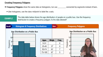
Creating Frequency Polygons

Frequency Distribution

A frequency distribution is a summary of how often each value occurs in a dataset. It organizes data into categories or intervals, showing the number of observations (frequency) for each category. This foundational concept is essential for constructing histograms, as it provides the necessary data to visualize the distribution and assess characteristics like skewness.
Recommended video:
Guided course
06:38
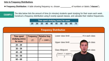
Intro to Frequency Distributions
Related Practice
Textbook Question

Normal Distribution If the following data are randomly selected, which are expected to have a normal distribution?


a. Weights of Reese’s Peanut Butter Cups

151
views
Textbook Question

Exercises 29–34 involve large sets of data, so technology should be used. Complete lists of the data are not listed in Appendix B, but they can be downloaded from the website TriolaStats.com. Use the indicated data and construct the frequency distribution.


Diastolic Blood Pressure Use the diastolic blood pressures of the 300 subjects included in Data Set 1 “Body Data.” Use a class width of 15 mm Hg and begin with a lower class limit of 40 mm Hg. Does the frequency distribution appear to be a normal distribution?

160
views
Textbook Question

In Exercises 5 and 6, construct the dotplot.


Pulse Rates Listed below are pulse rates (beats per minute) of females selected from Data Set 1 “Body Data” in Appendix B. All of those pulse rates are even numbers. Is there a pulse rate that appears to be an outlier? What is its value?


142
views
Textbook Question

More IQ Scores The population of IQ scores of adults is normally distributed. If we obtain a voluntary response sample of 5000 of those IQ scores, will a histogram of the sample be bell-shaped?

184
views
Textbook Question

Tornado Alley A stemplot of the same data summarized in Exercise 1 is created, and one of the rows of that stemplot is 3 | 000144669. Identify the values represented by that row of the stemplot.

96
views
Textbook Question

In Exercises 9–18, construct the histograms and answer the given questions.


Hershey’s Kisses Use the frequency distribution from Exercise 20 in Section 2-1 to construct a histogram. In using a strict interpretation of the criteria for being a normal distribution, does the histogram appear to depict data from a population with a normal distribution?

145
views