
Statistics Tables: Craps for the Normal Distribution
This series of statistical examples is intended to inform students about the statistics (and how it relates to the psychology) casinos use on table games to make them a more informed consumer. This series is not intended to be a “how to beat the house” or any other sort of get rich quick scheme. If I had a way to beat the house, don’t you think I would be doing it and not giving up the secrets? Overall, it is good to think of casino games as forms of entertainment, and you are encouraged to treat them as such. If you have or know someone who has a gambling problem, please use resources, and reach out to a professional for help.
Often students do not have a concept for the Normal Distribution when it comes to the sampling chapter, and the Galton Board is used to give students the visual reference in the classroom for discrete random variables showing a normal distribution when enough observations are dropped through the board. Unless students are soon to be contestants on The Price Is Right and are faced with Plinko, or NBC’s game show The Wall, they are not likely to encounter the board in their life outside the class. A more accessible way for students to see the normal distribution and understand the importance of sample size is the Craps Table.
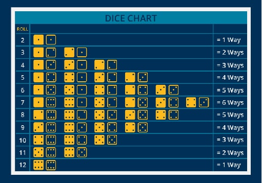
The casino game of Craps is simplistic: the act of throwing two dice and summing up the showing faces is the experiment in the game of craps. While using the full casino game with payouts and their corresponding probabilities creates a valued learning activity, this activity focuses only on the act of rolling the dice. To emphasize the previous chapters (discrete random variables categorization and visualization) the image below shows the number of ways the dice total can occur:
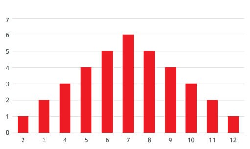
The number of ways the dice can add up to the total can also be shown using the bar chart. This format will also be used for the normal distribution charts.
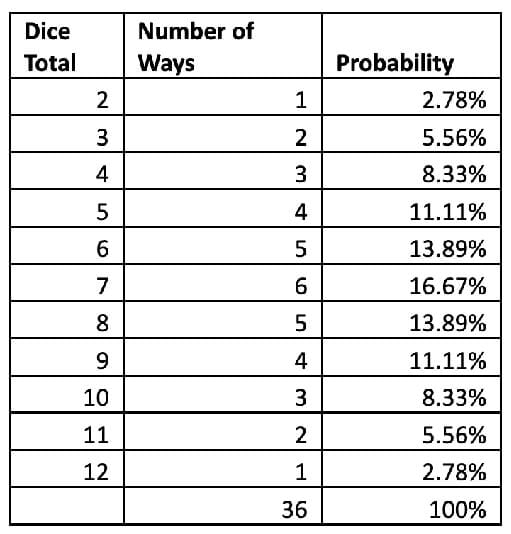
The corresponding probabilities are calculated by dividing the number of ways (frequency) by the total of 36 outcomes (x/T=probability). Having knowledge that the expectation of the outcomes is apriori probability, and will not always show up in the empirical (experiment based) probability.
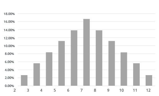
The attached Excel worksheet allows the instructor to create a visualization in class to describe how the sample size matters in empirical work. The different sheets were created using the codes provided in the code sheet for the different sample sizes on the tab. To use the excel document as an example in class, replace the data in columns B and C with the code “=randbetween(1,6)” [Do this all at once because every time you click a new cell, a new random number will be generated for each cell. That is why the data was copied and pasted as a value].
Students will be able to point out that as the sample size increases that the visualization of the empirical data closer resembles the normal distribution. In part, this is why the casino operators want to keep bettors at the tables longer, this increases the chance that a 7 (all bets are lost) will result in the roll. Arming students with this information, even if they are not 21 and thus not gambling at casinos, allows them to be more informed if they do decide to use gambling as a form of entertainment in the future.
About the author

Eric Nielsen, PhD
Eric Nielsen started at St Louis Community College in 2008, where he teaches classes in Economics and Statistics. He earned his Bachelor’s Degree from Pitzer College along with a Master’s and Doctoral Degrees from Claremont Graduate University in Claremont, CA. When not teaching, Eric enjoys spending time with his wife, children and dogs. Occasionally they find ways to escape from the children, through swimming, biking and running with the dogs.


