Digital Assessment Research: Text Styling and Formatting
We believe that all students should be able to best show what they know and can do in exams – regardless of whether the exam is taken onscreen or on paper.
That’s why we’re continuously researching and gathering feedback to better understand and inform how we can enhance accessibility and inclusion in exams – including through text styling and formatting.
At a glance
- To further support accessibility and inclusion, we drew upon best practices to shape enhanced text styling and formatting options for onscreen exams.
- User testing with diverse student groups showed an overwhelming student preference for layouts with enhanced inclusive text styling and formatting options – with noted feedback on improvements in readability, distinguishability of instructions, and clarity of marks.
- Following best practice and research across the sector, plus the validation from this user testing, we’ve already introduced the enhanced text styling and formatting options to all our onscreen International GCSE exams.
- As well as monitoring the impact of the enhanced text styling and formatting options, we’ll continue to explore further research areas to enhance accessibility and inclusion, plus share our findings to support the evolution of digital assessment at Pearson and across the wider sector.
What was the research about?
As technology and accessibility best practices evolve, it’s only right that our exams do too. Enhancing accessibility and usability within our exams not only delivers on our commitment to students, but also ensures that we meet regulatory requirements, and can confidently offer a choice of exam formats that schools, colleges and the education community can trust.
We’ve been delivering onscreen International GCSE exams since 2022, and the onscreen exam platform has in-built accessibility tools and features that we’re always looking to evolve to support students. As part of a wider research programme, we have a project focusing on more inclusive text styling. This project aims to:
- collate best practices across existing research and guidance
- identify new text styling and formatting options
- test these with students to inform developments for onscreen exams.
By doing this, we’ve been able to shape and implement an enhanced range of text styling and formatting options to further support students in understanding the structure of the content and navigating it within our onscreen exams.
How was the research conducted?
Scope
We focused specifically on identifying whether there were opportunities to enhance our onscreen exams with:
- visual formatting – how the text appears, e.g. font choice, size, alignment, spacing, colour, letter case, and formatting such as bold, italics and underline for emphasis
- visual text styling – applying formatting to give text a consistent and cohesive structure e.g. paragraphs and hierarchy of heading levels. These support the ability to decode and navigate visual content more easily and efficiently.
- semantic (text) styling – ensuring that visual styles are linked to correct HTML code means that assistive technology (e.g. a screen reader or keyboard) can understand the structure of the text.
Research shows that text styling and formatting can particularly benefit learners with SEND and additional needs, such as dyslexia, ADHD and autism; low vision or no vision; learning disabilities and mobility issues. It can also support those for whom English is not their first language, people using smaller devices and/or are unable to adjust settings easily. Moreover, improved inclusive text styling and formatting can benefit everyone in their reading and understanding of content.
Best practices
We wanted to base recommendations for enhanced text styling and formatting options on accessibility and usability standards and guidance across sectors and technologies. This included, but wasn’t limited to:
- Web Content Accessibility Guidelines 2.1 AA
- The Universal Design for Learning Guidelines
- Ofqual guidance on designing and developing accessible assessments
- British Dyslexia Association: Dyslexia friendly style guide
- Guidelines for Technology-Based Assessment.
Analysing these alongside our content from our onscreen exams, as well as initial onscreen assessment usability studies and feedback, we created an initial set of recommendations for more inclusive text styling.
These included updates to font style, size and spacing, the use of sentence case and web accessibility conventions, text alignment, colour and contrast, plus enhancements to visual text hierarchy and styling.
User testing
To further refine and validate the evidence-based recommendations, we sought the views of a range of learners Years 9 and 10 (aged 13–15) from UK and international schools that had a range of technological capabilities.
As we’re conscious that text styling can have benefits for everyone, the sample included a mix of genders and learners without diagnosed SEND conditions, as well as students with dyslexia, ASD, ADHD, visual impairments, mild mobility impairments, and screen reader and text-to-speech users.
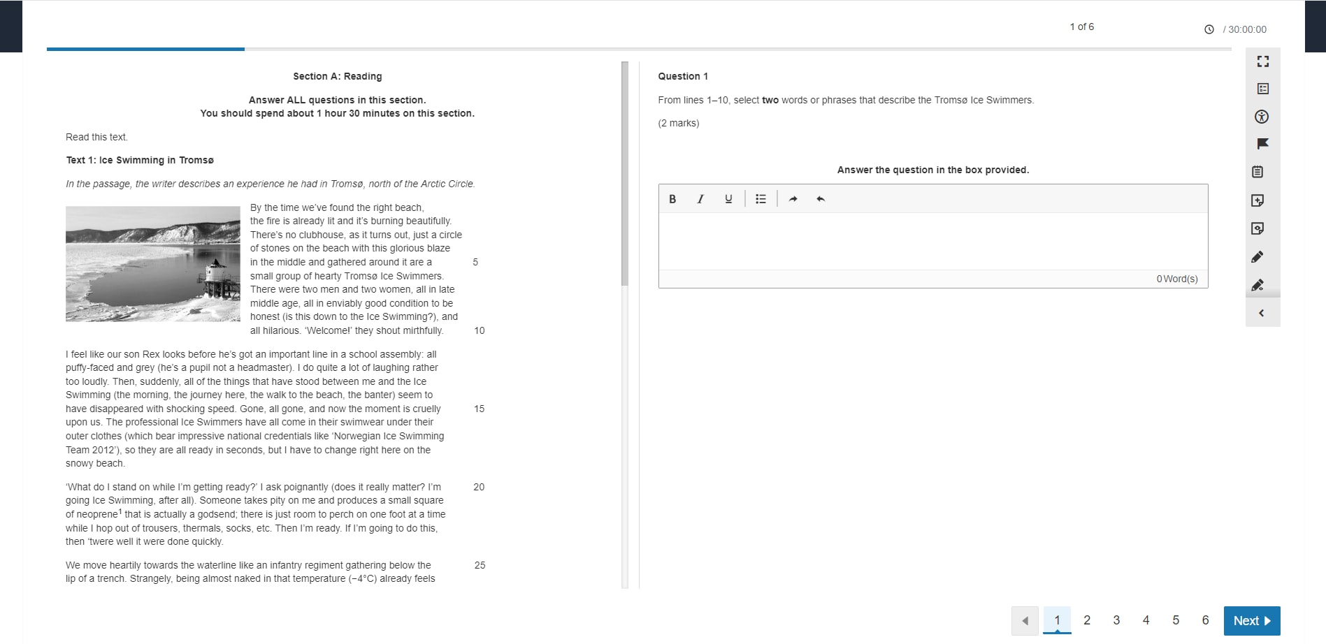
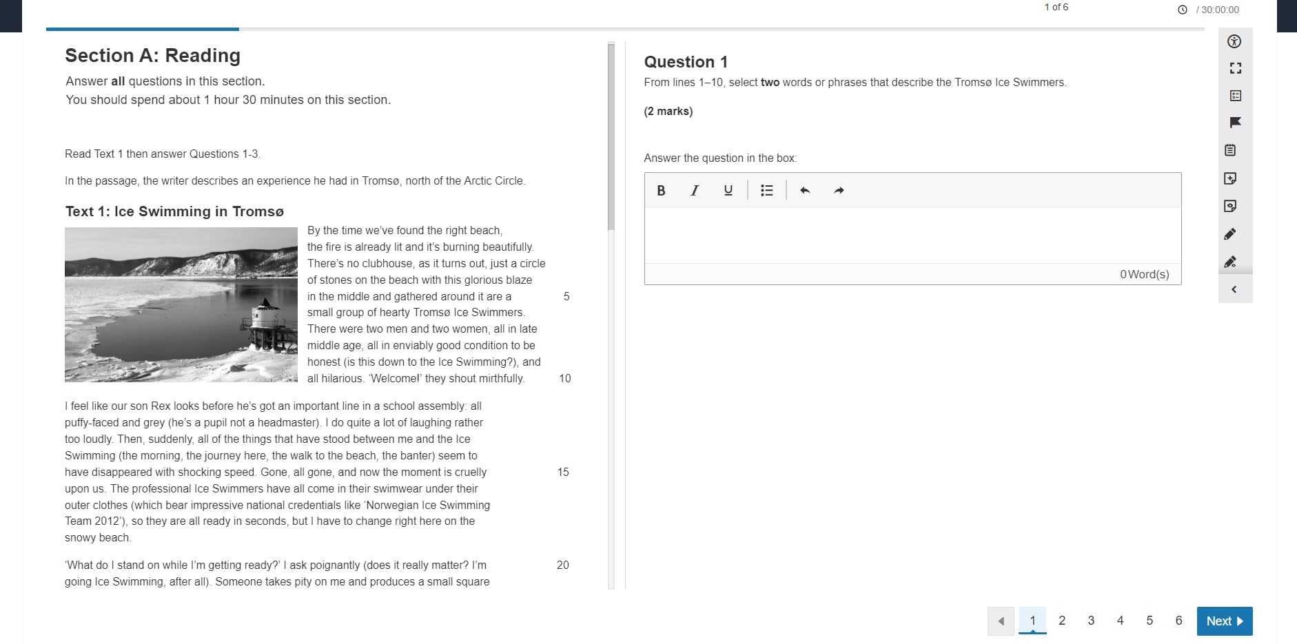
Students were shown two versions of exam questions – with and without the recommendations applied. We chose International GCSE English Language A questions as they offered a variety of text content, lengths and types that could present varying styling and formats

Testlet option 1: without enhanced text styling and formatting applied, e.g. use of italics

Testlet option 2: with enhanced text styling and formatting applied
We asked the students for their feedback and preferences, through semi-structured in-person interviews and a detailed online survey.
What were the key findings?
From the user testing, there was overwhelming student preference (78%) for the testlet with the more inclusive text styling and formatting recommendations applied.

Student preference was for testlet option 2: with enhanced text styling and formatting applied
Preference for the testlet with inclusive text styling and formatting was consistent across both students with and without SEND.
- 90% said that the headings were the right size
- 94% said that the instructions were easier to distinguish
- 84% said that left-aligned text was preferable
- 98% said that the number of marks stood out more clearly
There was also strong feedback validating that the areas students felt were important were the areas where changes had been applied.
“The bigger writing made it easier to concentrate without me having to fiddle with the zoom. For the essay questions, I am less likely to miss the instructions at the top.”
”… more efficient and easy to read as opposed to…” the original “…which was hazy and more difficult to read”
“There is more variation in text size which makes it easier to distinguish between titles, instructions and questions. The larger spacing … also makes it easier to read and makes the words clearer.”
This shows that by improving accessibility of these aspects, there is real potential to enhance exam experiences for students.
What do these findings mean for Pearson and the wider sector?
These findings mean that we can have confidence that the visual and semantic styling we’ve tested can support reading experiences for all candidates but especially those with SEND. As such, we’ve now introduced the text styling and formatting options to all our onscreen exams.
As they align with global industry best practice that’s also established in many educational resources, and within educational institutions and their high-stakes examinations (e.g. K-12 assessments, UK and US university and college systems), this means there is more consistency with the wider sector and experiences that students may have in future assessments.
This not only can build confidence in onscreen exam options from Pearson but also for the education community as a whole as we shape the assessments of the future in the UK and across the globe. This includes that as awarding bodies, we have a wider evidence base to support enhancing accessibility in assessments and that many (if not all) students can benefit from more inclusive design.
What are Pearson’s next steps on this?
It’s important that this is only seen as one step in a wider accessibility journey that the whole sector contributes towards. This research is part of a comprehensive series of studies being carried out by Pearson that consider various aspects of onscreen exams – from accessibility and inclusion through to comparability and feedback from teachers and students.
As such, we’ll not only be looking at this study in isolation but also in relation to our wider research and evidence base to create a full and informed picture.
We’re also continuously improving accessibility features for our onscreen exam platform, such as adding four new colour options students can choose from to aid their reading. We’ll continue to seek opportunities for validating our accessibility improvements with a range of learners with different needs to help ensure we are meeting a wide range of learner needs and continue to grow and develop our understanding of what else we need to explore in the design accessible digital assessments.
Our next steps include (but are not limited to):
- monitoring the impact of inclusive text styling – as we’ve already implemented updates to the text styling and formatting of our onscreen exams based on the research, we’ll continue to gather and review feedback to identify opportunities for further optimisation and evolution.
- building on our research findings with further usability testing that includes diverse samples where possible
- broadening the research scope to also explore font choices, font colour and additional subjects
- exploring implications and applications across assessment formats – for instance, if the learnings here can enhance also accessibility and inclusion across different exam modes
- informing sector-wide conversations and recommendations – we will continue to share our research and use the insights gained to inform recommendations that can improving assessment practices and ensuring fairness and comparability across all exam modes.
About the research
Date: November 2024