Graph the line passing through the given point and having the indicated slope. Plot two points on the line. through (3, -4), m = - 1/3
Table of contents
- 0. Review of Algebra4h 18m
- 1. Equations & Inequalities3h 18m
- 2. Graphs of Equations1h 43m
- 3. Functions2h 17m
- 4. Polynomial Functions1h 44m
- 5. Rational Functions1h 23m
- 6. Exponential & Logarithmic Functions2h 28m
- 7. Systems of Equations & Matrices4h 5m
- 8. Conic Sections2h 23m
- 9. Sequences, Series, & Induction1h 22m
- 10. Combinatorics & Probability1h 45m
2. Graphs of Equations
Lines
Problem 66
Textbook Question
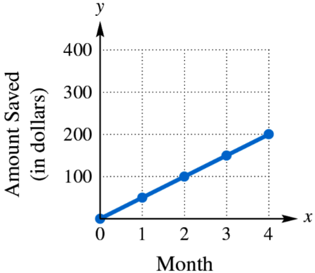
Find and interpret the average rate of change illustrated in each graph.

 Verified step by step guidance
1
Step 1: Identify two points on the graph to calculate the average rate of change. For example, use the points (2, 90) and (8, 360).
Step 2: Recall the formula for the average rate of change between two points \((x_1, y_1)\) and \((x_2, y_2)\):
\[\text{Average Rate of Change} = \frac{y_2 - y_1}{x_2 - x_1}\]
Step 3: Substitute the coordinates of the chosen points into the formula:
\[\frac{360 - 90}{8 - 2}\]
Step 4: Simplify the expression to find the average rate of change, which represents the change in carbon production rate per year.
Step 5: Interpret the result as the average increase in Company X's bi-yearly carbon production rate (in tonnes) for each year over the 8-year period.
 Verified video answer for a similar problem:
This video solution was recommended by our tutors as helpful for the problem above
Video duration:
5mPlay a video:
Key Concepts
Here are the essential concepts you must grasp in order to answer the question correctly.
Average Rate of Change
The average rate of change measures how much a quantity changes, on average, between two points. It is calculated as the change in the output (y-values) divided by the change in the input (x-values). In this context, it shows how the carbon production rate changes per year.
Recommended video:

Change of Base Property
Interpreting Coordinates on a Graph
Each point on the graph represents a specific year and the corresponding carbon production rate. Understanding these coordinates helps in calculating the rate of change and interpreting real-world data, such as how production increases over time.
Recommended video:
Guided course

Graphs and Coordinates - Example
Linear Relationships
A linear relationship is shown by a straight line on the graph, indicating a constant rate of change. Here, the straight line connecting the points suggests that the carbon production rate increases steadily over the years.
Recommended video:

Linear Inequalities
Related Videos
Related Practice
Textbook Question
553
views


