Multiple Choice
In business statistics, a time-series plot is also known as which of the following?
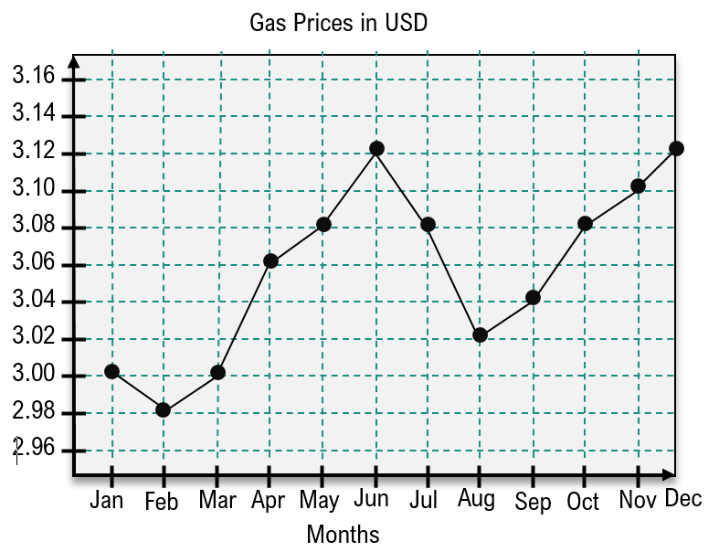
Jan-Feb and Jun-Aug
Feb-Dec
Mar-Apr and May-Jun
Feb-Jun and Aug-Dec
 Verified step by step guidance
 4:13m
4:13mMaster Creating Time-Series Graphs with a bite sized video explanation from Patrick
Start learning