Table of contents
- 1. Introduction to Statistics53m
- 2. Describing Data with Tables and Graphs2h 1m
- 3. Describing Data Numerically2h 8m
- 4. Probability2h 26m
- 5. Binomial Distribution & Discrete Random Variables3h 28m
- 6. Normal Distribution & Continuous Random Variables2h 21m
- 7. Sampling Distributions & Confidence Intervals: Mean3h 37m
- Sampling Distribution of the Sample Mean and Central Limit Theorem19m
- Distribution of Sample Mean - Excel23m
- Introduction to Confidence Intervals22m
- Confidence Intervals for Population Mean1h 26m
- Determining the Minimum Sample Size Required12m
- Finding Probabilities and T Critical Values - Excel28m
- Confidence Intervals for Population Means - Excel25m
- 8. Sampling Distributions & Confidence Intervals: Proportion1h 33m
- 9. Hypothesis Testing for One Sample3h 32m
- 10. Hypothesis Testing for Two Samples4h 49m
- Two Proportions1h 12m
- Two Proportions Hypothesis Test - Excel28m
- Two Means - Unknown, Unequal Variance1h 2m
- Two Means - Unknown Variances Hypothesis Test - Excel12m
- Two Means - Unknown, Equal Variance15m
- Two Means - Unknown, Equal Variances Hypothesis Test - Excel9m
- Two Means - Known Variance12m
- Two Means - Sigma Known Hypothesis Test - Excel21m
- Two Means - Matched Pairs (Dependent Samples)42m
- Matched Pairs Hypothesis Test - Excel12m
- 11. Correlation1h 24m
- 12. Regression1h 59m
- 13. Chi-Square Tests & Goodness of Fit2h 31m
- 14. ANOVA2h 1m
2. Describing Data with Tables and Graphs
Bar Graphs and Pareto Charts
Struggling with Statistics for Business?
Join thousands of students who trust us to help them ace their exams!Watch the first videoMultiple Choice
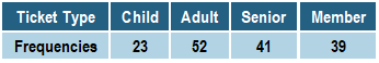
Using the table below, which category would appear first in a Pareto Chart representing the data?

A
Child
B
Adult
C
Senior
D
Member
Verified step by step guidance1
Step 1: Understand the concept of a Pareto Chart. A Pareto Chart is a type of bar chart where categories are arranged in descending order of frequency or importance. The category with the highest frequency appears first.
Step 2: Examine the table provided. The table lists ticket types (Child, Adult, Senior, Member) and their corresponding frequencies (23, 52, 41, 39). These frequencies represent the number of occurrences for each category.
Step 3: Identify the category with the highest frequency. Compare the frequencies: Adult (52), Senior (41), Member (39), and Child (23). The category with the highest frequency is Adult.
Step 4: Arrange the categories in descending order of frequency for the Pareto Chart. The order would be: Adult, Senior, Member, and Child.
Step 5: Conclude that the category 'Adult' would appear first in the Pareto Chart, as it has the highest frequency of 52.
Watch next
Master Creating Bar Graphs and Pareto Charts with a bite sized video explanation from Patrick
Start learningRelated Videos
0
Bar Graphs and Pareto Charts practice set

