Ch. 2 - Exploring Data with Tables and Graphs
Triola - Elementary Statistics 14th Edition
Triola14th EditionElementary StatisticsISBN: 9780137366446Not the one you use?Change textbook
Chapter 2, Problem 2.3.16

In Exercises 15 and 16, construct the frequency polygons.
Presidents Use the frequency distribution from Exercise 14 in Section 2-1 to construct a frequency polygon. Does the graph suggest that the distribution is skewed? If so, how?

Verified step by step guidance
1
Step 1: Understand the concept of a frequency polygon. A frequency polygon is a graphical representation of a frequency distribution. It is created by plotting points corresponding to the midpoints of each class interval and their respective frequencies, and then connecting these points with straight lines.
Step 2: Identify the class midpoints from the frequency distribution provided in Exercise 14. The midpoint of a class interval is calculated as the average of the lower and upper boundaries of the interval. Use the formula: Midpoint=Lower+Upper2.
Step 3: Plot the midpoints on the x-axis and the corresponding frequencies on the y-axis. For each class interval, locate the midpoint on the x-axis and plot a point at the height corresponding to the frequency of that class.
Step 4: Connect the plotted points with straight lines to form the frequency polygon. Optionally, extend the lines to the x-axis at the beginning and end of the graph to close the polygon.
Step 5: Analyze the shape of the frequency polygon to determine if the distribution is skewed. If the graph is symmetric, the distribution is not skewed. If the graph has a longer tail on the right, it is positively skewed. If the graph has a longer tail on the left, it is negatively skewed.

Verified video answer for a similar problem:

This video solution was recommended by our tutors as helpful for the problem above.
Video duration:
3m
Was this helpful?

Key Concepts

Here are the essential concepts you must grasp in order to answer the question correctly.

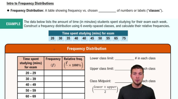
Frequency Distribution

A frequency distribution is a summary of how often each value occurs in a dataset. It organizes data into categories or intervals, showing the number of observations within each category. This helps in visualizing the data's overall shape and identifying patterns, such as central tendency and variability.
Recommended video:
Guided course
06:38
Intro to Frequency Distributions

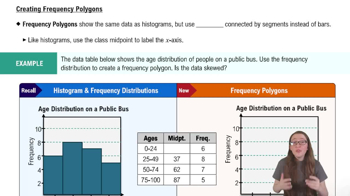
Frequency Polygon

A frequency polygon is a graphical representation of a frequency distribution. It is created by plotting points for the frequency of each category and connecting them with straight lines. This type of graph provides a clear visual of the distribution's shape, making it easier to identify trends, peaks, and potential skewness in the data.
Recommended video:
04:41
Creating Frequency Polygons

Skewness

Skewness refers to the asymmetry of a probability distribution. A distribution is considered skewed if one tail is longer or fatter than the other. Positive skewness indicates that the tail on the right side is longer, while negative skewness indicates a longer left tail. Analyzing skewness helps in understanding the data's behavior and potential outliers.
Recommended video:
04:41
Creating Frequency Polygons
Related Practice
Textbook Question

IQ Scores IQ scores of adults are normally distributed. If a large sample of adults is randomly selected and the IQ scores are illustrated in a histogram, what is the shape of that histogram?

250
views
Textbook Question

In Exercises 5 and 6, construct the dotplot.


Diastolic Blood Pressure Listed below are diastolic blood pressure measurements (mm Hg) of females selected from Data Set 1 “Body Data” in Appendix B. All of the values are even numbers. Are there any outliers? If so, identify their values.

102
views
Textbook Question

In Exercises 5–8, identify the class width, class midpoints, and class boundaries for the given frequency distribution. Also identify the number of individuals included in the summary. The frequency distributions are based on real data from Appendix B.

476
views
Textbook Question

In Exercises 9–12, using a loose interpretation of the criteria for determining whether a frequency distribution is approximately a normal distribution, determine whether the given frequency distribution is approximately a normal distribution. Give a brief explanation.

Blood Platelet Counts of Females Refer to the frequency distribution from Exercise 8

125
views
Textbook Question

Causation A study has shown that there is a correlation between body weight and blood pressure. Higher body weights are associated with higher blood pressure levels. Can we conclude that gaining weight is a cause of increased blood pressure?

208
views
Textbook Question

Use Table 2-11 to find the critical values of r. Based on a comparison of the linear correlation coefficient r and the critical values, what do you conclude about a linear correlation?

Using the data from Exercise 6 “Airport Data Speeds,” the linear correlation coefficient is r = 0.866

255
views