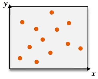
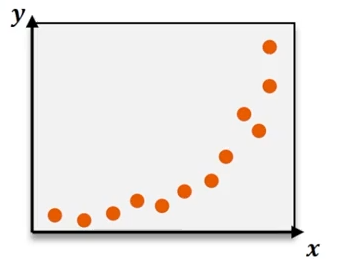
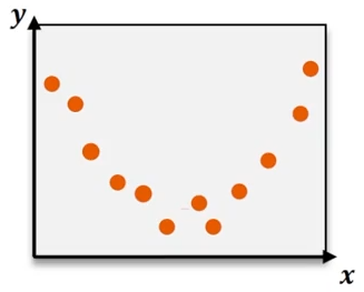
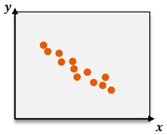
Quadratic regression is a powerful statistical method used to model data that follows a curved pattern rather than a straight line. Unlike linear regression, which fits data to a line defined by the equation y = bx + c, quadratic regression fits data to a parabola described by the equation y = ax² + bx + c. The key difference lies in the ax² term, which introduces curvature, allowing the model to capture U-shaped or inverted U-shaped trends in the data.
When analyzing datasets that exhibit nonlinear trends, quadratic regression provides a more accurate representation by estimating the coefficients a, b, and c that define the best-fit curve. These coefficients are typically calculated using technology such as a TI-84 graphing calculator, which simplifies the process by performing complex computations automatically.
To perform quadratic regression on a TI-84 calculator, first input your data points into the Stat Edit lists, usually L1 for the independent variable (x-values) and L2 for the dependent variable (y-values). Next, access the Stat menu, navigate to the Calc submenu, and select the quadratic regression function (often labeled as QuadReg). Specify the lists containing your data and choose to store the resulting regression equation in the calculator’s function editor (e.g., Y1) for easy graphing.
After running the regression, the calculator outputs the coefficients a, b, and c, which can be substituted back into the quadratic equation:
\[ \hat{y} = a x^{2} + b x + c \]
For example, if the calculator returns a = -2.07, b = 20.63, and c = -1.05, the quadratic regression equation becomes:
\[ \hat{y} = -2.07 x^{2} + 20.63 x - 1.05 \]
Evaluating the quality of the fit involves examining the coefficient of determination, denoted as R². This value ranges from 0 to 1 and indicates how well the regression curve explains the variability in the data. An R² value close to 1 signifies a strong fit. For instance, an R² of 0.977 suggests that the quadratic model explains approximately 97.7% of the variance, confirming that the curve closely matches the data points.
To visualize the quadratic regression, adjust the graphing window on the calculator to encompass the range of your data. Ensure that the Stat Plot feature is enabled to display the original data points alongside the regression curve. The resulting graph will show a smooth parabola passing near or through the data points, illustrating the model’s accuracy.
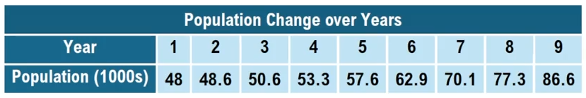
Quadratic regression is especially useful in real-world scenarios where relationships between variables are not linear, such as tracking sales trends over time, modeling projectile motion, or analyzing growth rates that accelerate or decelerate. By leveraging technology like graphing calculators, students and professionals can efficiently derive and interpret quadratic models, enhancing their ability to analyze complex datasets.