Ch. 5 - Normal Probability Distributions
Larson - Elementary Statistics: Picturing the World 8th Edition
Larson8th EditionElementary Statistics: Picturing the WorldISBN: 9780137493470Not the one you use?Change textbook
Chapter 5, Problem 5.2.21

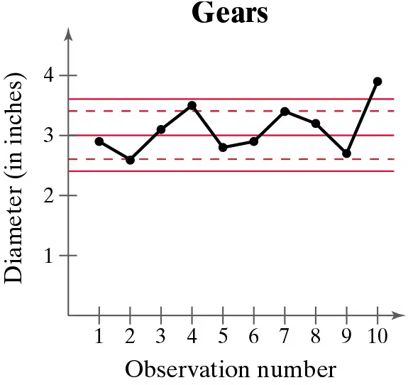
In Exercises 21–24, a control chart is shown. Each chart has horizontal lines drawn at the mean mu, at mu ±2sigma, and at mu±3sigma. Determine whether the process shown is in control or out of control. Explain.


A gear has been designed to have a diameter of 3 inches. The standard deviation of the process is 0.2 inch.


Control chart showing gear diameters over 10 observations with mean and control limits marked.

Verified step by step guidance
1
Step 1: Understand the control chart. The chart shows the diameter of gears across 10 observations. The horizontal lines represent the mean (μ = 3 inches), μ ± 2σ, and μ ± 3σ, where σ = 0.2 inches.
Step 2: Calculate the control limits. The upper control limit (UCL) is μ + 3σ = 3 + 3(0.2) = 3.6 inches, and the lower control limit (LCL) is μ - 3σ = 3 - 3(0.2) = 2.4 inches. Points outside these limits indicate the process is out of control.
Step 3: Analyze the data points. Observe whether any points fall outside the control limits (above 3.6 or below 2.4 inches). In the chart, the 10th observation exceeds the UCL, indicating a potential issue.
Step 4: Check for patterns. Even if all points are within the control limits, patterns such as trends, cycles, or sudden shifts can indicate the process is out of control. In this case, the 10th observation is an outlier, suggesting the process may be out of control.
Step 5: Conclude the analysis. Based on the observation of the 10th point exceeding the UCL, the process is likely out of control. Further investigation is needed to identify the cause of this deviation.

Verified video answer for a similar problem:

This video solution was recommended by our tutors as helpful for the problem above.
Video duration:
5m
Was this helpful?

Key Concepts

Here are the essential concepts you must grasp in order to answer the question correctly.

Control Chart

A control chart is a statistical tool used to monitor the stability of a process over time. It displays data points in time order and includes control limits, typically set at the mean plus or minus two and three standard deviations. This helps identify variations in the process, distinguishing between common cause variation (in control) and special cause variation (out of control).
Recommended video:
06:10
Creating Pie Charts

Mean and Standard Deviation

The mean is the average value of a dataset, representing the central tendency, while the standard deviation measures the dispersion or spread of the data points around the mean. In the context of control charts, the mean serves as the center line, and the standard deviation is used to calculate the control limits, which help assess whether the process is operating within expected parameters.
Recommended video:
Guided course
08:45
Calculating Standard Deviation

In Control vs. Out of Control

A process is considered 'in control' if the data points fall within the control limits and show no patterns or trends, indicating that variations are due to common causes. Conversely, a process is 'out of control' if data points fall outside the control limits or display non-random patterns, suggesting the presence of special causes that require investigation and correction.
Recommended video:
Guided course
04:39
Visualizing Qualitative vs. Quantitative Data
Related Practice
Textbook Question

Draw two normal curves that have the same mean but different standard deviations. Describe the similarities and differences.

378
views

Textbook Question

Graphical Analysis In Exercises 11–16, determine whether the graph could represent a variable with a normal distribution. Explain your reasoning. If the graph appears to represent a normal distribution, estimate the mean and standard deviation.

75
views
Textbook Question

Testing a Drug A drug manufacturer claims that a drug cures a rare skin disease 75% of the time. The claim is checked by testing the drug on 100 patients. If at least 70 patients are cured, then this claim will be accepted. Use this information in Exercises 31 and 32.


Find the probability that the claim will be accepted, assuming that the actual probability that the drug cures the skin disease is 65%.

118
views
Textbook Question

Finding Probabilities for Sampling Distributions In Exercises 29–32, find the indicated probability and interpret the results.


Dow Jones Industrial Average From 1975 through 2020, the mean annual gain of the Dow Jones Industrial Average was 652. A random sample of 32 years is selected from this population. What is the probability that the mean gain for the sample was between 400 and 700? Assume sigma=1540

87
views
Textbook Question

"Getting Physical The figure shows the results of a survey of U.S. adults ages 18 to 29 who were asked whether they participated in a sport. In the survey, 48% of the men and 23% of the women said they participate in sports. The most common sports are shown below. Use this information in Exercises 29 and 30.


You randomly select 300 U.S. women ages 18 to 29 and ask them whether they participate in at least one sport. Of the 72 who say yes, 50% say they participate in volleyball. How likely is this result? Do you think this sample is a good one? Explain your reasoning."

44
views
Textbook Question

In Exercises 1–4, the sample size n, probability of success p, and probability of failure q are given for a binomial experiment. Determine whether you can use a normal distribution to approximate the distribution of x.

n=18, p=0.90, q=0.10

105
views