The dotplot below shows the number of books read in a month by students in a college class. Find the most and least frequent number of books read.
Table of contents
- 1. Intro to Stats and Collecting Data1h 14m
- 2. Describing Data with Tables and Graphs1h 56m
- 3. Describing Data Numerically2h 0m
- 4. Probability2h 17m
- 5. Binomial Distribution & Discrete Random Variables3h 6m
- 6. Normal Distribution and Continuous Random Variables2h 11m
- 7. Sampling Distributions & Confidence Intervals: Mean3h 23m
- Sampling Distribution of the Sample Mean and Central Limit Theorem19m
- Distribution of Sample Mean - ExcelBonus23m
- Introduction to Confidence Intervals15m
- Confidence Intervals for Population Mean1h 18m
- Determining the Minimum Sample Size Required12m
- Finding Probabilities and T Critical Values - ExcelBonus28m
- Confidence Intervals for Population Means - ExcelBonus25m
- 8. Sampling Distributions & Confidence Intervals: Proportion2h 10m
- 9. Hypothesis Testing for One Sample5h 8m
- Steps in Hypothesis Testing1h 6m
- Performing Hypothesis Tests: Means1h 4m
- Hypothesis Testing: Means - ExcelBonus42m
- Performing Hypothesis Tests: Proportions37m
- Hypothesis Testing: Proportions - ExcelBonus27m
- Performing Hypothesis Tests: Variance12m
- Critical Values and Rejection Regions28m
- Link Between Confidence Intervals and Hypothesis Testing12m
- Type I & Type II Errors16m
- 10. Hypothesis Testing for Two Samples5h 37m
- Two Proportions1h 13m
- Two Proportions Hypothesis Test - ExcelBonus28m
- Two Means - Unknown, Unequal Variance1h 3m
- Two Means - Unknown Variances Hypothesis Test - ExcelBonus12m
- Two Means - Unknown, Equal Variance15m
- Two Means - Unknown, Equal Variances Hypothesis Test - ExcelBonus9m
- Two Means - Known Variance12m
- Two Means - Sigma Known Hypothesis Test - ExcelBonus21m
- Two Means - Matched Pairs (Dependent Samples)42m
- Matched Pairs Hypothesis Test - ExcelBonus12m
- Two Variances and F Distribution29m
- Two Variances - Graphing CalculatorBonus16m
- 11. Correlation1h 24m
- 12. Regression3h 33m
- Linear Regression & Least Squares Method26m
- Residuals12m
- Coefficient of Determination12m
- Regression Line Equation and Coefficient of Determination - ExcelBonus8m
- Finding Residuals and Creating Residual Plots - ExcelBonus11m
- Inferences for Slope31m
- Enabling Data Analysis ToolpakBonus1m
- Regression Readout of the Data Analysis Toolpak - ExcelBonus21m
- Prediction Intervals13m
- Prediction Intervals - ExcelBonus19m
- Multiple Regression - ExcelBonus29m
- Quadratic Regression15m
- Quadratic Regression - ExcelBonus10m
- 13. Chi-Square Tests & Goodness of Fit2h 21m
- 14. ANOVA2h 29m
2. Describing Data with Tables and Graphs
Dot Plots
Problem 2.R.8
Textbook Question
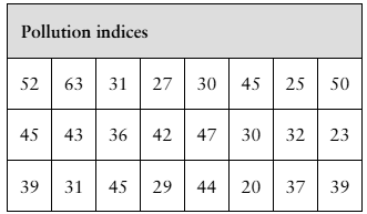
In Exercises 7 and 8, use the data set shown in the table at the left, which represents the pollution indices (a unitless measure of pollution ranging from 0 to 100) for 24 U.S. cities. (Adapted from Numbeo)

Use a dot plot to display the data set. Describe any patterns.
 Verified step by step guidance
1
Step 1: Understand the data set. The table contains pollution indices for 24 U.S. cities, ranging from 0 to 100. Each value represents a unitless measure of pollution.
Step 2: Organize the data. Extract all the pollution indices from the table and list them in ascending order to make it easier to plot the dot plot. For example: [20, 23, 23, 25, 27, 29, 30, 30, 31, 31, 32, 36, 37, 39, 39, 42, 43, 44, 45, 45, 45, 47, 50, 52, 63].
Step 3: Create a dot plot. On a horizontal axis, label the range of pollution indices (e.g., 20 to 63). For each pollution index value, place a dot above the corresponding number on the axis. If a value appears multiple times, stack the dots vertically.
Step 4: Analyze the dot plot. Look for patterns such as clustering of values, gaps, or outliers. For example, you might notice that most pollution indices are clustered between 30 and 50, with fewer cities having indices below 30 or above 50.
Step 5: Describe the patterns. Based on the dot plot, summarize the distribution of pollution indices. For instance, you might note that the data is moderately spread out, with a concentration of values in the mid-range (30-50), and a few cities with lower or higher pollution indices.
 Verified video answer for a similar problem:
This video solution was recommended by our tutors as helpful for the problem above
Video duration:
5mPlay a video:
0 Comments
Key Concepts
Here are the essential concepts you must grasp in order to answer the question correctly.
Dot Plot
A dot plot is a simple graphical display used to represent the frequency of data points in a dataset. Each value is represented by a dot above a number line, allowing for easy visualization of the distribution and frequency of the data. It is particularly useful for small to moderate-sized datasets, as it clearly shows clusters, gaps, and outliers.
Recommended video:

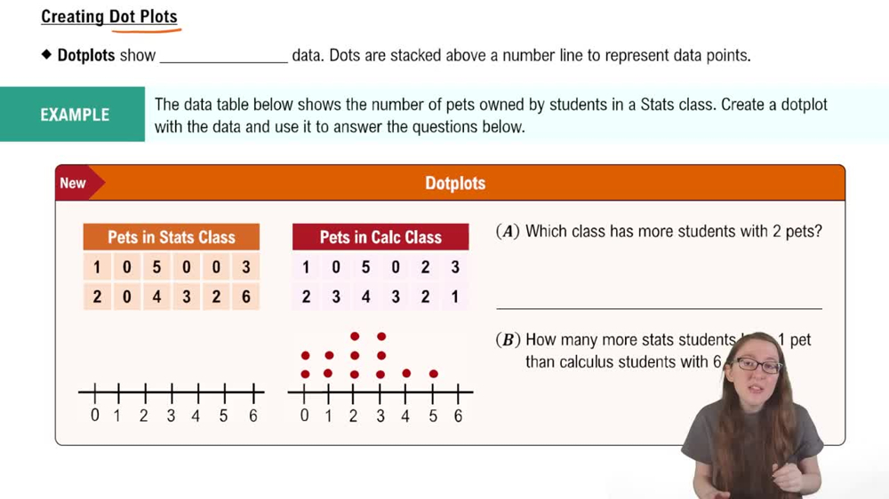
Creating Dotplots
Descriptive Statistics
Descriptive statistics summarize and describe the main features of a dataset. This includes measures such as mean, median, mode, range, and standard deviation, which provide insights into the central tendency and variability of the data. Understanding these statistics is essential for interpreting the patterns observed in the dot plot.
Recommended video:
Guided course

Parameters vs. Statistics
Patterns in Data
Identifying patterns in data involves looking for trends, clusters, or anomalies within the dataset. In the context of pollution indices, one might observe whether pollution levels are generally high or low, if there are any outliers, or if certain ranges of pollution indices are more common. Recognizing these patterns helps in understanding the overall environmental conditions represented by the data.
Recommended video:

Introduction to Collecting Data
Related Videos
Related Practice
Multiple Choice
487
views
4
rank
1
comments


