[DATA] Old Faithful In Problem 26 from Section 3.1, we drew a histogram of the length of eruption of California’s Old Faithful geyser and found that the distribution is symmetric. Draw a boxplot of these data. Use the boxplot and quartiles to confirm the distribution is symmetric. For convenience, the data are displayed again.
Table of contents
- 1. Intro to Stats and Collecting Data1h 14m
- 2. Describing Data with Tables and Graphs1h 56m
- 3. Describing Data Numerically2h 0m
- 4. Probability2h 17m
- 5. Binomial Distribution & Discrete Random Variables3h 6m
- 6. Normal Distribution and Continuous Random Variables2h 11m
- 7. Sampling Distributions & Confidence Intervals: Mean3h 23m
- Sampling Distribution of the Sample Mean and Central Limit Theorem19m
- Distribution of Sample Mean - ExcelBonus23m
- Introduction to Confidence Intervals15m
- Confidence Intervals for Population Mean1h 18m
- Determining the Minimum Sample Size Required12m
- Finding Probabilities and T Critical Values - ExcelBonus28m
- Confidence Intervals for Population Means - ExcelBonus25m
- 8. Sampling Distributions & Confidence Intervals: Proportion2h 10m
- 9. Hypothesis Testing for One Sample5h 8m
- Steps in Hypothesis Testing1h 6m
- Performing Hypothesis Tests: Means1h 4m
- Hypothesis Testing: Means - ExcelBonus42m
- Performing Hypothesis Tests: Proportions37m
- Hypothesis Testing: Proportions - ExcelBonus27m
- Performing Hypothesis Tests: Variance12m
- Critical Values and Rejection Regions28m
- Link Between Confidence Intervals and Hypothesis Testing12m
- Type I & Type II Errors16m
- 10. Hypothesis Testing for Two Samples5h 37m
- Two Proportions1h 13m
- Two Proportions Hypothesis Test - ExcelBonus28m
- Two Means - Unknown, Unequal Variance1h 3m
- Two Means - Unknown Variances Hypothesis Test - ExcelBonus12m
- Two Means - Unknown, Equal Variance15m
- Two Means - Unknown, Equal Variances Hypothesis Test - ExcelBonus9m
- Two Means - Known Variance12m
- Two Means - Sigma Known Hypothesis Test - ExcelBonus21m
- Two Means - Matched Pairs (Dependent Samples)42m
- Matched Pairs Hypothesis Test - ExcelBonus12m
- Two Variances and F Distribution29m
- Two Variances - Graphing CalculatorBonus16m
- 11. Correlation1h 24m
- 12. Regression3h 33m
- Linear Regression & Least Squares Method26m
- Residuals12m
- Coefficient of Determination12m
- Regression Line Equation and Coefficient of Determination - ExcelBonus8m
- Finding Residuals and Creating Residual Plots - ExcelBonus11m
- Inferences for Slope31m
- Enabling Data Analysis ToolpakBonus1m
- Regression Readout of the Data Analysis Toolpak - ExcelBonus21m
- Prediction Intervals13m
- Prediction Intervals - ExcelBonus19m
- Multiple Regression - ExcelBonus29m
- Quadratic Regression15m
- Quadratic Regression - ExcelBonus10m
- 13. Chi-Square Tests & Goodness of Fit2h 21m
- 14. ANOVA2h 29m
3. Describing Data Numerically
Boxplots
Problem 2.5.24
Textbook Question
Using Technology to Find Quartiles and Draw Graphs In Exercises 23–26, use technology to draw a box-and-whisker plot that represents the data set.
Vacation Days The number of vacation days used by a sample of 20 employees in a recent year
3 9 2 1 7 5 3 2 2 6
4 0 10 0 3 5 7 8 6 5
 Verified step by step guidance
1
Step 1: Organize the data set in ascending order. This will make it easier to calculate the quartiles and create the box-and-whisker plot. The ordered data set is: 0, 0, 1, 2, 2, 2, 3, 3, 3, 4, 5, 5, 5, 6, 6, 7, 7, 8, 9, 10.
Step 2: Identify the minimum, maximum, median (Q2), first quartile (Q1), and third quartile (Q3). Use the following definitions: Q1 is the median of the lower half of the data (excluding the overall median), Q2 is the median of the entire data set, and Q3 is the median of the upper half of the data (excluding the overall median).
Step 3: Use technology (e.g., a graphing calculator, spreadsheet software, or statistical software) to calculate the quartiles and create the box-and-whisker plot. Input the ordered data set into the software and use its built-in functions to compute Q1, Q2, Q3, and the interquartile range (IQR).
Step 4: Draw the box-and-whisker plot. The box represents the interquartile range (from Q1 to Q3), with a line inside the box indicating the median (Q2). The whiskers extend from the minimum value to Q1 and from Q3 to the maximum value, unless there are outliers. Outliers are typically defined as values that are more than 1.5 × IQR below Q1 or above Q3.
Step 5: Label the box-and-whisker plot appropriately. Include a title, label the axes, and mark the quartiles, minimum, and maximum values on the plot. If there are outliers, indicate them with a separate marker (e.g., a dot or asterisk).
 Verified video answer for a similar problem:
This video solution was recommended by our tutors as helpful for the problem above
Video duration:
10mPlay a video:
0 Comments
Key Concepts
Here are the essential concepts you must grasp in order to answer the question correctly.
Quartiles
Quartiles are values that divide a data set into four equal parts, each containing 25% of the data. The first quartile (Q1) is the median of the lower half, the second quartile (Q2) is the overall median, and the third quartile (Q3) is the median of the upper half. Understanding quartiles is essential for summarizing data distributions and identifying the spread and center of the data.
Recommended video:
Guided course

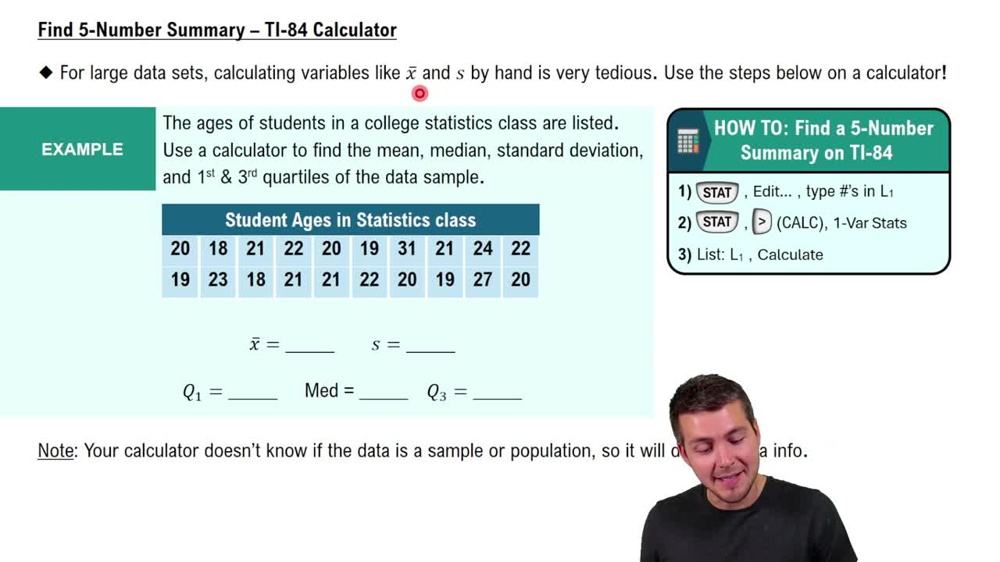
Find 5-Number Summary - TI-84 Calculator
Box-and-Whisker Plot
A box-and-whisker plot is a graphical representation of a data set that displays its minimum, first quartile, median, third quartile, and maximum. The 'box' shows the interquartile range (IQR), which represents the middle 50% of the data, while the 'whiskers' extend to the minimum and maximum values. This plot is useful for visualizing the distribution, central tendency, and variability of the data.
Recommended video:
Guided course

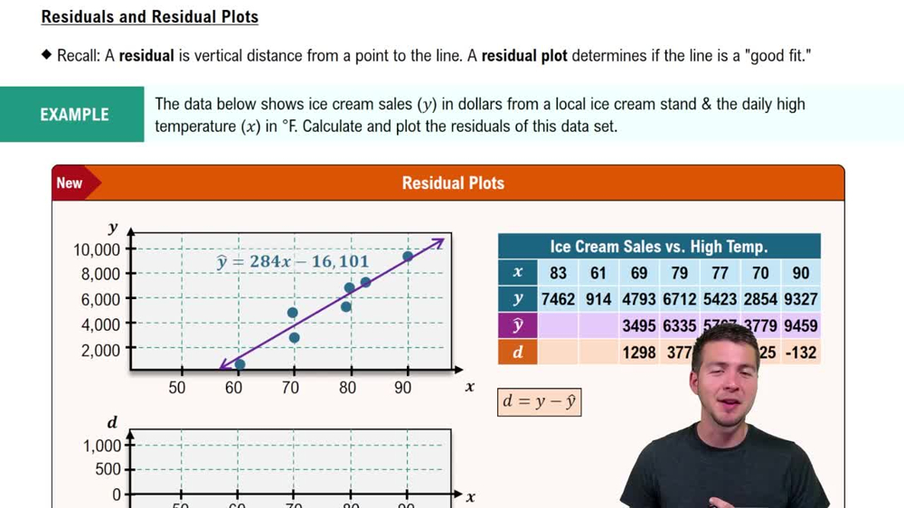
Residuals and Residual Plots
Technology in Statistics
Using technology in statistics involves employing software or tools to perform calculations, create visualizations, and analyze data efficiently. Programs like Excel, R, or Python libraries can automate the process of finding quartiles and generating box-and-whisker plots, making it easier to handle large data sets and perform complex statistical analyses without manual calculations.
Recommended video:
Guided course

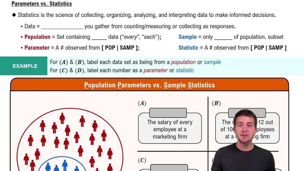
Parameters vs. Statistics
Related Videos
Related Practice
Textbook Question
49
views


