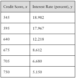
In Problems 17–20, (a) draw a scatter diagram of the data,
Table of contents
- 1. Intro to Stats and Collecting Data1h 14m
- 2. Describing Data with Tables and Graphs1h 55m
- 3. Describing Data Numerically2h 5m
- 4. Probability2h 16m
- 5. Binomial Distribution & Discrete Random Variables3h 6m
- 6. Normal Distribution and Continuous Random Variables2h 11m
- 7. Sampling Distributions & Confidence Intervals: Mean3h 23m
- Sampling Distribution of the Sample Mean and Central Limit Theorem19m
- Distribution of Sample Mean - Excel23m
- Introduction to Confidence Intervals15m
- Confidence Intervals for Population Mean1h 18m
- Determining the Minimum Sample Size Required12m
- Finding Probabilities and T Critical Values - Excel28m
- Confidence Intervals for Population Means - Excel25m
- 8. Sampling Distributions & Confidence Intervals: Proportion1h 25m
- 9. Hypothesis Testing for One Sample3h 29m
- 10. Hypothesis Testing for Two Samples4h 50m
- Two Proportions1h 13m
- Two Proportions Hypothesis Test - Excel28m
- Two Means - Unknown, Unequal Variance1h 3m
- Two Means - Unknown Variances Hypothesis Test - Excel12m
- Two Means - Unknown, Equal Variance15m
- Two Means - Unknown, Equal Variances Hypothesis Test - Excel9m
- Two Means - Known Variance12m
- Two Means - Sigma Known Hypothesis Test - Excel21m
- Two Means - Matched Pairs (Dependent Samples)42m
- Matched Pairs Hypothesis Test - Excel12m
- 11. Correlation1h 24m
- 12. Regression1h 50m
- 13. Chi-Square Tests & Goodness of Fit2h 21m
- 14. ANOVA1h 57m
1. Intro to Stats and Collecting Data
Intro to Stats
Problem 12.3A.2a
Textbook Question
[DATA] Credit Scores [See Problem 12 in Section 12.3] An economist wants to determine the relation between one’s FICO score, x, and the interest rate of a 36-month auto loan, y. The data represent the interest rate (in percent) a bank might offer on a 36-month auto loan for various FICO scores.

a. Draw a scatter diagram of the data treating credit score as the explanatory variable.
Verified step by step guidance1
Step 1: Identify the variables for the scatter diagram. Here, the explanatory variable (independent variable) is the Credit Score, denoted as \(x\), and the response variable (dependent variable) is the Interest Rate (percent), denoted as \(y\).
Step 2: Set up the coordinate axes for the scatter plot. Label the horizontal axis (x-axis) as 'Credit Score' and the vertical axis (y-axis) as 'Interest Rate (percent)'. Choose an appropriate scale for each axis to cover the range of the data: Credit Scores from 545 to 750, and Interest Rates from about 5% to 19%.
Step 3: Plot each data point on the graph by pairing each credit score \(x\) with its corresponding interest rate \(y\). For example, plot the point \((545, 18.982)\), then \((595, 17.967)\), and so on for all six data points.
Step 4: After plotting all points, observe the overall pattern or trend in the scatter diagram. This will help in understanding the relationship between credit score and interest rate.
Step 5: Optionally, you can draw a smooth curve or line that best fits the data points to visualize the trend, which in this case is expected to be a decreasing relationship between credit score and interest rate.
Verified video answer for a similar problem:This video solution was recommended by our tutors as helpful for the problem above
Video duration:
1mPlay a video:
Was this helpful?
Key Concepts
Here are the essential concepts you must grasp in order to answer the question correctly.
Scatter Diagram
A scatter diagram is a graphical representation that displays the relationship between two quantitative variables. Each point on the plot corresponds to one observation, with the explanatory variable on the x-axis and the response variable on the y-axis. It helps visualize patterns, trends, or correlations between variables.
Recommended video:
Probability of Mutually Exclusive Events
Explanatory and Response Variables
In a bivariate analysis, the explanatory variable (independent variable) is the one that is presumed to influence or predict changes in the response variable (dependent variable). Here, the credit score is the explanatory variable, and the interest rate is the response variable, as the interest rate depends on the credit score.
Recommended video:
Guided course
Intro to Random Variables & Probability Distributions
Relationship Between Variables
Understanding the relationship between variables involves identifying whether they have a positive, negative, or no correlation. In this case, as credit scores increase, interest rates tend to decrease, indicating a negative correlation. Recognizing this helps in interpreting the scatter plot and further statistical analysis.
Recommended video:
Guided course
Intro to Random Variables & Probability Distributions
Watch next
Master Introduction to Statistics Channel with a bite sized video explanation from Patrick
Start learningRelated Videos
Related Practice
Textbook Question
17
views
