Is there such a thing as the correct choice for a class width? Is there such a thing as a poor choice for a class width? Explain your reasoning.
Table of contents
- 1. Intro to Stats and Collecting Data1h 14m
- 2. Describing Data with Tables and Graphs1h 55m
- 3. Describing Data Numerically2h 5m
- 4. Probability2h 16m
- 5. Binomial Distribution & Discrete Random Variables3h 6m
- 6. Normal Distribution and Continuous Random Variables2h 11m
- 7. Sampling Distributions & Confidence Intervals: Mean3h 23m
- Sampling Distribution of the Sample Mean and Central Limit Theorem19m
- Distribution of Sample Mean - Excel23m
- Introduction to Confidence Intervals15m
- Confidence Intervals for Population Mean1h 18m
- Determining the Minimum Sample Size Required12m
- Finding Probabilities and T Critical Values - Excel28m
- Confidence Intervals for Population Means - Excel25m
- 8. Sampling Distributions & Confidence Intervals: Proportion2h 10m
- 9. Hypothesis Testing for One Sample5h 9m
- Steps in Hypothesis Testing1h 6m
- Performing Hypothesis Tests: Means1h 4m
- Hypothesis Testing: Means - Excel42m
- Performing Hypothesis Tests: Proportions37m
- Hypothesis Testing: Proportions - Excel27m
- Performing Hypothesis Tests: Variance12m
- Critical Values and Rejection Regions28m
- Link Between Confidence Intervals and Hypothesis Testing12m
- Type I & Type II Errors17m
- 10. Hypothesis Testing for Two Samples5h 37m
- Two Proportions1h 13m
- Two Proportions Hypothesis Test - Excel28m
- Two Means - Unknown, Unequal Variance1h 3m
- Two Means - Unknown Variances Hypothesis Test - Excel12m
- Two Means - Unknown, Equal Variance15m
- Two Means - Unknown, Equal Variances Hypothesis Test - Excel9m
- Two Means - Known Variance12m
- Two Means - Sigma Known Hypothesis Test - Excel21m
- Two Means - Matched Pairs (Dependent Samples)42m
- Matched Pairs Hypothesis Test - Excel12m
- Two Variances and F Distribution29m
- Two Variances - Graphing Calculator16m
- 11. Correlation1h 24m
- 12. Regression3h 33m
- Linear Regression & Least Squares Method26m
- Residuals12m
- Coefficient of Determination12m
- Regression Line Equation and Coefficient of Determination - Excel8m
- Finding Residuals and Creating Residual Plots - Excel11m
- Inferences for Slope31m
- Enabling Data Analysis Toolpak1m
- Regression Readout of the Data Analysis Toolpak - Excel21m
- Prediction Intervals13m
- Prediction Intervals - Excel19m
- Multiple Regression - Excel29m
- Quadratic Regression15m
- Quadratic Regression - Excel10m
- 13. Chi-Square Tests & Goodness of Fit2h 21m
- 14. ANOVA2h 28m
2. Describing Data with Tables and Graphs
Visualizing Qualitative vs. Quantitative Data
Problem 2.3.12a
Textbook Question
Gas Hike The average per gallon price for regular unleaded gasoline in the United States rose from \$1.46 in 2001 to \$2.77 in 2018.
Source: U.S. Energy Information Administration
a. Construct a graphic that is not misleading to depict this situation.
 Verified step by step guidance
1
Step 1: Identify the key data points to be represented in the graphic. Here, you have two values: the average price per gallon of regular unleaded gasoline in 2001 (\$1.46) and in 2018 (\$2.77).
Step 2: Choose an appropriate type of graph to clearly show the change over time. A simple bar chart or a line graph with two points (2001 and 2018) would be effective and straightforward.
Step 3: Set the vertical axis (y-axis) to represent the price per gallon. Make sure the scale starts at zero to avoid exaggerating the difference between the two prices, which helps prevent a misleading visual impression.
Step 4: Label the horizontal axis (x-axis) with the years 2001 and 2018, and clearly label the y-axis with the price in dollars. Include a descriptive title for the graph, such as 'Average Price per Gallon of Regular Unleaded Gasoline in the U.S. (2001 vs 2018)'.
Step 5: Plot the two data points accurately according to their values and connect them if using a line graph, or display two bars of appropriate heights if using a bar chart. This visual will clearly show the increase in price without distortion.
 Verified video answer for a similar problem:
This video solution was recommended by our tutors as helpful for the problem above
Video duration:
3mPlay a video:
Was this helpful?
Key Concepts
Here are the essential concepts you must grasp in order to answer the question correctly.
Data Visualization Principles
Data visualization principles guide the creation of clear and accurate graphics that represent data truthfully. This includes choosing appropriate chart types, scales, and labels to avoid misleading interpretations. For example, using a consistent scale on the y-axis prevents exaggeration of changes in gasoline prices.
Recommended video:
Guided course

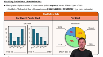
Visualizing Qualitative vs. Quantitative Data
Scale and Axis Manipulation
Understanding scale and axis manipulation is crucial to avoid distorting data trends. Proper scaling ensures that the visual differences in data points reflect actual differences in values. For instance, starting the y-axis at zero is often necessary to provide context and prevent exaggeration of price increases.
Recommended video:

Creating Bar Graphs and Pareto Charts
Time Series Data Representation
Time series data representation involves plotting data points collected over time to show trends or changes. In this case, showing gasoline prices from 2001 to 2018 requires a line graph or bar chart that accurately reflects the progression over years. This helps viewers understand the trend without misinterpretation.
Recommended video:

Creating Time-Series Graphs

 4:39m
4:39mWatch next
Master Visualizing Qualitative vs. Quantitative Data with a bite sized video explanation from Patrick
Start learningRelated Videos
Related Practice
Textbook Question
26
views
