Explain why we use the term association rather than correlation when describing the relation between two qualitative variables.
Table of contents
- 1. Intro to Stats and Collecting Data1h 14m
- 2. Describing Data with Tables and Graphs1h 55m
- 3. Describing Data Numerically2h 5m
- 4. Probability2h 16m
- 5. Binomial Distribution & Discrete Random Variables3h 6m
- 6. Normal Distribution and Continuous Random Variables2h 11m
- 7. Sampling Distributions & Confidence Intervals: Mean3h 23m
- Sampling Distribution of the Sample Mean and Central Limit Theorem19m
- Distribution of Sample Mean - Excel23m
- Introduction to Confidence Intervals15m
- Confidence Intervals for Population Mean1h 18m
- Determining the Minimum Sample Size Required12m
- Finding Probabilities and T Critical Values - Excel28m
- Confidence Intervals for Population Means - Excel25m
- 8. Sampling Distributions & Confidence Intervals: Proportion2h 10m
- 9. Hypothesis Testing for One Sample5h 9m
- Steps in Hypothesis Testing1h 6m
- Performing Hypothesis Tests: Means1h 4m
- Hypothesis Testing: Means - Excel42m
- Performing Hypothesis Tests: Proportions37m
- Hypothesis Testing: Proportions - Excel27m
- Performing Hypothesis Tests: Variance12m
- Critical Values and Rejection Regions28m
- Link Between Confidence Intervals and Hypothesis Testing12m
- Type I & Type II Errors17m
- 10. Hypothesis Testing for Two Samples5h 37m
- Two Proportions1h 13m
- Two Proportions Hypothesis Test - Excel28m
- Two Means - Unknown, Unequal Variance1h 3m
- Two Means - Unknown Variances Hypothesis Test - Excel12m
- Two Means - Unknown, Equal Variance15m
- Two Means - Unknown, Equal Variances Hypothesis Test - Excel9m
- Two Means - Known Variance12m
- Two Means - Sigma Known Hypothesis Test - Excel21m
- Two Means - Matched Pairs (Dependent Samples)42m
- Matched Pairs Hypothesis Test - Excel12m
- Two Variances and F Distribution29m
- Two Variances - Graphing Calculator16m
- 11. Correlation1h 24m
- 12. Regression3h 33m
- Linear Regression & Least Squares Method26m
- Residuals12m
- Coefficient of Determination12m
- Regression Line Equation and Coefficient of Determination - Excel8m
- Finding Residuals and Creating Residual Plots - Excel11m
- Inferences for Slope31m
- Enabling Data Analysis Toolpak1m
- Regression Readout of the Data Analysis Toolpak - Excel21m
- Prediction Intervals13m
- Prediction Intervals - Excel19m
- Multiple Regression - Excel29m
- Quadratic Regression15m
- Quadratic Regression - Excel10m
- 13. Chi-Square Tests & Goodness of Fit2h 21m
- 14. ANOVA1h 57m
13. Chi-Square Tests & Goodness of Fit
Contingency Tables
Problem 4.4.7e
Textbook Question
Made in America In a recent Harris Poll, a random sample of adult Americans (18 years and older) was asked, “When you see an ad emphasizing that a product is ‘Made in America,’ are you more likely to buy it, less likely to buy it, or neither more nor less likely to buy it?” The results of the survey, by age group, are presented in the contingency table below.

e. Create a bar graph for the conditional distribution found in part (d).
Verified step by step guidance1
Identify the conditional distribution you need to graph. Since part (d) likely asked for the conditional distribution of responses given the age group, you will focus on the distribution of 'More likely', 'Less likely', and 'Neither more nor less likely' within each age group.
Calculate the conditional proportions for each response category within each age group. For each age group, divide the count of each response by the total number of respondents in that age group. For example, for the 18-34 age group, calculate \(\frac{238}{542}\) for 'More likely', \(\frac{22}{542}\) for 'Less likely', and \(\frac{282}{542}\) for 'Neither more nor less likely'.
Repeat the above step for all age groups (35-44, 45-54, 55+), so you have the proportion of each response category within each age group.
Set up your bar graph with age groups on the x-axis and the proportion (or percentage) on the y-axis. For each age group, create bars representing the three response categories side by side or stacked, depending on your preference.
Label your graph clearly, including a title, axis labels, and a legend to distinguish the response categories. This will help interpret the conditional distribution visually.
Verified video answer for a similar problem:
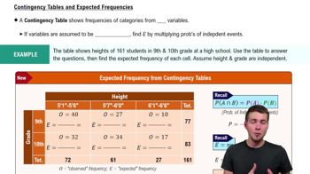
This video solution was recommended by our tutors as helpful for the problem above
Video duration:
3mPlay a video:
Was this helpful?
Key Concepts
Here are the essential concepts you must grasp in order to answer the question correctly.
Contingency Table
A contingency table displays the frequency distribution of variables and shows the relationship between two categorical variables. In this case, it summarizes survey responses by age group and likelihood to buy products labeled 'Made in America.' Understanding how to read and interpret these tables is essential for analyzing categorical data.
Recommended video:
Guided course
Contingency Tables & Expected Frequencies
Conditional Distribution
Conditional distribution refers to the distribution of one variable given a specific condition on another variable. Here, it involves calculating the proportion of responses within each age group to understand buying likelihood. This helps isolate the effect of age on buying behavior by focusing on percentages rather than raw counts.
Recommended video:
Conditional Probability Rule
Bar Graph for Categorical Data
A bar graph visually represents categorical data by showing the frequency or proportion of categories with bars. Creating a bar graph for conditional distributions allows easy comparison of response patterns across age groups. It helps identify trends or differences in buying likelihood among different age categories.
Recommended video:
Creating Bar Graphs and Pareto Charts
Watch next
Master Contingency Tables & Expected Frequencies with a bite sized video explanation from Patrick
Start learningRelated Videos
Related Practice
Textbook Question
7
views
