
Textbook Question
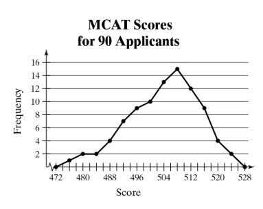
use the frequency polygon to identify the class with the greatest, and the class with the least, frequency.
82
views

 Verified step by step guidance
 04:41
04:41 04:41
04:41 04:36
04:36use the frequency polygon to identify the class with the greatest, and the class with the least, frequency.
In Exercises 37– 40, without performing any calculations, determine which measure of central tendency best represents the graphed data. Explain your reasoning.
True or False? In Exercises 7–10, determine whether the statement is true or false. If it is false, rewrite it as a true statement.
The second quartile is the mean of an ordered data set.
Modified Box-and-Whisker Plot In Exercises 59–62, (a) identify any outliers and (b) draw a modified box-and-whisker plot that represents the data set. Use asterisks (*) to identify outliers.
75 78 80 75 62 72 74 75 80 95 76 72
Extending Concepts
A Misleading Graph? A misleading graph is not drawn appropriately, which can misrepresent data and lead to false conclusions. In Exercises 37–40, (a) explain why the graph is misleading, and (b) redraw the graph so that it is not misleading.
use the frequency distribution to find the (a) class width, (b) class midpoints, and (c) class boundaries.
Toledo, OH, Average Normal Temperatures (F)