Which type of graph best fits the definition
Table of contents
- 1. Intro to Stats and Collecting Data1h 14m
- 2. Describing Data with Tables and Graphs1h 55m
- 3. Describing Data Numerically2h 5m
- 4. Probability2h 16m
- 5. Binomial Distribution & Discrete Random Variables3h 6m
- 6. Normal Distribution and Continuous Random Variables2h 11m
- 7. Sampling Distributions & Confidence Intervals: Mean3h 23m
- Sampling Distribution of the Sample Mean and Central Limit Theorem19m
- Distribution of Sample Mean - Excel23m
- Introduction to Confidence Intervals15m
- Confidence Intervals for Population Mean1h 18m
- Determining the Minimum Sample Size Required12m
- Finding Probabilities and T Critical Values - Excel28m
- Confidence Intervals for Population Means - Excel25m
- 8. Sampling Distributions & Confidence Intervals: Proportion2h 10m
- 9. Hypothesis Testing for One Sample5h 6m
- Steps in Hypothesis Testing1h 6m
- Performing Hypothesis Tests: Means1h 4m
- Hypothesis Testing: Means - Excel42m
- Performing Hypothesis Tests: Proportions37m
- Hypothesis Testing: Proportions - Excel27m
- Performing Hypothesis Tests: Variance12m
- Critical Values and Rejection Regions28m
- Link Between Confidence Intervals and Hypothesis Testing12m
- Type I & Type II Errors15m
- 10. Hypothesis Testing for Two Samples4h 50m
- Two Proportions1h 13m
- Two Proportions Hypothesis Test - Excel28m
- Two Means - Unknown, Unequal Variance1h 3m
- Two Means - Unknown Variances Hypothesis Test - Excel12m
- Two Means - Unknown, Equal Variance15m
- Two Means - Unknown, Equal Variances Hypothesis Test - Excel9m
- Two Means - Known Variance12m
- Two Means - Sigma Known Hypothesis Test - Excel21m
- Two Means - Matched Pairs (Dependent Samples)42m
- Matched Pairs Hypothesis Test - Excel12m
- 11. Correlation1h 24m
- 12. Regression3h 33m
- Linear Regression & Least Squares Method26m
- Residuals12m
- Coefficient of Determination12m
- Regression Line Equation and Coefficient of Determination - Excel8m
- Finding Residuals and Creating Residual Plots - Excel11m
- Inferences for Slope31m
- Enabling Data Analysis Toolpak1m
- Regression Readout of the Data Analysis Toolpak - Excel21m
- Prediction Intervals13m
- Prediction Intervals - Excel19m
- Multiple Regression - Excel29m
- Quadratic Regression15m
- Quadratic Regression - Excel10m
- 13. Chi-Square Tests & Goodness of Fit2h 21m
- 14. ANOVA1h 57m
2. Describing Data with Tables and Graphs
Time-Series Graph
Problem 2.2.18a
Textbook Question
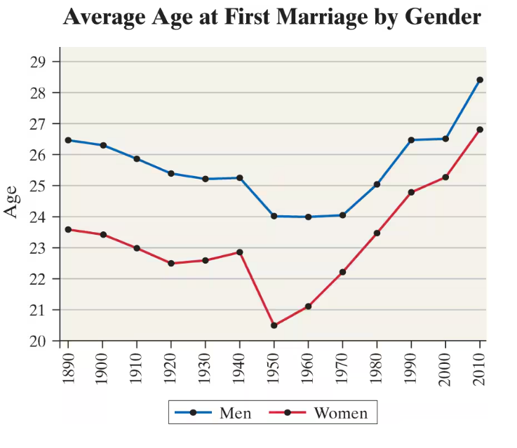
"Age at First Marriage The following time-series plot shows the average age at which individuals first marry by gender for each year of the census since 1890.
a. To the nearest year, what was the average age of a man who first married in 1980?"

Verified step by step guidance1
Identify the year of interest on the horizontal axis, which is 1980 in this case.
Locate the blue line on the graph, as it represents the average age at first marriage for men.
Find the point on the blue line that corresponds to the year 1980.
Trace horizontally from this point to the vertical axis to determine the average age value.
Round the value to the nearest whole number to find the average age of a man who first married in 1980.
Verified video answer for a similar problem:This video solution was recommended by our tutors as helpful for the problem above
Video duration:
1mPlay a video:
Was this helpful?
Key Concepts
Here are the essential concepts you must grasp in order to answer the question correctly.
Time-Series Data
Time-series data consists of observations collected sequentially over time. In this question, the average age at first marriage is recorded for each census year, allowing us to analyze trends and changes over decades.
Recommended video:
Creating Time-Series Graphs
Reading Graphs and Interpreting Data Points
To answer the question, one must accurately read the graph by locating the year 1980 on the x-axis and then identifying the corresponding data point for men. This skill involves understanding axes, legends, and how to estimate values from plotted points.
Recommended video:
Empirical Rule of Standard Deviation and Range Rule of Thumb
Comparative Analysis by Categories
The graph compares two categories—men and women—over time. Understanding how to distinguish and interpret multiple data series on the same graph is essential for analyzing differences and trends between groups.
Recommended video:
Guided course
Comparing Mean vs. Median
Watch next
Master Creating Time-Series Graphs with a bite sized video explanation from Patrick
Start learningRelated Videos
Related Practice
Multiple Choice
32
views
