Which of the following charts provides a useful means for displaying data over time?
Table of contents
- 1. Intro to Stats and Collecting Data1h 14m
- 2. Describing Data with Tables and Graphs1h 55m
- 3. Describing Data Numerically2h 5m
- 4. Probability2h 16m
- 5. Binomial Distribution & Discrete Random Variables3h 6m
- 6. Normal Distribution and Continuous Random Variables2h 11m
- 7. Sampling Distributions & Confidence Intervals: Mean3h 23m
- Sampling Distribution of the Sample Mean and Central Limit Theorem19m
- Distribution of Sample Mean - Excel23m
- Introduction to Confidence Intervals15m
- Confidence Intervals for Population Mean1h 18m
- Determining the Minimum Sample Size Required12m
- Finding Probabilities and T Critical Values - Excel28m
- Confidence Intervals for Population Means - Excel25m
- 8. Sampling Distributions & Confidence Intervals: Proportion1h 25m
- 9. Hypothesis Testing for One Sample3h 29m
- 10. Hypothesis Testing for Two Samples4h 50m
- Two Proportions1h 13m
- Two Proportions Hypothesis Test - Excel28m
- Two Means - Unknown, Unequal Variance1h 3m
- Two Means - Unknown Variances Hypothesis Test - Excel12m
- Two Means - Unknown, Equal Variance15m
- Two Means - Unknown, Equal Variances Hypothesis Test - Excel9m
- Two Means - Known Variance12m
- Two Means - Sigma Known Hypothesis Test - Excel21m
- Two Means - Matched Pairs (Dependent Samples)42m
- Matched Pairs Hypothesis Test - Excel12m
- 11. Correlation1h 24m
- 12. Regression1h 50m
- 13. Chi-Square Tests & Goodness of Fit2h 21m
- 14. ANOVA1h 57m
2. Describing Data with Tables and Graphs
Time-Series Graph
Struggling with Statistics?
Join thousands of students who trust us to help them ace their exams!Watch the first videoMultiple Choice
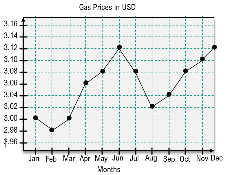
The time-series graph below gives the price (USD) of a gallon of gas each month over the course of a year. Find the time intervals during which gas prices are increasing.

A
Jan-Feb and Jun-Aug
B
Feb-Dec
C
Mar-Apr and May-Jun
D
Feb-Jun and Aug-Dec
Verified step by step guidance1
Step 1: Observe the time-series graph provided. The x-axis represents months (Jan to Dec), and the y-axis represents the price of gas in USD. Each point on the graph corresponds to the price of gas for a specific month.
Step 2: Identify the intervals where the graph is increasing. An increasing interval occurs when the price of gas rises from one month to the next, indicated by an upward slope between consecutive points.
Step 3: Analyze the graph month by month: From Feb to Jun, the graph shows a consistent upward trend, indicating that gas prices are increasing during this interval. Similarly, from Aug to Dec, the graph again shows an upward trend.
Step 4: Note that the graph decreases in price from Jun to Jul and remains flat or decreases slightly in other intervals, which are not considered increasing intervals.
Step 5: Conclude that the time intervals during which gas prices are increasing are Feb-Jun and Aug-Dec, based on the upward slopes observed in the graph.
Watch next
Master Creating Time-Series Graphs with a bite sized video explanation from Patrick
Start learningRelated Videos
Related Practice
Multiple Choice
Time-Series Graph practice set

