
Textbook Question
Using and Interpreting Concepts
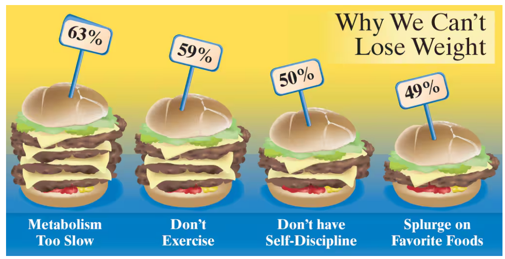
Graphical Analysis In Exercises 13–16, give three observations that can be made from the graph.
60
views
 Verified step by step guidanceVerified video answer for a similar problem:
 04:24
04:24 5:14
5:14 07:10
07:10