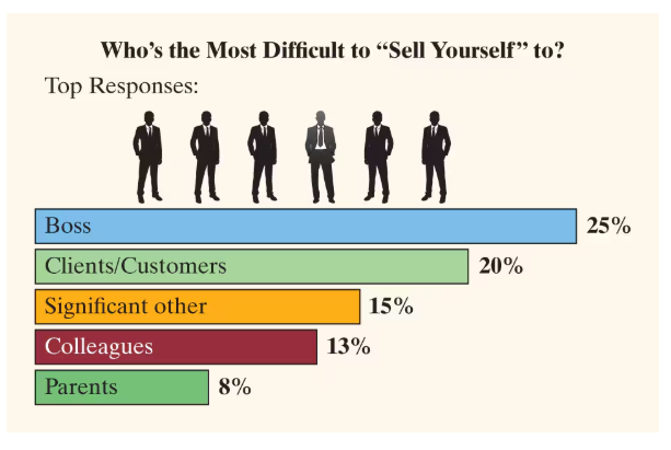
Selling Yourself This USA Today–type chart shows the top responses to the question, “Who’s the most difficult to ‘sell yourself’ to?”
Explain why this graphic cannot be displayed as a pie chart.
Verified step by step guidance
1
Step 1: Understand the nature of a pie chart. A pie chart represents parts of a whole, where all the categories combined must sum to 100%. Each slice of the pie corresponds to the proportion of each category relative to the total.
Step 2: Examine the given data percentages: Boss (25%), Clients/Customers (20%), Significant other (15%), Colleagues (13%), and Parents (8%). Add these percentages to check if they sum to 100%.
Step 3: Calculate the total percentage: \$25\% + 20\% + 15\% + 13\% + 8\% = 81\%$. Since the total is less than 100%, the data does not represent the entire population or all possible categories.
Step 4: Recognize that because the total is less than 100%, the missing 19% represents other categories or responses not shown. This incomplete total means the data cannot be accurately represented as a pie chart, which requires all parts to sum to 100%.
Step 5: Conclude that a bar chart is more appropriate here because it can display individual category percentages without requiring them to sum to 100%, allowing for clear comparison of the top responses.
Verified video answer for a similar problem:
This video solution was recommended by our tutors as helpful for the problem above
Video duration:
3m
Play a video:
Was this helpful?
Key Concepts
Here are the essential concepts you must grasp in order to answer the question correctly.
Pie Chart Requirements
A pie chart represents parts of a whole, so the data categories must sum to 100%. If the total percentage is less than or more than 100%, a pie chart would misrepresent the data by implying completeness or exclusivity that doesn't exist.
The given data does not cover all possible categories, as the percentages add up to less than 100%. This means the responses shown are only a subset, making a pie chart inappropriate because it would suggest these categories are exhaustive.
Bar charts effectively display individual category values without implying they sum to a whole. They allow comparison of different categories independently, making them suitable when data is partial or categories are not mutually exclusive.

 Verified step by step guidance
 06:10
06:10
